Search This Blog

Showing posts with label green. Show all posts

Sunday, October 30, 2016

The Rose Hip Saga... it went on forever!!!


I have worked out several ways to make this project easier and tutorial-worthy, and am hoping for a release date just after Thanksgiving!  Never say never, I guess.

This idea came from a shrub rose cluster near my home.  I had taken pictures of it a year ago, in the fall, when it was colored, and had a few hips still dangling and I fell in love with the extraordinary look of the thing! Sadly, I could not find that image, but this exceptional one has the feel of the thing beautifully.


Staggering, right?  Yep, someday I'll have a go with the fall colors, because OMG!  But what I loved most was the little hip.  BUT, I have just played with fall color and leaves and I thought it might be time to move on.  So I did more looking about at my world.  The beautiful rose patch had changed.  It's been cut back to allow it to thicken for next year and just a few little leaves had begun to sprout.  But they still had that great TEXTURE.


I did a little more research with my BFF Google Images.  I believe in working from life (lol) as much as possible when I try to do botanical imagery, so I hunted for pictures of rose hips.  What I found showed me that they came in two different shapes, both oval, and like the rondelle shape I had seen.


So first I set out to create some leaves, with the cool, quilted texture and vein-y-ness of the shrub roses.  I had to remember how to make Russian Leaves first, and then I began playing with the texture, which I ultimately got with both a combination of cylinders and rounds, and also with finish, using a matte cylinder and a shiny round, and vice-versa.  I had to stop and draw bits of leaves to figure out how to get that all to happen.


After much color experimentation, (much of which I ripped out before finishing a leaf) I finally had leaves and colors I liked.  I thought I would do a less shiny, casual version first, and then explore using silver-lined beads too, for a dressier look.  But I never got past the casual version, and I think it's plenty dressy.

I also thought I might want to use thorns. Because, WOW!  Thorny!!!


Then I went on a hip and thorn hunt.  One of my local bead shops (J-Ring Glass) is closing.  I am sad about this, because I liked their semi-precious collection especially.  I found loads of possible dressy and casual hips there (both coral and glass) and some amazing red/gold daggers at Bobby Bead and brought them all home.  I added the actual thorn beads I had been hoarding.


And then, I played a bit with the funky ends of the hips, the part that would have been the base for the rose flower, before the petals fell off and the fruit matured.  Actually, I got completely obsessed with these.


OK, meanwhile, back at the ranch, I had my leaves assembled on a piece of Stren, the same magic that supports my lilacs.  I had a rope with the red dagger thorns, and I wove them together, and tried out the hips.  I hated the results. Clunky, awkward, the daggers were stealing the thunder from the leaves and hips, and I had imagined a cascade of hips, but they were fighting with the leaves. EGAD.
I rather wanted to quit.  You cannot imagine the difficulty of weaving this uncontrolled, catchy sprig of leaves into this insane thorny rope.  I gave it a couple days, and ripped the leaves out of the rope.  I did like the bright red berries against the dark forest-y green leaves, so thank goodness, all was not lost.


Then I made MORE leaves and attached them in a triangular shape, which thank heaven, I liked. But the darn hip-tip thingies (of which I finally had made ones I just loved) were totally wrong, and masked the berries. And I thought the fat rondelle berries were awfully heavy for the sleek leaves, so they were wrong too.  OF COURSE.  I think this was just that kind of project.  Although, I often do things so many times it makes me dizzy, so maybe because (like childbirth) while it's fresh, you remember all the agony, and then later on, you think... maybe another baby would be nice.  Anyhow...


Also, I thought the placement of the hips was just too perfect and inorganic.  I removed the hip tips, and put in more hips with just a tiny Czech rondelle and a gold picot, and did it as randomly as I could, although they arrange themselves despite my efforts to be organic.

So, finally, I like the dang thing!


And a back view, for structure.


Did you make it through all the angst?  I don't blame you if you didn't, because I nearly gave up several times.  But I am glad I didn't.  Happy beady trails to you!

Sunday, January 31, 2016

Springtime Dragon


There is a new Dragon kit in my Etsy shop.  Meet Springtime Dragon.  I think they are all girls.
You can name your own yourself.  Maybe, for you, it's a boy dragon. :)

Last year, I started playing with the idea of using gradation in Chenille stitch.  I also decided to try working a series of similar pieces, instead of bouncing around at will, as I usually do.  So I made friends with dragons, and dragon scale beads, and the idea of multiple colorways.  It was kind of a quest for mastery of an idea.  I began with gradation that ran vertically around the cord.


I did the fuchsia one first, with a Fuchsia jewel, and a pink to purple rope ombre.

Then I used a Crystal Astral Pink jewel, and used color from the jewel for my ombre. from gold, through pumpkin to pink.  I gifted that one to a dear longtime beading friend.
Because she liked it.  :)


To better explain the ombre gradation, I have laid the rope on its side.  The outside edge of the rope is chartreuse, which deepens across the top to a middle value and then to a dark forest green on the inside.  And since I was thinking of writing tutorials, I gave this third version a fuchsia "belly" because I knew it would be easier for students to see mistakes in the pattern if there was a bold reference point.  I think there is some mastery to be had with repetition.


Here's a similar ombre, from "Second Hand Rose" which I have other plans for.  

Then I worked with spiraling the ombre around the rope, and that too, is a tutorial in my Etsy shop.


And I did a couple dragons with that gradation as kits. The Volcano sold out really fast, and two of the Chili Pepper are still available in my shop.


I think Springtime is the last Dragon kit I will do.  How many dragons might people want to bead??


I think she (or maybe yours would be a he?) would be fun to wear for Valentine's Day, or St. Paddys, or maybe even Easter!  For sure the vernal equinox!  The project takes about 10-12 hours, (intermediate level with a knowledge of Peyote required and the ability to follow a chart) so there is plenty of time if you get started right away, lol.

But I have a couple other dragons to show, and if this is the end of dragons for me, now is the time.


Expect more gradation.  It is one of my favorite things to do.  And I love Chenille, so meditative.
But if you want a dragon, now is the time.  


Find her in my Etsy Shop here!

Wednesday, May 2, 2012

Kelp Forest


I needed a distraction, and the Etsy Beadweavers May Challenge provided an excellent one. The theme was "Nautical Inspired."  I didn't plan or draw.  I wanted to fill my mind, and use up all the time alloted. Since the description of the challenge mentioned "lush ocean life" I started by searching Google Images for ocean plants, and the first images were of a kelp forest and I was HOOKED!

Rocks with Barnacles

I searched through my stash for things that looked like they might be part of a kelp forest and found several things to love.  Deep blues and greens found their way into my possibilities pile, and two things really spoke to me.  I had some blue green Swarovski jewels that asked to be the rocks that provide the kelp with an anchor on the ocean floor, and some iridescent beetle wings that looked like kelp leaves to me.  I began bezeling the jewels, and realized I needed one more than I had, but (curses!) my supplier was out of town until the 30th of April.  I imagine this is how drug addicts feel when then need a fix, and their dealers are in Aruba!  So I posted an image of what I needed on Facebook, hoping one of my beady buddies might sell me one of these beauties.

And Cindy Hlavka (awesome ex-president of the Upper Midwest Bead Society, who recognizes bead need when she sees it!) came riding to my rescue!  We met in a parking lot and she opened the trunk of her "MN Twins Mobile" to display her Swarovski jewel stash, in a black velvet lined box no less.  I really felt like I was buying drugs!  THANK YOU CINDY!!! 

After the jewels were bezeled, I decided they needed lots of sparkly ocean floor texture, so created a barnacle embellished look with freshwater pearls and bicones.  And I made a center back closure that would allow me to add kelp fringe and made a net connection, which seemed wildly appropriate to the ocean-going theme.
You can see a couple of the beetle wings in the corner of this photo.  I had begun playing with how they might become kelp, but holy mackerel (pardon the expression) that was a challenge!  They are wings, so they are SUPER LIGHT WEIGHT.  Sadly, lightweight things do not lend themselves to fringe, which requires weight to drape beautifully.  I tried MANY configurations and the best one abandoned all thread and used chain and jump rings, which provided the necessary weight for effective drape.  I loved those wings, but I just didn't love what I was able to make from them.

The Quest for Kelp

Thus began the hunt for a way to communicate the beautiful movement and shapes of the kelp itself.  I made a few samples.   One extraordinary thing about the kelp plant that really appealed to me was its flotation device.  Kelp needs sunlight for photosynthesis.  If it lies on the ocean floor, there is not much sunllight to be had.  So it makes its own little pontoons.  Each leaf has a gas bladder, connecting it to the main stalk of the plant and the plant fills the bladders and thus, keeps itself afloat to wave in the currents.  LOVED that.  And I found some awesome freshwater pearls that seemed perfect.  BUT, I struggled with how literal to be, how sparkly the leaves should be, and how to keep the two portions of the necklace harmonious.  This was lacking cohesiveness for me, but I thought it was close.
So I tried a bluer, less glittery version, without the big pearl bladder.
But then, the little bladder pearls were shocking and the leaves were stripey.
so I tried a simpler fringe, thinking it would still have the persuasiave movement.  Fail.

Then I tried putting the big bladder pearl at the bottom, more negative space a the top of kelp and softer stitching to achieve a more tassle-like result, and finally a tassle that I ripped apart later in my process for parts!  Still nothing right.
Plus I found working on this necklace was like sewing on black at night.  It's dark enough that I can't tell what I have done until the next day's dawn.  Finally, I waited for a dawn and did an assessment.  I like the sparkle, but not too much of it.  The bladder pearls were screaming and I needed them to be more integrated, so I found a different, quieter bead for the task.  And the color really needed to blend with the rocks, since the texture and shape were different. AND, I used the big bladder pearl at the top of the fringe strand.  It had a sprouted seed quality in that position that I really liked.   Finally, I could just make the kelp!!!

Final Results: "Poseidon's Garden"

Poseidon, mythological God of the Ocean was also responsible for horses.  Hence the clasp detail! 

This very glamorous evening-wear necklace is for sale in my Etsy shop and also an entry in the May 2012 Etsy Beadweavers Challenge, "Nautical Imspired."  Please visit our team blog to see all the wonderful entries and vote for your personal favorite between May 9th and 15th at:

And happy beading to you!

Sunday, April 1, 2012

Everything's Coming Up Crocus

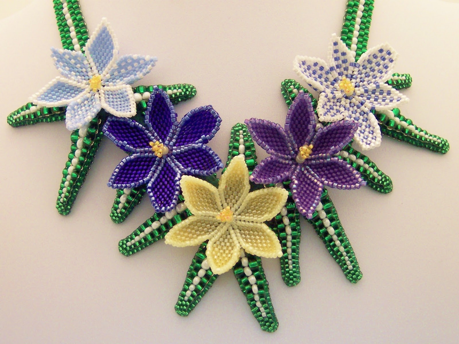
When the Etsy Beadweavers "Seed Beads Only" challenge was announced, I thought it might be nice opportunity to make beaded flowers, something I usually enjoy.  I began with researching crocus on google images and found the variety of colors and shapes appealing, so decided to make several different colored and shaped versions to replicate one particularly appealing image, from Dutch Mill Bulbs.

The range of colors ran from white through yellow to blue, purple, and even magenta. There were also lovely stripey patterns and beautiful ombre's. They all had six petals, but some were pointy, some more blunt, and opened from tightly closed to gently cupped with age.

I simplified a little to try to avoid visual confusion. And finally after a number of test petals, selected five I liked, and got the flowers finished, complete with upright stamen and pistils.   Most of the plants had delicate grasslike leaves and those were my biggest struggle.  I tried some peyote ones that I could cup a little with bead choice and thread tension, but they looked like bandaids to me.  Drat!  :o)
Then I turned the peyote sideways and did a double needle odd count technique, with beads in 4 sizes.  This did not have the same structural merit as the little bandaids, but did pleasantly reflect the size and shape of the leaves.

The white center stripe was also clean and clear with this technique, and I could create curves, but they required support.  So, enter the bead backing.  I created each leaf and then stitched it to the bead backing.  I decided the spiky quality of the leaf structure didn't really want to be other than straight, so ditched the curve potential.  I placed the leaves in what I hoped was a randomly balanced  pattern, and trimmed away the backing as I went.

Then I went on a hunt for something soft and comfortable to back the bead backing with, and a means to apply the backing without widening the leaves with the traditionaly quilled edge beads. I asked my friend Kinga Nichols (beauteous bead embroiderer!) a million questions about leather, adhesives, and stitches which she patiently answered. I found a beautiful piece of "super softy pigskin" in a deep green, and know I will re-visit Tandy Leather in Roseville to buy more in other colors some day.  I tried buttonhole and blanket stitches without an edge bead, but finally decided that the best finish was the quilling.  I quilled with both size 11 and 15 beads, and kept my shape reasonably well with only a small amount of additional width.  I thought the leaves looked like tiny crocodiles from the sides, with their two rows of scary tooth beads!

This finished product is certainly organic in feeling, different from my usual precise and more formal results, but a happy little piece, and certainly a nice harbinger of Spring.

Monday, March 5, 2012

A Visit to the Emerald Isle

When the "Destinations" theme was chosen and announced by Jacquie Champion of Etsy Beadweavers, I immediately thought of Ireland.  I am a quarter Irish, and although I am a dreadful traveler, frequently completely undone by motion sickness, if I could go anywhere in the world, Ireland would be my choice.   Add to that, I usually like to make jewelry that suits my mood, and I am always longing for green when March finds Minnesota.   And with St. Patrick's day the big holiday in the month, happening right after our challenge, the deal was sealed.  Shamrocks, shillelaghs, and leprechaun gold!


I was also inspired by a book I was reading, The Witching Hour, by Anne Rice. My travel is frequently done in my imagination through books. I knew my necklace would be emerald green for Ireland's beautiful rolling hills and clover, bumpy for the famous buckthorn walking (and fighting!) sticks, and gold, to represent end-of-the-rainbow treasure.  In this book, a Brazilian emerald necklace, vintage late 1600's, is acquired and passed down through 13 generations of female designees to the Mayfair Legacy, and its description became part of my design imagery as well.  It had a heavy gold chain, and ornate gold setting.  So my necklace also represents the "Mayfair Emerald," as well as Ireland.  The Mayfair necklace had only one, large rectangular jewel, but I added more jewels and other shapes.

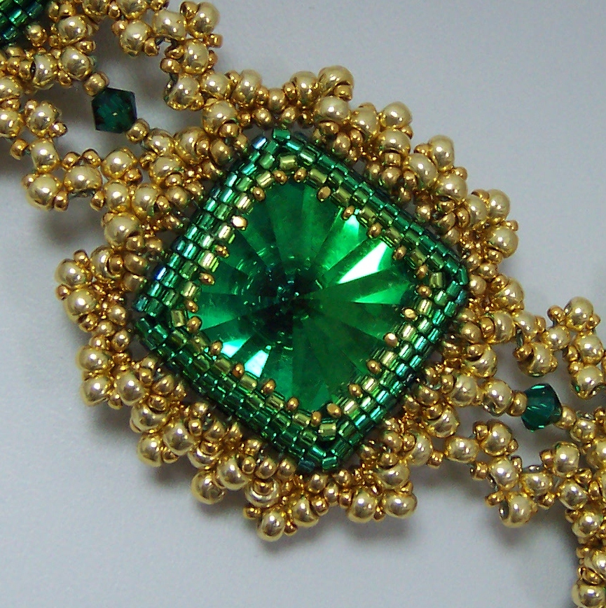
I began with bezels for the beautiful rectangle and triangle Swarovski emerald jewels, and the amazing vintage effect squares I got from my friend Doris Coghill at BeadsbyDee.  In all fairness, much of the magic in the necklace is in the beautiful color in those squares.  I bezeled the jewels in gradated rows of greens in teal, emerald, grass, and peridot.  This is pretty subtle color use, and you may not have consciously noticed it at first glance, but I think this kind of detail really makes a huge difference in the final product, and provides added dimension for the bezel, since the darker, cooler colors recede from the eye and the lighter ones advance toward it.

 I did the same sort of thing with the gold beads that I used.  My 15/0 beads are Miyuki 24k gold plate, a deep rich gold. The 11/0 are labeled 4202 Duracoat, (pet peeve! a label that does not tell me what bead I have bought!!!) and also fairly dark and rich.  The 8/0 beads are Toho PF557 Gold Galvanized, which I don't usually like to use because the durability is questionable, (despite the "permanent finish" advertised) but I needed gold beads, and these are what is available.  My personal body chemistry does not strip metal from beads, but I know I am in a minority. The point here is, the bigger beads are a lighter shade of gold than the smaller ones.  This provides lots of added depth and dimension, which may not be noticable without having attention called to it.  See how the beads closer to the bezel are darker?  They really increase visual depth.  Well, that, plus the negative space I left open there, and of course, the bezel ombre, helps too.


I was stuck on my frame for a long time.  I added a simple picot.


Then I closed it for stability and to create substance and size, and then I was stuck for a while.


Finally, I began to embellish the frame, aiming for both "bumpy" like the blackthorn Shillelaghs, and "heavy" from my book. The first row thickened the frame, and began adding bumps, which I wanted to look something like granulation.


Then, I added a netted picot through that layer.


And finally, I felt good about my goals of evoking Ireland, ornate, bumpy, granulation, and late 17th century, portrayed in beads. Then I began a quest for "heavy gold chain" that would still represent all the above characteristics, and relate to the framework I had already created.  I tried spiral, flat spiral, double spiral, embellished RAW, cubic RAW, tried to work out what cubic triangle weave might be (which was pure disaster!) and finally resorted to double stitched flat triangle weave.  I used moss green power pro, and although you can't see it so well in the photos, in person, it lends a kind of antique verdegris shadow to the work, which felt just right to me.


Then I laid out my components and began linking them with the triangle weave chain.  I considered a shamrock configuration, but felt it would be too literal, not pleasing to the eye, plus it denied the vintage jewelry quality I was trying to create.


I desperately wanted to add fringe, but in looking at jewelry from the late 1600's and early 1700's,  I saw few fringy components, so managed to restrain myself this time.  But those emerald faceted drops I bought are bound to show up in my work in the near future.  They are just too good to pass over permanently.

Being obsessive compulsive, I also had to finish the backs of my bezels.


Then I went shopping for a clasp and I must say, I have been spoiled by the fantastic Elegant Elements clasps I have put on my last three projects. Mind you, this clasp is good on the piece, but as I mentioned, I am spoiled!!!  Usually, when I piece is done, I hate to back up, but I would gladly rip this one back for an Elegant Elements clasp.  I've lost the link to the collection, but maybe I'll ask Steven if he's interested.  Neither of my two favorite local bead shops carries Elegant Elements clasps.  SAD!!!