Search This Blog

Showing posts with label ombre. Show all posts

Wednesday, November 1, 2017

To Tell the Truth...

... I was not really planning to kit a new color of my vertical ombre dragon necklace right now.  BUT... Dreamscape Dragon has a shiny new, wintery friend. Meet Paradise Dragon.


How does one end up with a new set of kits without planning to do this?  One of my buyers found mistakes in my text.  Again.  This was the last tutorial I released before the advent of Marie Weakland,  beader extraordinaire, who agreed to help me test my tutorials in early 2017.  I admired her complex projects and lovely technique, and asked her if she would be interested, and she has kindly, (and dramatically!), improved my tutorials with her intelligent suggestions, and wonderful editing.

So I set aside my new colorways for Caramel's Claws and instead worked my way through this tutorial in a new colorway I had been thinking about for long enough to already have scales.


A Paradise Shine Swarovski Fancy Stone provided all the color inspiration for this pretty gal, and while Dreamscape is vibrant and bright, I tried to give this version depth and darkness.  It's still an attention-getting neckpiece, but a little more subtle and rich.


In the photo above, you can see the vertical gradation in the rope, with teal outside edges that fade through turquoise to sapphire to violet at the inside edge against the neck.  I have kept the bezel simple in these dragons, to feature the pretty shapes in the dragons wings and tail, and the hand-painted color.  It also gives you a simple and workable bezel for this Swarovski jewel, which you could play with and embellish as you choose.


I believe I have sent every buyer of this tutorial a corrected copy via e-mail.  But if I missed anyone, please let me know, and I will send you a fresh copy right away, that also includes the materials list for Paradise Dragon.   I want my instructions to be right for you, and I am so sorry for mistakes!

I will post a set of kits for this Paradise Dragon Necklace on this Saturday, November 4th at 9am in my Etsy shop, and I will come back here and add a link.

NOTE:  If you own the Springtime Dragon tutorial, it is correct.  


But it is a 4 color gradation.  
It is light, warm green to dark, cool green in three steps, with a pink belly.  It looks like this in text: AA, BB, CC, DD.  Dreamscape and Paradise color shift much further.  Dreamscape moves from light yellow-orange to purple and Paradise moves from a green-blue to purple, and so I added a FIFTH color to the top side of the rope.  The text chart for these dragons is: AA, BC, DD, EE.

 If you have purchased the Springtime Dragon tutorial,
and want an upgrade to this new tutorial, 
I offer you a deal!
Convo me, from the receipt for your purchase of Springtime Dragon, and I will make you a Custom Listing for this new FIVE COLOR dragon tutorial at $5.00.  That is the only way I can do this quickly and expediently, so the deal is only good via that process.

Now, back to painting dragons!  I promise to get to work on the new colors for Caramel's Claws the second these kits are done.


Sunday, January 31, 2016

Springtime Dragon


There is a new Dragon kit in my Etsy shop.  Meet Springtime Dragon.  I think they are all girls.
You can name your own yourself.  Maybe, for you, it's a boy dragon. :)

Last year, I started playing with the idea of using gradation in Chenille stitch.  I also decided to try working a series of similar pieces, instead of bouncing around at will, as I usually do.  So I made friends with dragons, and dragon scale beads, and the idea of multiple colorways.  It was kind of a quest for mastery of an idea.  I began with gradation that ran vertically around the cord.


I did the fuchsia one first, with a Fuchsia jewel, and a pink to purple rope ombre.

Then I used a Crystal Astral Pink jewel, and used color from the jewel for my ombre. from gold, through pumpkin to pink.  I gifted that one to a dear longtime beading friend.
Because she liked it.  :)


To better explain the ombre gradation, I have laid the rope on its side.  The outside edge of the rope is chartreuse, which deepens across the top to a middle value and then to a dark forest green on the inside.  And since I was thinking of writing tutorials, I gave this third version a fuchsia "belly" because I knew it would be easier for students to see mistakes in the pattern if there was a bold reference point.  I think there is some mastery to be had with repetition.


Here's a similar ombre, from "Second Hand Rose" which I have other plans for.  

Then I worked with spiraling the ombre around the rope, and that too, is a tutorial in my Etsy shop.


And I did a couple dragons with that gradation as kits. The Volcano sold out really fast, and two of the Chili Pepper are still available in my shop.


I think Springtime is the last Dragon kit I will do.  How many dragons might people want to bead??


I think she (or maybe yours would be a he?) would be fun to wear for Valentine's Day, or St. Paddys, or maybe even Easter!  For sure the vernal equinox!  The project takes about 10-12 hours, (intermediate level with a knowledge of Peyote required and the ability to follow a chart) so there is plenty of time if you get started right away, lol.

But I have a couple other dragons to show, and if this is the end of dragons for me, now is the time.


Expect more gradation.  It is one of my favorite things to do.  And I love Chenille, so meditative.
But if you want a dragon, now is the time.  


Find her in my Etsy Shop here!

Monday, March 5, 2012

A Visit to the Emerald Isle

When the "Destinations" theme was chosen and announced by Jacquie Champion of Etsy Beadweavers, I immediately thought of Ireland.  I am a quarter Irish, and although I am a dreadful traveler, frequently completely undone by motion sickness, if I could go anywhere in the world, Ireland would be my choice.   Add to that, I usually like to make jewelry that suits my mood, and I am always longing for green when March finds Minnesota.   And with St. Patrick's day the big holiday in the month, happening right after our challenge, the deal was sealed.  Shamrocks, shillelaghs, and leprechaun gold!


I was also inspired by a book I was reading, The Witching Hour, by Anne Rice. My travel is frequently done in my imagination through books. I knew my necklace would be emerald green for Ireland's beautiful rolling hills and clover, bumpy for the famous buckthorn walking (and fighting!) sticks, and gold, to represent end-of-the-rainbow treasure.  In this book, a Brazilian emerald necklace, vintage late 1600's, is acquired and passed down through 13 generations of female designees to the Mayfair Legacy, and its description became part of my design imagery as well.  It had a heavy gold chain, and ornate gold setting.  So my necklace also represents the "Mayfair Emerald," as well as Ireland.  The Mayfair necklace had only one, large rectangular jewel, but I added more jewels and other shapes.

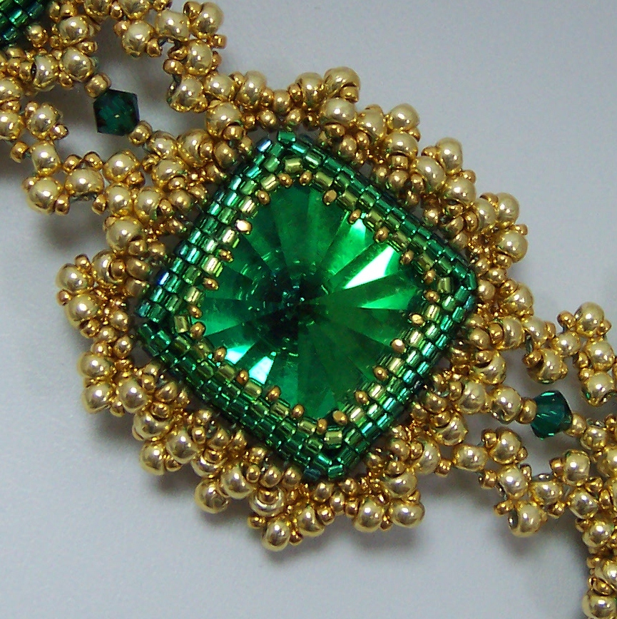
I began with bezels for the beautiful rectangle and triangle Swarovski emerald jewels, and the amazing vintage effect squares I got from my friend Doris Coghill at BeadsbyDee.  In all fairness, much of the magic in the necklace is in the beautiful color in those squares.  I bezeled the jewels in gradated rows of greens in teal, emerald, grass, and peridot.  This is pretty subtle color use, and you may not have consciously noticed it at first glance, but I think this kind of detail really makes a huge difference in the final product, and provides added dimension for the bezel, since the darker, cooler colors recede from the eye and the lighter ones advance toward it.

 I did the same sort of thing with the gold beads that I used.  My 15/0 beads are Miyuki 24k gold plate, a deep rich gold. The 11/0 are labeled 4202 Duracoat, (pet peeve! a label that does not tell me what bead I have bought!!!) and also fairly dark and rich.  The 8/0 beads are Toho PF557 Gold Galvanized, which I don't usually like to use because the durability is questionable, (despite the "permanent finish" advertised) but I needed gold beads, and these are what is available.  My personal body chemistry does not strip metal from beads, but I know I am in a minority. The point here is, the bigger beads are a lighter shade of gold than the smaller ones.  This provides lots of added depth and dimension, which may not be noticable without having attention called to it.  See how the beads closer to the bezel are darker?  They really increase visual depth.  Well, that, plus the negative space I left open there, and of course, the bezel ombre, helps too.


I was stuck on my frame for a long time.  I added a simple picot.


Then I closed it for stability and to create substance and size, and then I was stuck for a while.


Finally, I began to embellish the frame, aiming for both "bumpy" like the blackthorn Shillelaghs, and "heavy" from my book. The first row thickened the frame, and began adding bumps, which I wanted to look something like granulation.


Then, I added a netted picot through that layer.


And finally, I felt good about my goals of evoking Ireland, ornate, bumpy, granulation, and late 17th century, portrayed in beads. Then I began a quest for "heavy gold chain" that would still represent all the above characteristics, and relate to the framework I had already created.  I tried spiral, flat spiral, double spiral, embellished RAW, cubic RAW, tried to work out what cubic triangle weave might be (which was pure disaster!) and finally resorted to double stitched flat triangle weave.  I used moss green power pro, and although you can't see it so well in the photos, in person, it lends a kind of antique verdegris shadow to the work, which felt just right to me.


Then I laid out my components and began linking them with the triangle weave chain.  I considered a shamrock configuration, but felt it would be too literal, not pleasing to the eye, plus it denied the vintage jewelry quality I was trying to create.


I desperately wanted to add fringe, but in looking at jewelry from the late 1600's and early 1700's,  I saw few fringy components, so managed to restrain myself this time.  But those emerald faceted drops I bought are bound to show up in my work in the near future.  They are just too good to pass over permanently.

Being obsessive compulsive, I also had to finish the backs of my bezels.


Then I went shopping for a clasp and I must say, I have been spoiled by the fantastic Elegant Elements clasps I have put on my last three projects. Mind you, this clasp is good on the piece, but as I mentioned, I am spoiled!!!  Usually, when I piece is done, I hate to back up, but I would gladly rip this one back for an Elegant Elements clasp.  I've lost the link to the collection, but maybe I'll ask Steven if he's interested.  Neither of my two favorite local bead shops carries Elegant Elements clasps.  SAD!!!