Search This Blog

Showing posts with label gradation. Show all posts

Wednesday, November 1, 2017

To Tell the Truth...

... I was not really planning to kit a new color of my vertical ombre dragon necklace right now.  BUT... Dreamscape Dragon has a shiny new, wintery friend. Meet Paradise Dragon.


How does one end up with a new set of kits without planning to do this?  One of my buyers found mistakes in my text.  Again.  This was the last tutorial I released before the advent of Marie Weakland,  beader extraordinaire, who agreed to help me test my tutorials in early 2017.  I admired her complex projects and lovely technique, and asked her if she would be interested, and she has kindly, (and dramatically!), improved my tutorials with her intelligent suggestions, and wonderful editing.

So I set aside my new colorways for Caramel's Claws and instead worked my way through this tutorial in a new colorway I had been thinking about for long enough to already have scales.


A Paradise Shine Swarovski Fancy Stone provided all the color inspiration for this pretty gal, and while Dreamscape is vibrant and bright, I tried to give this version depth and darkness.  It's still an attention-getting neckpiece, but a little more subtle and rich.


In the photo above, you can see the vertical gradation in the rope, with teal outside edges that fade through turquoise to sapphire to violet at the inside edge against the neck.  I have kept the bezel simple in these dragons, to feature the pretty shapes in the dragons wings and tail, and the hand-painted color.  It also gives you a simple and workable bezel for this Swarovski jewel, which you could play with and embellish as you choose.


I believe I have sent every buyer of this tutorial a corrected copy via e-mail.  But if I missed anyone, please let me know, and I will send you a fresh copy right away, that also includes the materials list for Paradise Dragon.   I want my instructions to be right for you, and I am so sorry for mistakes!

I will post a set of kits for this Paradise Dragon Necklace on this Saturday, November 4th at 9am in my Etsy shop, and I will come back here and add a link.

NOTE:  If you own the Springtime Dragon tutorial, it is correct.  


But it is a 4 color gradation.  
It is light, warm green to dark, cool green in three steps, with a pink belly.  It looks like this in text: AA, BB, CC, DD.  Dreamscape and Paradise color shift much further.  Dreamscape moves from light yellow-orange to purple and Paradise moves from a green-blue to purple, and so I added a FIFTH color to the top side of the rope.  The text chart for these dragons is: AA, BC, DD, EE.

 If you have purchased the Springtime Dragon tutorial,
and want an upgrade to this new tutorial, 
I offer you a deal!
Convo me, from the receipt for your purchase of Springtime Dragon, and I will make you a Custom Listing for this new FIVE COLOR dragon tutorial at $5.00.  That is the only way I can do this quickly and expediently, so the deal is only good via that process.

Now, back to painting dragons!  I promise to get to work on the new colors for Caramel's Claws the second these kits are done.


Friday, September 2, 2016

"Aflame" and Friends


I have been playing with chenille stitch and gradation for over a year, and find there is a nice depth in working with the same idea over an extended period.  Part this work is the rope above, published in the October 2016 Bead & Button Magazine.


I submitted the project with a maple leaf pendant, employing the same gradation, but only the rope was chosen for publication.  One nice thing about working with Bead & Button is, although you cannot publish your accepted project anywhere else before they do, afterward, you may submit it for publication elsewhere, or self-publish, which I have done in my Etsy shop.  I have published a tutorial for the leaf, rope, and bail here, as well as a kit in the "Aflame" colors shown above.

I think they play nicely together, and really like the flame-ish aspect of the whole.  I tried to combine both the colors of the leaves I pick up on my daily walks, with the colors in the bonfires I find so appealing in my fire pit in the fall.  I love the crisp cool air on my back and toasty toes, and the blue-purple embers at the edges of the fire.  I tried to roll all of the juicy goodness of Autumn together into this work.

I worked up two other colorways to include in my tutorial.  I realize that "Aflame" is a very bold piece with bright colors.  So I did a much more subtle version.  This is "Singe". I made up jest a few kits in this color group, since the investment in the 24k beads is substantial.  They are available here!


It represents the leaves of the Silver Maples that fill my yard, which go almost directly from green to coppery topaz, bypassing all the reds and oranges of the Sugar Maples in the neighbor's yards.  They always seem a little burnt to me.  But they have their own beauty, and the colorway has more a feeling of proper jewelry, (a bit less fantastical than bold "Aflame") given the 24k gold edges and accents in the rope.

And then, there is "Psychedelic Scarab".  OK, get out the mushrooms. This might be a tribute to my coming of age in the early '70's. I had a few Scarabeus Green Swarovski beetles left over from a dressmaking project, and the color in that little piece of glass was pretty awesome.


I added a beetle to the bail, and despite the "tripiness" of the colors in the leaf, this baby looks awesome worn with either of my two cobalt blue tops, and turns heads. Ladies who share my table while I am sipping my tea at the farmer's market demand I take it off for closer examination. I have to admit, it might be my favorite.  And the ROPE!  The kit for this color is here in my Etsy shop.


Both pieces (rope and leaf) could also be worn separately, and I have made a few leaves as samples for another, larger project, which I am also selling in my shop.


These leaves use the same pattern, MOSTLY.  I have scaled the bail down for the thinner rope. As you might notice, I take liberties with the exact placement of the beads as I work this pattern.  You can bead both sides symmetrically if you like, but in my world, it looks much more natural if each side is a little different.  I suggest in my pattern that when you lay out the second side, you use the beads I suggest, but switch a few with their neighbors.  In my samples, I have fiddled further than that, and changed a few edges a bit, but it's nice to know that once you have the shape established, you can play with color placement to your hearts content.  I really look forward to seeing what you all will do with this pattern.

I hope your will enjoy the curly-edged, ripply-centered, funky shape of this project too, which also keeps the leaves looking realistic!


Happy Autumn to you!  I hope you will enjoy making your very own leaf pile!


Sunday, January 31, 2016

Springtime Dragon


There is a new Dragon kit in my Etsy shop.  Meet Springtime Dragon.  I think they are all girls.
You can name your own yourself.  Maybe, for you, it's a boy dragon. :)

Last year, I started playing with the idea of using gradation in Chenille stitch.  I also decided to try working a series of similar pieces, instead of bouncing around at will, as I usually do.  So I made friends with dragons, and dragon scale beads, and the idea of multiple colorways.  It was kind of a quest for mastery of an idea.  I began with gradation that ran vertically around the cord.


I did the fuchsia one first, with a Fuchsia jewel, and a pink to purple rope ombre.

Then I used a Crystal Astral Pink jewel, and used color from the jewel for my ombre. from gold, through pumpkin to pink.  I gifted that one to a dear longtime beading friend.
Because she liked it.  :)


To better explain the ombre gradation, I have laid the rope on its side.  The outside edge of the rope is chartreuse, which deepens across the top to a middle value and then to a dark forest green on the inside.  And since I was thinking of writing tutorials, I gave this third version a fuchsia "belly" because I knew it would be easier for students to see mistakes in the pattern if there was a bold reference point.  I think there is some mastery to be had with repetition.


Here's a similar ombre, from "Second Hand Rose" which I have other plans for.  

Then I worked with spiraling the ombre around the rope, and that too, is a tutorial in my Etsy shop.


And I did a couple dragons with that gradation as kits. The Volcano sold out really fast, and two of the Chili Pepper are still available in my shop.


I think Springtime is the last Dragon kit I will do.  How many dragons might people want to bead??


I think she (or maybe yours would be a he?) would be fun to wear for Valentine's Day, or St. Paddys, or maybe even Easter!  For sure the vernal equinox!  The project takes about 10-12 hours, (intermediate level with a knowledge of Peyote required and the ability to follow a chart) so there is plenty of time if you get started right away, lol.

But I have a couple other dragons to show, and if this is the end of dragons for me, now is the time.


Expect more gradation.  It is one of my favorite things to do.  And I love Chenille, so meditative.
But if you want a dragon, now is the time.  


Find her in my Etsy Shop here!

Tuesday, November 3, 2015

Spiral Chenille Rope

Since mid-August, I have been working on producing my first tutorial.  This has been an amazing journey.  In the process, I have woven thirteen different necklaces, in varying degrees of difficulty.  I can show you a few of them now, because I have published that FIRST TUTORIAL!!  Meet base 8, four color Chenille Spiral Rope!  You can find it in my Etsy shop here!

For those who have purchased the tutorial, I have done a re-write, which I hope clarifies and better organizes my ideas.  I have also added a chart and pictures for 6 base spiral rope worked over a smaller cord.  If you would like a copy of the edited version, send me a convo with your order number and e-mail addy and I will send the new version along!!  Being a first timer, I am still working actively on improving my presentation.


The others you have to wait a bit to see.

All these pieces are based on a design principle.  Maybe I should explain that first.  There are elements of design, right?  Most of us are familiar with color, texture, line, shape, space, light, movement... the list varies depending on who you are talking to, and what they design.  But then there are also principles.  Principles are ways to manipulate the elements.  That list would include harmony, repetition, transition, scale, proportion... I name just a few, and again, it depends on who you ask, how many there might be.

One of my favorite principles, always on my mind when I design, is gradation. It is gradation I am using primarily in this collection, if you want to think in terms of fashion.  You could call it a series, if you wanted to be more arty.

As I work to assemble my ideas into print and picture and diagram, the questions are many!  How to communicate, and then, how much information should be presented at once, to challenge a learner, without overwhelming.  How do I teach a project, AND a technique, AND a design principle, all at once without confusion, and especially, without needless words.   I just love to write.  Can you tell?  I'll show you another picture, just to break up the monotony of my jibber-jabber.


When I started beading, I took several classes.  When I took my first class, I had seen "500 Beaded Objects" and I wanted to learn how to do what the artists in the book had done.  I didn't want to make anything they had made particularly, I just wanted to DO THAT THING!

Technique was given for each project in the book, and peyote stitch was the most common.  So I found a bead shop, teaching a class using peyote stitch.  I didn't really want to make the project.  I just wanted the stitch. SO, I made the project to learn the stitch.  And then I learned Russian Spiral Weave,  RAW, Herringbone, and Spiral Stitch, some beaded beads...  There was a Brick Stitch class, but it never fit into my schedule, and that has always been my weak spot.  Sheesh.

Even now, when I choose a class, I choose it to learn a technique, or sometimes, to see how a designer's mind, (or hand) works.  I mostly could not care less about the project, but it helps to sell me on the class if it's appealing.

Time for another picture?  Here's how I finished one of the ropes, with a lampwork bead by Jeff Barber. That bead suggested the colorway.


But I don't think I am your average bear.  I think people who buy tutorials and take classes, mostly want to make the project.  Nothing wrong with that!  But for someone like me, its a bit daunting.

I bet you see my dilemma.  I have been a teacher.  I taught costume design and stage makeup at Purdue University.  I taught ballroom dance to groups and individuals for the Arthur Murray franchise.  Certainly I used projects, (or a syllabus of steps for the dancers) to teach my subject.  But it was never ONLY the project or the step that was the lesson.  It was design, or the dancing I was teaching, not the project, or the step.  And the advantage I had was, I was there, in person.  And when the eyes glazed over, or the going got too rough, I could SEE when to back off.  I could see how to customize the message for the recipient.

SO... This first tutorial, is principally a technique tutorial.  I have charted, photographed and even... illustrated! a way to make Chenille stitch create a wonderful spiral, using four gradating colors, with a handy chevron reversal at the mid point.  And then, I tried to throw in a little lesson about gradation, and how to maximize the look of the spiral with gradation.  If you have read the tutorial, I would love feedback.  Was that part a waste of your printer ink, or did you feel better prepared to create your own colorway?

I also assembled samples with charts of four other possible spirals in 8 base Chenille stitch.  I can think of some more, but I imagine if you work through all of my charts, you will be able to as well.

One uses gradation,  the same principle I explained in my tutorial.  The other two use different principles (contrast, sequence) and more elements, (texture, light) to accomplish their effects. I didn't talk about that.  Hopefully, with experience and feedback, I can improve and more effectively target what I present.

For my next effort, I will present a project, and create a kit.  Meet Spiral Damsel Dragon.


I have been honored by the support I have received on Facebook and in my Etsy shop for my first effort, and I look forward to trying a first kit experience.  Thanks for reading, and and to each of you who are trying my spiral rope tutorial.  Please feel free to offer advice and opinions. I have already edited my text twice, to try to clarify improve it,  and I value your input, as I try to become adept at passing along my ideas and designs.  The beady world is such a lovely place to try fledgling flight!

Monday, March 5, 2012

A Visit to the Emerald Isle

When the "Destinations" theme was chosen and announced by Jacquie Champion of Etsy Beadweavers, I immediately thought of Ireland.  I am a quarter Irish, and although I am a dreadful traveler, frequently completely undone by motion sickness, if I could go anywhere in the world, Ireland would be my choice.   Add to that, I usually like to make jewelry that suits my mood, and I am always longing for green when March finds Minnesota.   And with St. Patrick's day the big holiday in the month, happening right after our challenge, the deal was sealed.  Shamrocks, shillelaghs, and leprechaun gold!


I was also inspired by a book I was reading, The Witching Hour, by Anne Rice. My travel is frequently done in my imagination through books. I knew my necklace would be emerald green for Ireland's beautiful rolling hills and clover, bumpy for the famous buckthorn walking (and fighting!) sticks, and gold, to represent end-of-the-rainbow treasure.  In this book, a Brazilian emerald necklace, vintage late 1600's, is acquired and passed down through 13 generations of female designees to the Mayfair Legacy, and its description became part of my design imagery as well.  It had a heavy gold chain, and ornate gold setting.  So my necklace also represents the "Mayfair Emerald," as well as Ireland.  The Mayfair necklace had only one, large rectangular jewel, but I added more jewels and other shapes.

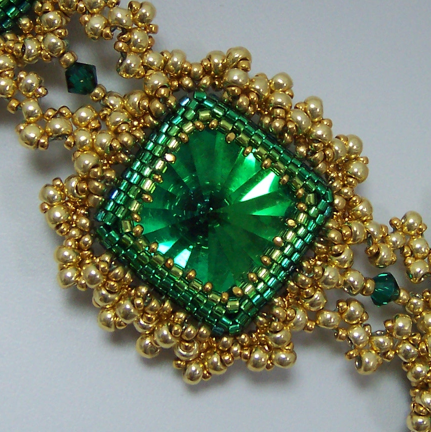
I began with bezels for the beautiful rectangle and triangle Swarovski emerald jewels, and the amazing vintage effect squares I got from my friend Doris Coghill at BeadsbyDee.  In all fairness, much of the magic in the necklace is in the beautiful color in those squares.  I bezeled the jewels in gradated rows of greens in teal, emerald, grass, and peridot.  This is pretty subtle color use, and you may not have consciously noticed it at first glance, but I think this kind of detail really makes a huge difference in the final product, and provides added dimension for the bezel, since the darker, cooler colors recede from the eye and the lighter ones advance toward it.

 I did the same sort of thing with the gold beads that I used.  My 15/0 beads are Miyuki 24k gold plate, a deep rich gold. The 11/0 are labeled 4202 Duracoat, (pet peeve! a label that does not tell me what bead I have bought!!!) and also fairly dark and rich.  The 8/0 beads are Toho PF557 Gold Galvanized, which I don't usually like to use because the durability is questionable, (despite the "permanent finish" advertised) but I needed gold beads, and these are what is available.  My personal body chemistry does not strip metal from beads, but I know I am in a minority. The point here is, the bigger beads are a lighter shade of gold than the smaller ones.  This provides lots of added depth and dimension, which may not be noticable without having attention called to it.  See how the beads closer to the bezel are darker?  They really increase visual depth.  Well, that, plus the negative space I left open there, and of course, the bezel ombre, helps too.


I was stuck on my frame for a long time.  I added a simple picot.


Then I closed it for stability and to create substance and size, and then I was stuck for a while.


Finally, I began to embellish the frame, aiming for both "bumpy" like the blackthorn Shillelaghs, and "heavy" from my book. The first row thickened the frame, and began adding bumps, which I wanted to look something like granulation.


Then, I added a netted picot through that layer.


And finally, I felt good about my goals of evoking Ireland, ornate, bumpy, granulation, and late 17th century, portrayed in beads. Then I began a quest for "heavy gold chain" that would still represent all the above characteristics, and relate to the framework I had already created.  I tried spiral, flat spiral, double spiral, embellished RAW, cubic RAW, tried to work out what cubic triangle weave might be (which was pure disaster!) and finally resorted to double stitched flat triangle weave.  I used moss green power pro, and although you can't see it so well in the photos, in person, it lends a kind of antique verdegris shadow to the work, which felt just right to me.


Then I laid out my components and began linking them with the triangle weave chain.  I considered a shamrock configuration, but felt it would be too literal, not pleasing to the eye, plus it denied the vintage jewelry quality I was trying to create.


I desperately wanted to add fringe, but in looking at jewelry from the late 1600's and early 1700's,  I saw few fringy components, so managed to restrain myself this time.  But those emerald faceted drops I bought are bound to show up in my work in the near future.  They are just too good to pass over permanently.

Being obsessive compulsive, I also had to finish the backs of my bezels.


Then I went shopping for a clasp and I must say, I have been spoiled by the fantastic Elegant Elements clasps I have put on my last three projects. Mind you, this clasp is good on the piece, but as I mentioned, I am spoiled!!!  Usually, when I piece is done, I hate to back up, but I would gladly rip this one back for an Elegant Elements clasp.  I've lost the link to the collection, but maybe I'll ask Steven if he's interested.  Neither of my two favorite local bead shops carries Elegant Elements clasps.  SAD!!!