Search This Blog

Showing posts with label color. Show all posts

Tuesday, July 5, 2016

Chihuly Garden and Glass

A day of inspiring imagery and fantastic depth and breadth in glass!
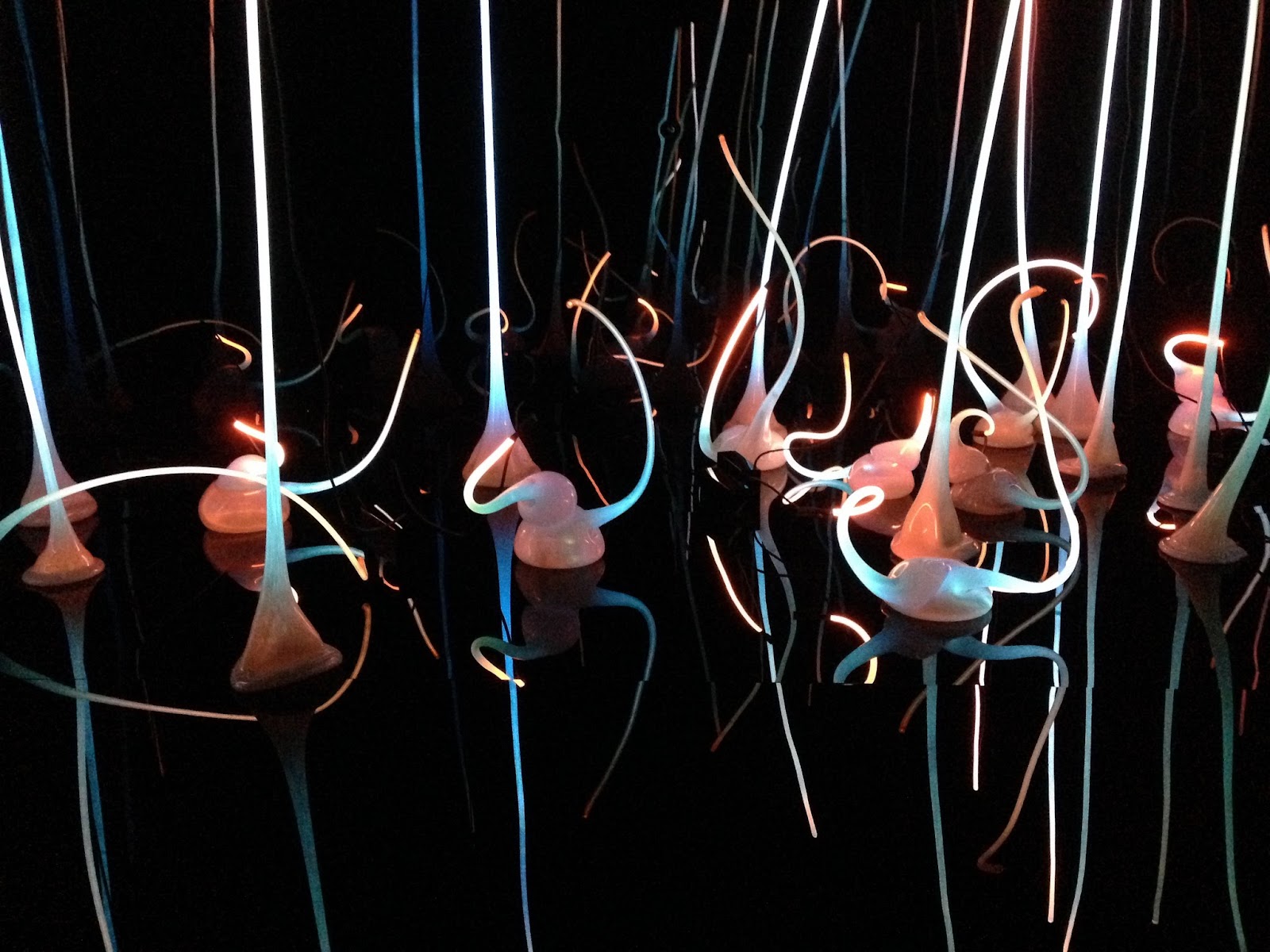
Starting point, the Glass Forest.  I thought it was much more like neon flamingoes in the dark.
I have gotten somewhat used to taking photos with my phone, because my otherwise practically perfect husband is annoyed by my DSLR camera. Apparently I squeal "OOOO, PRETTY!!"  and stop way too often when I have that tool in my hands. But I have never been quite as sad to be shooting with my phone as I was on the day we went to Chihuly Garden and Glass.  I could have stayed all day.
In the Northwest Room you can see the influence of Native Northwest art.
Motifs, shapes and textures from baskets, weaving, and vessels are obvious and elegant.
To quote from the little brochure you get when you pay your entry fee, " I want people to be overwhelmed with light and color in a way they have never experienced."  I was, Mr. Chihuly, sir. You blew me away.  Between the beautiful glass, the spectacular lighting and presentations, the massive installations, and THE GARDEN, I was frequently in tears from the beauty and joy and inspiration I was feeling.

In the Sea Life Room the central installation was gasp-worthy, churning and frothing
in a sinuous mass of color, creatures and foam.
Crabs from the Sea Life Room
My iPhone shots do none of this justice, but I put them here because I want to try to remember 
what I saw and how I felt.

Sea Turtles.  I just love the pedestal.  "Who lives in a pineapple under the sea..."
And the composition of this!!!  I wish I had a 3D image for you.
Then there was the Persian Ceiling.  The lighting design in this gallery is spectacular throughout, but for me, glass is all about transparency and translucency and shimmer and color!  This was a beautiful way to see those things! There is an aquarium that you can walk through and beneath in Minneapolis. This had the feeling of that place.

Persian Ceiling, with breathtaking backlighting.
And combined with some masterful reflections, it was water and wind and nearly alive.

I can't begin to describe the Mille Fiori installation.  
There were grapes and eggplants and grass and vines and ferns and flowers.

End view of the huge Mille Fiori Installation
Maybe even a few snakes?  Eden?

My photos of the Ikebana and Float Boat installation are especially lame.  Sigh.
I could really have used the panorama feature on my camera for this.  :(
I missed the floats entirely.
The monochrome chandeliers were almost relaxing. There is so much
energy in this huge body of work that it is a bit overstimulating!


And we had our picture taken.  

With The Best Man Ever and Most Excellent Son.  Do I look a bit over the moon?
In the Macchia Forest below, Chihuly challenged himself to make use of every color of glass available.  Often a layer of white glass made the inside of the vessel 
delightfully and dramatically different from the outside.


And then we saw the Glasshouse, which celebrates the artist's love of the conservatory.

Conservatory inside.
Conservatory from the outside.
And finally the Garden!!! 

Of course there was the perfect environment for each piece of glass... or would that be goose?  Note the BLACK grass!
No words for this!  But all the flora is Seattle is much larger than that in Minnesota.
Fern forms.
SO...   I have taken nearly a year off from competition and larger work. I have played a little, but mostly I have spent a year teaching myself to illustrate and write tutorials.  It has been a huge learning experience.  The best thing I have gotten from this time spent is a new design tool.  I now have the ability to draw and adjust my design before I pick up a needle. 

I have been plotting a new, bigger piece in my mind, and seeing Chihuly Garden and Glass has pushed my thinking about it much further forward.  I have one final tutorial in editing stage, and will release it later this summer, but then, I am going to step back to M A K I N G, because I have this thing demanding to be made, and many beautiful new ideas and approaches in my heart to finger out. I am sad to have mostly ignored my blog this year.  Hopefully that will revert to past form a bit too.  

Should you ever find yourself in Seattle, navigate to the bottom of the Space Needle, and see this gallery.  It is a true work of art, and labor of love.

Friday, May 6, 2011

Decisions To Be Made

I belong to the Etsy Beadweavers Team, and once a month, we hold a challenge, where members can bead something on a specific theme, and enter a contest to choose the best entry. The winner of the contest gets to choose the theme of the next challenge, and is featured on the team blog and facebook page.

In the past, the winners have been determined by popular vote on our team blog. There will still be a popular vote and a Fan Favorite. But this month, we are trying out a new voting system whereby the team will choose a Team Favorite.

I personally feel that extra consideration is due to my selection this month. It is my hope that this new team vote will be a reflection of what our team values as a group. And I want to establish a list of criteria for myself to help me make my selection.

I cannot take credit for this idea. It came from the Bead Mavens. They have hosted two competitions and found that it was hard for the group to select a winning entry, with each person having their own criteria, likes and dislikes.  Their solution was to develop a list of valuable characteristics.  Then each member ranked each entry by each criteria, using a point system. Finally, they compiled this information to determine their winner.

As a big fan of spread sheets, I think my selection system will take that form. So now to establish my criteria.

I think I'll start with FIRST IMPRESSION. When I first look at it, is it fantastic, or do I like it, or do I not find it appealing? And since this competition has a theme, I think that had best be my second criteria. How well does the design encorporate the THEME? Perhaps I can eliminate some of the work from consideration at this level.

When I am ready to delve deeper into my favorites, as an artist with an MA in costume design, I think the basic elements of design deserve consideration, so onto my spread sheet will go, LINE, COLOR, TEXTURE, SHAPE & FORM, (which for me is about the use of both positive and negative space) and my personal favorite MOVEMENT. You could argue for the inclusion of other ideas here, but those are the big six for me as a designer. I use a lengthy cadre of other concepts, repetition, sequence, gradation, transition, rhythm, proportion, scale, contrast, balance, on and on, but they are lesser tools, like supporting characters and I don't consider them all each time I design, so I'll stick with my major players. And while I am considering, I'll keep the theme in mind here.

Next, there are some technical considertions. What is the construction of the work like? How is it finished? Is it beautifully made? I think I will call this TECHNIQUE.

Then, since this is a contest between Etsy sellers, I want to consider SELL-ABILITY. Would someone want to purchase this item? Would they want to wear it or display it in their home, or maybe in their gallery?

I think there are some things that I don't want to consider. I don't really care how long the work took to make, or how complex it is, or how much it costs. Price, especially, is so specific to the seller that it would reqire comparing apples to oranges. Some of our members sell only on Etsy. Others sell in galleries and at art fairs as well. There is a huge range of experinece among our members and their pricing reflects their own needs and costs. I don't think for me it's a consideration.

Then there is one final something a little more intangible to consider. I'll call it ARTISTRY. Does everything come together to create a cohesive whole that speaks from the artist's soul to mine? Do I feel something when I look at this piece? Does it change me, make me see in a new way, make me ache or smile or cry? This is a very deeply personal thing, and I would expect that my reaction is probably not the same as yours, but still important.

I think I like my list, and it's probably more than complete for my purposes. I'm ready to make my spreadsheet, in preparation for casting my one, important-to-me, vote. I don't know what criteria will matter to other members, and I surely do not mean to suggest that my system is the only, or the best way to choose a winner. It's just mine. And writing it down and sharing it seemed an important thing to me this morning. So, now, before my laptop battery dies completely, off to work!

Wednesday, April 6, 2011

Lemonade from Lemons

I did start with a sketch.  But not a very detailed one.  This lilac necklace idea was so exciting I really didn't want to spend time in two dimensions with it.  I wanted to get right to the 3D part I love!  So although I thought about color, I didn't ever sketch in color.  I think that would have changed my mind, but hindsight is always 20/20.  If I had REALLY considered how busy this piece would be with 4 colors, TONS of texture, frenetic lines, and complex shapes, I'd have RE-considered.  But I didn't.


I didn't enter Bead Dreams last year because I was involved in a complex and time consuming piece with Hannah Rosner for the ISGB exhibit Convergence II, Adorning the Past, Present and Pretend.  So this year, I thought the time was ripe to collect a second rejection letter, and I planned to do that with the lilac piece I had envisioned.  Somehow, my day job got really busy.  So I worked in fits and bits and starts, assembling parts and making components, without ever laying them all out together to see how I was doing.  That would have helped too.

I arrived at the end of March with 72 4-petaled lilac flowerettes in three colors, 9 lilac leaves in various sizes and two different neckstraps, neither of which I was in love with.  The little flowerettes and leaves reminded me of my son's video game, Pikmin.  They seemed to flock on my bench like the little "floral militia" commanded by Captain Olimar.  If you have seen this game, I bet you know exactly what I mean.

Unfortunately, when I assembled the three colors of flowerettes into blossoms and laid them out together it was painfully obvious that that multi-colored blossoms were an unfortunate choice. There was way too much going on. (Note to self, next time, sketch in color!!!)

But all was not lost. There was the Etsy Beadweavers April challenge, with the serendipitous theme, "Spring Around the Corner" on the horizon, and I could take one of pretty awesome  blossoms and make a simpler necklace. So I put one together, using the least disliked neckstrap, but drat, I just didn't like that strap, (see the little ripple on the left side where it does not want to lay flat?) plus the blossom was not proportionately long enough.
So I listed it, because I know I am obsessive-compulsive and fairly hard on myself, and it wasn't terrible. It had potential for greatness. :o)  And then I began a race with the clock to make a new neckstrap I could like, and a longer blossom configuration, requiring several more flowerettes.  And, pwhew, at 10:30 ish on the evening of the 5th of April, minutes before the entry deadline, I posted the new piece, and I am SO happy with it.  And best of all, I can now make two more, a lovely pink one, and a pale lilac one.  Lemonade from lemons!