Search This Blog

Friday, March 13, 2015

I Made a Neck Form (with help from my carpenter husband)

Before I finished my Bead Dreams piece, I knew that a normal neck form was not going to flatter the work.  I needed wider shoulders and a broader chest, and after an exhaustive hunt, I knew what I wanted was just not out there.

I have never really been very satisfied with the forms I purchase, and one of them was so crooked in the neck area that I had never been able to use it.  I thought I could perhaps take it apart to see how it had been made, and make my own custom-shaped one.  So, I ripped off the cover, and took a look.


Were you expecting something different? I was.  :)  It had 1/2 inch foam padding, which I removed, and then sized up the components.


It had a base, a support with a curve, a piece of what looked like masonite to me, stapled to the curve, and a funky little neck thingy, hot glued in place.  This one was 1/2 inch off center, and that probably explains why my work always looked lop-sided on this particular form.


So before I was even finished with my piece, I asked my husband Carl, (aka The Best Man Ever) if he could make me a base, support piece, and differently shaped face for a custom form.  He built a new wood shop addition onto the garage last fall, and seems to enjoy the place.  He has been busy making new furniture and storage for it and installing machinery.


He said he would help me, so I designed a shape I thought would suit my work.


Here is how it differed from the original form. I wanted a wider shoulder and broader chest.


I made a pattern of the curved support for Carl, and we discussed materials.  He suggested aspen, for the curved support and base, which he would finish for me, so I would not have to cover it.


I thought the curved face could be masonite, but he said it would be better to use special curve-friendly plywood and create exactly the curve I wanted by laminating layers together over a form, which he made, and used to create the face.


I didn't take a picture of the laminating process.  :( But this was in his shop when I sneaked in there... something else being laminated into a curve, like he described the process for the face of my form.


Here is a pic of the finished curved face in my workspace, attached to the base and support Carl made, before it got its little neck thingy. I thought it looked like a shield.


Next, came the cover.  Here's the one I removed from the old form.


I shopped for materials and found three possibilities.  Two were light weight vinyls, and one, some sort of actual leather, bonded to a stretch interfacing, similar to what the original cover material looked like. 


I also found a place in NYC, that made "custom forms" and sold their leatherette material by the yard. But I decided to use the white vinyl for a first try and made a pattern.  Maybe because of the broader shoulders, or the heavier vinyl, I needed to create a dart to help make the neck shape.  


Here's the vinyl cover, cut out and assembled.


I still could not imagine how I was going to get the vinyl to wrap flat around the back of the curved edges of the form. So I paid a visit to the local Tandy Leather and got a great lesson on the use of leather adhesives from an adorable leather geek.  He suggested water based contact cement, and assured me it would be sufficiently strong for the task at hand.  He also said I would get one chance to get it positioned correctly, because once the two tacky surfaces touched, the bond was final.  YIKES!  He suggested I pin the cover in place first, apply the adhesive, and then wrap.  I was REALLY NERVOUS about this.  But I took his advice.  I glued on the 1/2" foam (from the fabric store), and pulled the vinyl into shape.


I was really glad to have the thickness of the bonded plywood to pin into at this point. Crunch time came, and I painted the vinyl and the back of the plywood with adhesive, and let it get tacky.


Here are the tools I used, recommended by the adorable Tandy Leather geek.  I wrapped one of the spreaders I purchased (which was great for spreading E-6000, btw) with a 1" strip of foam, and that was the right size to apply the strip of adhesive that I needed, and the foam held the watery glue nicely, with very little dripping or mess.


I let it dry overnight, and actually got up around 3am to see if it was still ok!  The next step was to prep that back for the paper cover.


Carl let me steal some of his gorgeous drawing paper for the back.


I told myself from the beginning of this adventure, that what we made would have to look neat, clean, and professional or I simply could not use it.  I am really happy with the results!


And I think mine actually looks better from the back, than the commercial one.


Finally, the button bit is glued on to the top, and I am ready to shoot pictures tomorrow.  Carl cut me a masonite disc to cover, but the original was cardboard, and that would have allowed me to adhere the center as well as the edges.  Next time!

And now,  Carl thinks my piece needs its very own fancy pants wooden box.  I am one very, VERY lucky girl. Whatever that shop addition cost, it was worth it!  

Do you think I have to give him co-design credit?

Sunday, February 15, 2015

About Time to be Ka-Blooming!


I write my blog partly for you who read it, but partly for myself as well.  I put information here that I refer back to, when I am trying to remember how I did something, or why I made a particular choice.

Yesterday, I struggled with a technique I did last year, and when I woke up this morning, I thought, "Go read what you wrote about this last time!"

But I didn't write!  So...


The things unique and worthy about this piece are the little flower components, and the bas relief branchy construction that supports them. They are both inventions specifically for this work, and the most interesting art of it.     Ha!      "Art" instead of "part" was a typo, but it has real meaning.  For me the most exciting and interesting part of bead art is mastering the part I do not know how to do!

The piece was meant to be a representation of a little plum tree my son picked out for our yard as a young child.  That tree went through a lot, and even had to be moved from it's original planting spot to protect it from hungry deer, who love fruit trees.  But every year, despite cold and hardship, it bursts into bloom and I want to remember it forever, particularly for the perserverence it embodies.

When I started the work, there were no flowering trees in bloom, so my BFF Google provided some images for me to consider.  And below those images are some of my flower bit efforts.


I liked things about each of these images, but my favorites were the lower right and lower left.  In the lower right, I loved how the color in the buds was deep and dark, and as the flower opened, it paled and softened.  I decided to try to create a blossom that would collapse into a bud, and work it in a range of colors that would replicate that color change.  I think I bought every pink seed bead available in the Twin Cities to try to meet that end.  Color is always a struggle, since you can't just mix it like a painter.  You can influence the color of any bead with the thread you use, and the ground you put it on, but it has to be close to begin with.

Here's my collapsible flower component, in several different stages of opening and color selections, all exactly the same stitches, just a different finish, to either hold it together or allow it to relax open.


I have already written about the flower in my post "A Little Flower for You" and you may make the component for yourself if you like.  It is free to you, and my only request is that if you use it, you show me what you have done.  I do not explain how I collapse and control it there,  but the images above would help you, if you wanted to do that.  I used the tightest and darkest of buds as a clasp!


In the image above of my inspiration collection, the lower left side photo was how I wanted the branching to look.  


I loved that the flowers appeared before any leaves, and that some branch was visible.  This project had a two month work time (for Battle of the Beadsmith) so the density of flowers in the lower right image was out of the question.  But I was interested in the branching idea, and I wanted it to have the quality of bas relief, partly for the challenge of it, and partly because I though it would be more comfortable to wear with a flat back.

So here is how that process went.  First I drew the branching I wanted.  I had to create the branches in two pieces, since the largest piece of Nicole's Bead Backing is 9x12, and the whole image did not fit on one piece.  I made one branch for each side of the work...


...colored each side separately and cut each out to make my pattern, and then traced it onto the NBB...


...then I stitched inside the line, to stabilize the edges and cut out each piece, marking the overlapping points carefully, so I could align and stitch them together, and carefully cut each piece, and...


...then, I couched satin cord onto the assembled backing, to provide dimension, and began covering it with seed beads...


...the right side is beaded, and the left side still shows the cord couched on.  I had to consider how the overlaps would appear, as though branches were actually crossed and some would be in front and some behind.  I also had to curve the work as I added the cord, to make sure it would flex easily over the shoulder area and that no points would stick up away from the skin.  I used lighter and darker beads to help with the three dimensional illusion.  It is hard to see in a flat photo, but here is a side view.  I know the flowers are overexposed, but I wanted to show you the dimension of the branch.


This is an easier to read view, but the dimension is not as readily apparent.


So, remember, I thought I would NOT have leaves??  Well, As soon as I finished the branching, I thought I might be in trouble.  The thing had a "creepiness."  Now I let that be OK in my mind.  I told myself that it was a good representation of winter's bare earthiness and, that once I got the flowers on, I told myself it would be both the naked spareness of Winter and the abundance of Spring.  Right.   


But at some point, the truth was pretty clear to me.  Maybe around the time real fruit trees began to bloom and I got to see them in person for myself.  I think I got the branch color wrong.  Because they appear in the shadow in photos, those branches look pretty dark.  But when you look at the actual color,  it's a pale silvery grey/taupe.  And that works pretty well (nature is so smart!) with the pale pinks.  But the browns I chose were not a good ground for my little flowers.  The components were at war with each other.  And there was not much to be done at that point, as I already had my backing on, and there was just no time to rip and redo, or start completely over.  That backing was a real challenge!!!  See how the work curls toward the body?  I am super proud of that!


So I added some leaves, after the fact, hoping to mitigate the severe contrast,  And they helped, but not really enough.  Sadly, "close enough" really isn't.


And because I never wrote this post... I just about made that SAME MISTAKE AGAIN.  Or at least, that is my story, and where I choose to place the blame, and I am sticking to it!!

I am using this same bas relief technique in my Bead Dreams piece for this year, and I had a shocking combination of poor choices going yesterday.  And I nearly went ahead, because time is running out. But I simply refuse to trash any piece ever again for a deadline.  SO...

I have ordered, beads, reconfigured my vines, and changed the color of my ground.  And with any luck, the snow on the East Coast (those POOR people!) will not delay the right beads too long, and my new ground color will be an exactly what my other components need to set them off perfectly.

Bead Dreams?  I hope I can still do it.  But my friend Mel ran out of time to accomplish her goals last year, and if it comes to that, I will learn from her choice, and wait until there is time to do the thing justice, rather than compromise my results.  


It's not awful.  I like it.   But I could have loved it.  Never again.  I will stay calm like the athletes I admire, in the face of pressure, and make the right choices, instead of feeling the pressure and making ones that will get the deadline met.


Wednesday, February 11, 2015

Swarovski 2016 Spring/Summer Launch Presentation

Boy was that ever fun, and inspiring!

I was invited to a Swarovski launch presentation this morning at my favorite sparkle wholesaler, Rhinestones Unlimited.  I have purchased most of the flatback crystals I use in my dance wear from them for many years, as well as a some things I have used in my beadwork, and they are great to work with!  They write a blog too, and here is a link to their post about new flat back colors available any day now.

The presentation by the knowledgeable Swarovski Rep Debbi Simon (a fine artist who was a Bead & Button employee for a time... you might know her book about crystals and adhesives called Crystal Chic) included an introduction to a tool that some of you might find very useful.  It is an iPad app that is essentially an interactive catalog of all available Swarovski beads, pearls, fancy stones, sew-on jewels... all of the over 16,000 items in their current inventory.  I downloaded it (free from the app store) and plan to play with it further this evening. It has several functions.  Fair warning, it took about 30 minutes to download it completely.

The app includes tutorials which help you understand how to use the catalog, filter products, find product details, and search a filter.  Then it also teaches you how to use the selections feature to choose products, group them to look at colors and finishes together, and even copy and arrange them as you see fit, maybe into the necklace or garment embellishment of your dreams. A very powerful design tool.  Pretty cool!  And once you have your selections made, it will make you an ordering list. Yikes.  It could be dangerous to the wallet, methinks!

In addition to learning about this cool app, we got to see and touch a wonderful inspiration look book, and receive a print version of the book, as well as the entire print catalog of available Swarovski products, featuring the new shapes, colors and finishes.  We were also given back issues of Sand, a Swarovski magazine of sorts, full of inspiring designs and designer profiles from past releases.


I really liked the pastel powder finished crystal pearls and matching jewels, which reminded me of E.H. Ashley Ultra Color finishes.  Plus of course, samples!  So I can show you what I saw.  Here's the sexy box...


And the cool products inside!  I love the pastel pearls, matching chatons, and Metallic Sunshine!  I have to say Blush Rose is not my favorite, but then it would be fair to say I am not very subtle most of the time. I like color purity and vibrancy, but it's nice there are pretties for every taste.


Rhinestones Unlimited host and owner Angela Peery and her staff provided tasty treats, and we all got a goody bag, which included...


...yummy checkerboard jewels and beads, plus a lovely new crystal pendant called Lotus, (top) which to me is an elegant sand dollar, and gorgeous!  PLUS...


...A bead mat with a measuring calibration of the left side.  Astonishing to me, as I mark all my mats in inches across the bottom with a permanent marker.  Apparently I am not the only one who likes this idea.  AND, the Rhinestones Unlimited version of the crystal katana, but without the blister-producing inset stone, and a narrower profile which suits my small hands better.

The best part of the day for me was the very inspiring imagery I got to feast on.  New ideas are floating happily in my brain.  I almost wanted to skip the Bead Dreams work for today and go try out some of them.  But that will have to wait.  Loved it!  Thanks for the invitation Angela, and for the great presentation, Debbi!

Thursday, January 29, 2015

Marching (Ambling?)Toward my Dream

I have arrived at the point in my Bead Dreams process where the meditation is nearly over and the magic must begin.  I generally create parts, and then engineer a whole.  The parts assembly is meditative and pleasant.  I can do some of it (once I have finished with making samples and know what to make) while relaxing on the couch.

But this moment between the methodical assembly and the aesthetic decisions and engineering is sometimes daunting.  It is the part where time to think and evaluate is most beneficial.

I'd like to show you, but I just can't.

For me, if I have a conflict with someone else, I am most successful if I work it out with them and them alone.  Anytime I try to tell another person my troubles, a kind of dishonesty begins.  And I find that not only do I needlessly burden a friend, I also cripple my floundering relationship.  For me, this is the perfect analogy.

Making a big piece is like resolving a conflict.  And in order to be honest with it, I have to work it out with the components, and my own heart and hands.

So yet another image free post.  but I look forward to being able to share!

Are you at work on a Dream?

Wednesday, November 12, 2014

Stuff They Don't Tell You & Unwritten Rules

The time has arrived for me (and maybe for you!) to consider the possibililty of entering Bead & Button Magazine's premier competition, Bead Dreams.  A message from Bead Dreams last week informed past participants that the rules have been posted.  (EDITED TO ADD:  It's a new place every year, and for those reading for the first time, here is the 2016-17 link:  http://secure.kalmbach.com/beaddreams/
The rest of the links in the article are likely no longer functioning, just so you know. )

This information is posted publicly on the Bead&Button Show site. Almost everything you need to know is posted there.  I LOVE this event, and I began a potential entry yesterday evening.

Take a good look at the Rules and Eligibility.  I read it all twice to make sure I understand.  Some of my not-from-the-USA friends were horrified to discover the cost of getting their work safely to the event.  I was surprised myself to realize that shipping my work, insured for its value, to Milwaukee cost almost $50, not counting the box I bought to ship it in.

Scroll down to check out the nine categories you can enter, and the prizes generously donated by the sponsors of the event. These are mostly gift certificates or gift packages, and in one instance, cash.  Although to qualify to win anything, your entry must be accepted as a finalist.  And then, the finalist entries are judged to determine prize winners. More on that in a moment.

Finally, here is the entry form.  It says on the right margin, that if you have Adobe Flash, you may take a guided tour of the application, and although I was not able to make that work, DO IT if you can, or mock your way through the form (carefully not submitting) and then make a list of information you will need to apply.  Write whatever descriptive sentences or paragraphs beforehand,  re-reading and editing for clarity.  I had a very hard time editing the form last year, so beware of inputting info before you are ready.

Should you enter?  If you have the time, desire, and capital, why not?  But if your beady soul will be crushed by not becoming a finalist, or not winning your category, or even Best in Show, then maybe not.  Because, that is the worst that can happen.  One way to help that decision along is to take a look at the handy galleries of past winners and finalists, and think about how your work might measure up, if that matters to you. Whatever your impression, there are no guarantees.  Artists who got in last year might not get in this year, and vice versa.  How you do in any competition depends on who else shows up and what they bring.  You might make the most amazing art you have ever created and be wildly proud of it, and not become a finalist.  But the experience might be worth more than any placement or prize.  Here is anther opinion about the question of whether or not to enter beading competition, (in this case, Battle of the Beadsmith) with some really great points and opinions.

Now on to a few bits of information you might find useful, which are not part of the official info links above.

The Judging Criteria


Here is something they do not tell you. Finalist entries are judged on three points, and given a numeric score between 1 and 10.  Those scores determine winners.  I know this from the judging sheets that have been returned to me for the last two years, and I will share them with you, because I find it helpful to have the information, and you might too.  I would even share my scores if you asked. Since it is not official published information, it could change at any time, should the organizers decide on different criteria.

1) OVERALL PRESENTATION;  Use of color, shape, texture, and other design elements; effective, well thought out; wow factor; design message.

2) TECHNICAL EXECUTION;  Mastery of technique (i.e., no excessive thread showing, no unintended gaps, precise wraps, etc.) proper choice of materials (beads, threads, findings, etc.) to achieve highest quality; superior craftsmanship (proper construction of materials); no unsightly connections, workings, clasps or breakage; workable - if an element is supposed to open, it should.

3) CREATIVITY;  Original design or design elements within the overall piece; creative use of materials (i.e., using common materials in an innovative way, using unexpected elements or materials, inspired new ideas); pushing the field, medium, or technique forward; keeping the craft evolving.

COMMENTS AND NOTES are also written, and I have found both the scores and comments extremely beneficial and helpful.  The judging is done by people who know what they are talking about.

The Unwritten Rules


To be perfectly clear, I am writing tongue-in-cheek here.  None of these is a real rule, and you do not need to follow them... but you may encounter unintended consequences, and forewarned is forearmed.  I find my own opinions and ethics are presented here as "good ideas."  You should find your own truth and ethics, I think.  Shows me how easy it is, to think you know what is best for all!

Now to the "unwritten rules."  Stuff you have no idea about if it is your first experience with the show. And these rules are not the rules of the organizers of the event.  But should you ignore any of these unwritten, unpublished rules, others may take it upon themselves to make it known that you are breaking these rules, and that you should be ashamed of your behavior.  I broke the rules, and was called out for it, and was wretched for a long time because of it. So I am going to share these unwritten rules, and you can decide for yourself whether you want to follow them, knowing the potential consequences.

UNWRITTEN RULE #1 - Before the submission date, feel free to mention that you are assembling an entry to Bead Dreams on social media.  But post NO pictures!  No progress shots, no finished shots!  Some people do show tiny portions of their work in sneak peeks, or the detritus on their bead mat when they are done. I have not seen anyone shamed for sneak peek/detritus postings.   I am not sure how it came to be a rule, but I have heard it discussed, and I can see the logic to it.  It might be terribly embarrassing to proudly flaunt your baby, only to discover that your work is not designated as a finalist, and not accepted to the show.  And I think some people are superstitious about the procedure.  Maybe they have to wear the right sox and not clear their bead mats until after finalists are announced.  Now, this is NOT a rule put forward by the organizers of the event, and in no way an expectation of theirs. So whether you follow along is up to you.  But beware that there are those with this expectation, and they could make your life miserable should you choose to ignore it.

UNWRITTEN RULE #2 - This one is where I got my nose whacked.  Should you be fortunate enough to become a finalist, DO NOT post pictures on social media in celebration.  Again, this is a rule created by past participants, not by the organizer.  I was so crushed and destroyed by this, I wrote to Julia Gerlach, editor of Bead & Button to get the full story and apologize for my behavior.

Here's what I said:

"When I received the finalist letter, I posted the images I sent with my application on facebook, and a message about being thrilled to have been chosen on my page.  I titled the post, "Bead Dreams Bound."  The album and individual images were spread far and wide across fB through sharing, much more so than I would ever have anticipated.  Then it was pointed out to me that I and several others who had also posted images of their finalist work, were wrong, ignorant and foolish.  Various reasons were given: spoiling the surprise at the event, ruining our chances of placing, getting unfair views by judges online, disrespecting the event and the organizers: generally a very log list of complaints.  I carefully re-read the rules and my contract and nothing was said about keeping the work under wraps until the event.  I am a rule follower at my core, and was devastated to think I had broken unwritten rules.

Then I began to wonder, what exactly are your expectations?  And if you have a preference as to how and when we state that we have work in the show, and make our images public, and write about the experience in our blogs, I wondered why these are not clearly stated in the rules, or on the contract.

So my question is, did I make the horrible error I was so publicly humiliated for?  If so, I apologize most sincerely!  In my experience, some competitions and events do require secrecy and others like publicity and encourage promotion of the event in any and all ways, actually asking for blog posts and tweets, etc."

And here is what Julia (who is really nice!) said, which I publish here with her permission:

"I'm so sorry you were called out for posting your BeadDreams entry.  We don't have anything in the rules about it and we do not plan to add a rule stating that you can't post your entries."

So, I felt better. And the next year, I wrote a blog post about my entry, including my images, and posted a link on facebook with a spoiler alert, so that those who did not want to see images of my work splashed on their home pages could avoid it if they chose. I find there is a time, if I have something to say, that is optimal for the writing.  If am a forced to wait, I find I no longer am excited to tell my story, or have different things to say, and I prefer more immediacy and truth here. But I have another purpose too.  Which brings up the next unwritten rule.

UNWRITTEN RULE #3 - Do NOT do as the event organizer requests, and post the link they send you by email for voting for the People's Choice Award. I think what the creators of this rule were trying to avoid was ballot box stuffing by enthusiastic finalists, who want every single one of their facebook friends and all of their family, and everyone on whose e-mail address they know, to VOTE FOR THEIR ENTRY.  In my opinion, that is indeed not an appropriate thing to do. But asking interested parties to visit the poll and vote for their favorite work is how the thing works.  SO unless you wish to ignore the organizer's direct instructions, you should ignore UR#3 and post the link, requesting that people vote, not for YOUR entry, but for their favorite work.

In all fairness, this is a flawed award process.  It is theoretically a blind vote.  But it is not difficult to figure out mostly which work belongs to which artist.  And some of the work, which can be created anytime throughout the year, has already been widely seen, for example in Battle of the Beadsmith. So the idea that the vote is blind is not realistic to begin with.  I personally believe that most people are sufficiently ethical to look at the staggering body of work and vote for the piece they find most awesome, whether they know who created it or not. Sadly, sometimes, finalist's friends and relatives go to work to solicit votes, without the entrants knowledge. And sometimes a finalist does aggressively solicit votes for themselves. And, in my opinion, those results are sad.  But until the event organizer chooses to rule differently on this matter, I will follow the rules as they are written, and ignore this unwritten one..

EDITED TO ADD:  Wow. I just was shown an entirely different perspective on this third rule by someone who I believe wants to remain anonymous.  Please go and check out rule commentary #19 at the Land of Odds Ugly Necklace Contest here.  It suggests that part of being an artist is self promotion, and that learning to do it (I might have added gracefully) is a necessity for all artists.  It goes on to suggest that it might even be appropriate to explain your work to make it appealing to voters.  In a way, I suppose that is why I write this blog.  I am promoting my jewelry and myself.  I learn so much from my readers and discussion!!!

And about posting my own pictures before the People's Choice vote?  Here is why I choose to do it.  I work REALLY, REALLY hard to take accurate photos of my work, with the best possible lighting.  I work to represent the colors, shapes, and techniques as they actually are.  I take at least 100 shots under different conditions, with different lighting and camera settings to accomplish this.  I find the "official" photos used for the public voting, and serve as reference on the galleries of past winners and finalists, sometimes to not meet the criteria I demand of my own pictures.  So if I am to be judged by the general public on my work, I would prefer that voters see the best possible representation of the work.  Chances are I will continue to post my pictures on my blog.  I mean no disrespect to the Bead Dreams photography.  I am glad they post images!  I also appreciate that doing every piece justice would be a monolithic task.

Compare for yourself here.


So, what do you think?  Will you enter BeadDreams 2015?  The clock is ticking!

Sunday, November 2, 2014

Maltese Squircle!
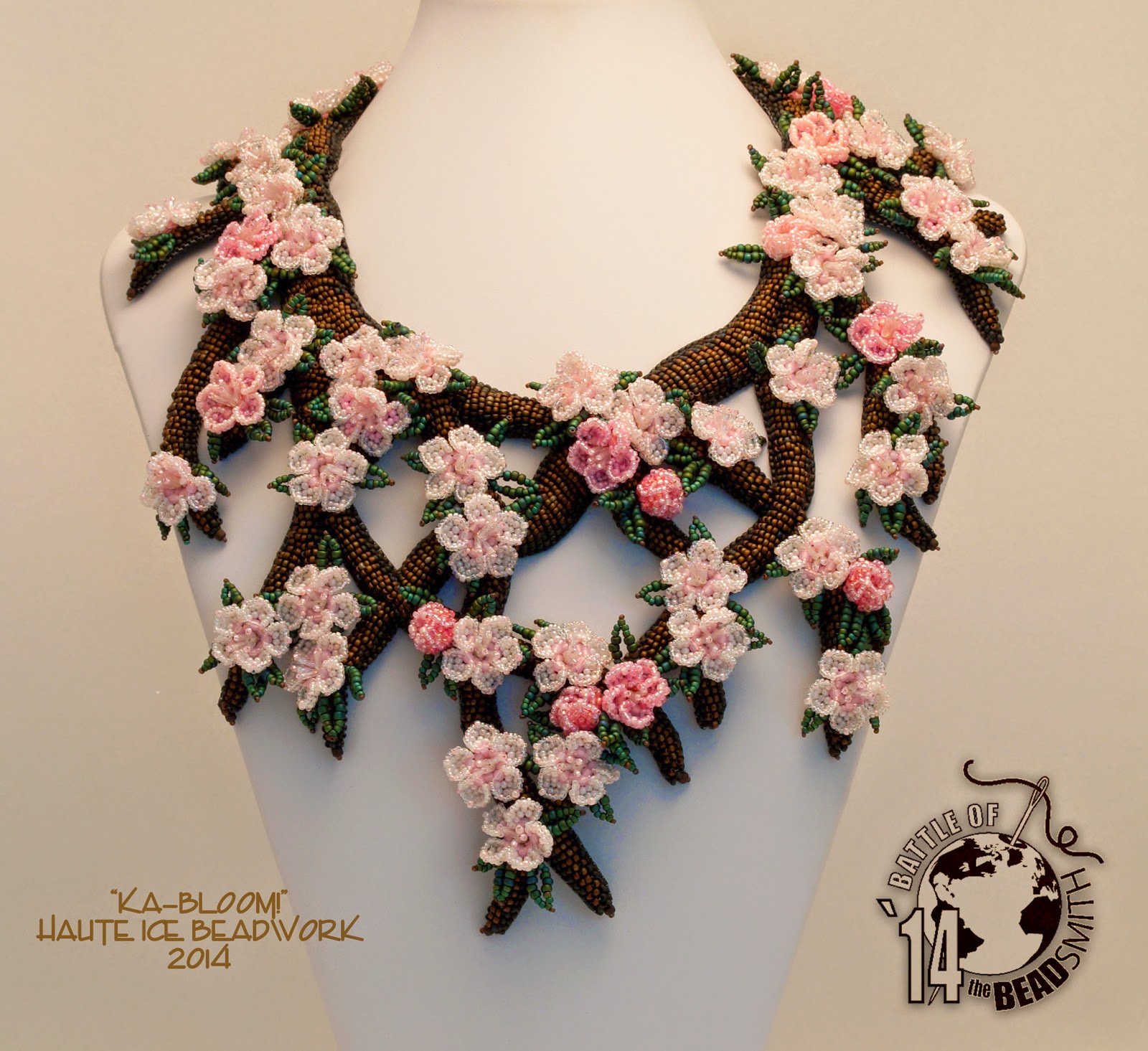
Occasionally I am asked to solve a bezel problem, which kinda delights me. I recently agreed to try a shape for Cindy, who sent me a Swarovski Squircle, because I could not find this item locally.  Or that is what she called it.  And it is a pretty descriptive name.  The jewel is mostly a square, with rounded corners. A SQUare cIRCLE!  I wish like crazy that I had taken a picture of it before I started working with it Friday evening, but I did not.  So you will have to trust me when I tell you it had a gold foiled back.  And it was 18mm across its widest point, according to my caliper.  Now Swarovski, according to the Create Your Style site, has a NEW cut, #4470, which looks very much like this one.  But it is only available in 10mm and 12mm.  And in the picture, the "new" jewel has a silver foil backing.  So from this evidence, (and the color looking like Tabac or maybe Sahara to me) I will guess that this item is vintage cut #4471.
SO this may not be the most universally applicable bezel, but I do hope Cindy likes it!

When I looked at her picture, I thought the shape was pretty, and that there should be a way to bezel it to emphasize and delineate the lovely shaped edges.  I decided first to apply a leather back to it, both since I believed is was old, and because of the sharp point on the back.  I thought that point would be vulnerable to chipping, and not be especially comfy either.  So I cut a chunk of lambskin about twice the size of the jewel, warmed it with my iron, stretched it over the upside down jewel, and waited while it cooled to create a pointy pocket.  Then I applied some E-6000 to the back of  the jewel, pressed it into the leather pocket, and dropped it into my rice bed to dry.
Ok, true, my rice bed is not rice.  It is Poly Pellets, which is a craft store weighted stuffing material. But it does a great job of holding oddly shaped things while they cure.  After the drying was complete, I trimmed the leather back neatly to the edge, and chose two contrasting colors for the bezel.
I chose a light, shiny metallic delica, (24k green gold) and a dark, matte metallic delica,(Jet AB), and 15/0 seed beads to match.  You could be much more subtle than I was by choosing the same color in shiny and matte, but I wanted the finished piece to be for daily wear, with a nod toward denim, hence my choices.  Also I wanted to show you clearly what I was doing and thought the two colors would be helpful.

For all four (and like in this case eight) sided figures, we need a number of beads to begin with that is divisible by four.  If you want to read some general info on geometric bezels look here, and specifically for octagons, look here.  I found that 48 beads was perfect, not too snug, not at all loose.

Rows 1 and 2: String 5 dark, 7 light, four times total, and then go through the original bead again to form a circle.  If you need help getting started with appropriate tension, you could put a knot in the circle before going through the original bead again.  I just hold the tail tight,
Row 3: Peyote one full round, holding the work flat, and matching colors. Step up into the center of the circle.  
Row 4: Begin to curve the dark corners by stitching a 15/0 at each edge of the dark section, and matching delicas everywhere else.  So begin with 1 dark delica, then 1 dark 15/0, 3 light delicas, and 1 dark 15/0, repeating three times.  Stitch snugly, (but not super tight) encouraging the dark corners to round out as you go.  Poof, squircle created!  
(Now it would be possible to finish the face of this bezel simply from this point as I do on the back of the bezel, in row 12, but I thought some geometry would further emphasize the pretty shape and cover some of the sparkle power, since I wanted this to be a casual piece.  So hang in there with me for now, and if you want to see more of your stone, you can simple replace the next row with row 12, and call it done on the face.)

Row 5: In this row, we will add two more 15/0 to the dark corners, and two 15/0 to each light edge, to begin to create a triangle peak.  SO, 15/0 dark, 15/0 light, 2 light delicas, 15/0 light, 15/0 dark, repeating three more times.
Row 6: A tricky row, and I officially WISH I had time to learn to use Illustrator, so I could make it more clear for you.  The picture above shows the first three stitches in row six, as well as all of row five. Notice I DID NOT step up after the last stitch in row 5, but carried my thread ahead through the work to the first light 15/0.  THEN I stepped up and stitched the first three stitches in row 6, one 15/0, one delica, and one 15/0 in light.  Then I stepped DOWN, into the previous row (the first dark 15/0) and will stitch the final 15/0 in the peak of the dark corner.  Then I step back up through the first dark 15/0 to continue with the remaining sides in the same manner.
You will go through that first dark 15/0 many times.  If you are not using a size 12 needle, switch now to avoid breaking that bead.  I set the bezel on the stone to show you row six completed above.  I left a space between the dark corner peaks, both because to add a bead would be to excessively tighten the face of the bezel and because I am trying to emphasize the shape.  See the place where the bead is missing, just before where my thread exits?  I hope this is clear!

Rows 7 and 8:  In this round, we will stitch two rows onto each of the light peaks, and step down through that original dark 15/0 to cross the completed dark peaks.  Step up into the second light 15/0, and peyote two stitches with light 15/0.  Then turn your needle as in the picture below to back up and allow yourself to apply the final 15/0 to the peak. Here's the needle, creating the first turn.  I stitched the first light peak to show you what you are trying to accomplish here. 
After turning, work across through the bezel three beads, and turn again, up into the 15/0, to position yourself to add the final peak, as in the photo below.
Apply the peak, sneak your thread back down into the original dark 15/0, pass through the bezel to the other side of the dark corner and finish off all the light peaks in the same way.  
Here is our bezel and our Squircle Jewel, which are now ready to be BFFs.
Install the jewel, and if you are like me and want to continue to work counter-clockwise, turn your needle to allow that.  See how the negative space forms a Maltese cross?  Love that!
Row 9: Peyote stitch 3 light delicas and 3 dark delicas, four times total, and step up into the new row.
Row 10: Peyote stitch 4 light delicas and 2 dark delicas, four times total and step up into the new row.
Row 11: Peyote stitch 3 light delicas and 3 dark 15/0, four times total and step up into the new row.
Row 12: Peyote stitch 4 light 15/0 and 2 dark 15/0, to finish the back and step down into previous rows to turn your thread a few times to secure the work.  Work in the original tail in the same way, or use either thread for additional embellishing or attachements, but I suggest that you make each thread secure before using it for other purposes.
I do think that rows 11 and 12 could also provide the face of the bezel, but I personally like the geometry and shapes highlighted.  To my eye, this looks mosly round, but if you do the first contraction in the dark corner only as illustrated here, it does create the shape and would allow more of the sparkly stone to be visible, if that is your purpose.  Both ideas will work to create the square sided, round cornered octagon that is this jewel.
OH, and here is my first sample effort, using nearly the same color in matte and shiny delicas, with a bronze matte edge accent on the curvey corners.  As you can see, the same or similar colors in different finishes could be amuch more elegant, less casual frame.
Thanks Cindy for your kind words, a fun challenge, and a pretty jewel, and I hope you enjoy your Squircle as much as I am enjoying mine.  I added a little lace to my bezel with square stitch and netting, strung it as a simple pendant, because soft golden greens are plentiful in my wardrobe, and I want to wear it often! Here's my finish for this bezel, which I do not think I can show you without Illustrator's help.  But feel free to riff off my idea.  I thought something swell could have been done with Herringbone  stitch too.
Why Maltese?  Well, it popped into my mind, and the Wiki Wisdom on the symbology is that the eight points of the cross represent the eight obligations and aspirations of the Knights Hospitaller.
Excellent rules to live by, IMHO, and ones I am happy to wear around my own neck:

1) to live in truth
2) to have faith
3) to repent one's sins
4) to give proof of humility
5) to love justice
6) to be merciful
7) to be sincere and wholehearted
8) to endure persecution  

That last bit, I officially suck at.  But occasionally I can swallow my annoyance and live with it.