Search This Blog

Showing posts with label beaded jewelry. Show all posts

Saturday, September 5, 2020

Back In Stock Fall Flame Leaf in "Singe"

Yup.  Singe is back in stock.  It's been a long time since this one was available.  Find it here in my Etsy shop:  https://www.etsy.com/listing/484089195/kit-only-for-singe-leaf-rope-and-bail

I was planning to restock this using the new Toho Permanent Finish gold beads, but Covid seems to have robbed me of that opportunity.  There are few to be found and the kit requires 11 grams.  So it's back to the original 24k gold finishes.  This makes it a more expensive kit that the others, but honestly, it is also REALLY elegant in person!

I love the rope in particular with the real gold shimmer guiding the eye through all the color transitions.


I have also made one change in the leaf beads.  I was never best pleased with the D bead, which was a soft gold transparent rainbow bead.  It's the one next to the smoke topaz at the edges of the leaf above.  All the other beads have a silver lining and this one did not, so I have replaced it with a silver lined topaz, which has better presence and punch.  You will have to take my word for it, since I did only a scrap of sample to be sure I would approve.

I have been spending my energies on finding a new colorway for this fall.  And yesterday, I thought I had it.  But when I finished the first half of the leaf, I noticed the Raspberry finish was rubbing off the bead, leaving some pale pinks and some flat silvers.  GAH!

See the Raspberry beads near the black edge?  See how some of they are pale pink?  There's one at the bottom center that has lost almost ALL of its color.  Sigh.  I looked the bead up on my favorite Toho suppliers website, and sure enough, there is a color stability warning.  So I have made another choice and a new sample is underway.  But I think you can see where I was going.  It screams October to me, and I think it will be good worn on black.

Yes, I do still have other design ideas, but the fall Gem and Lapidary Workers show was again cancelled like the spring one.  Until I have better access to unique and beautiful component shopping, I am kinda stalled.  Plus every other bead I decide I need seems to be impossible to locate.  SO... hang in there.  I am not done with beads, but the struggle is real, as they say.  If everything goes well and nothing is impossible to buy, this kit should be ready for next weekend.

OH!  And the 12mm Pearl Acorns are back in stock.  They went fast!  THANK YOU!! That tutorial is also half price again for this long weekend, through Monday.  I bet you know how to get there, but just in case:  https://www.etsy.com/shop/HauteIceBeadwork


Monday, August 31, 2020

12mm Pearl Acorn Earrings

EDITED TO SAY:  Kits are re-stocked in all four colors!

I am pleased to say that I have a tutorial in the FINAL Bead and Button magazine.  I made up a few kits and re-vamped my 12mm tutorial in honor of the event.  It's on sale half price (normally $5, now $2.50) for the rest of the holiday weekend.  I should have written this post on Friday!!!

The tutorial is very similar to the one I did for the Peach Caramel's Claws necklace, and if you own that version, there is no real need to buy the new one.  Except of course that I believe I improved the illustrations and layout just a bit.  But I am just like that. And it includes all the bead lists for the new colorways.  But I'll just give you that here. Not the best quality image, but the best I can do right now.

They are pretty, simple, and I like the scale with my smaller face and bones.  Here are the glamor shots.


I am also working on re-kitting my Fall Flame leaves.  Some are done and in my shop, and the rest, plus one new colorway should be ready this week.

I have done no beading this summer.  I have spent my time in my garden, community parks, and on our many lakes in my Covid kayak.  I have always wanted one, but have never before had the muscle to move one around on my own.  It's a wonderfully peaceful thing, and good for my soul.

I think about many of my repeat clients often, and hope that you are all weathering this year of challenges well.  I do have a couple new projects in mind, and maybe with the cooler weather, I will stay off the water and put some of them together for you.  Till then, a virtual, socially distanced hug to you all!


Sunday, December 30, 2012

Buddha's Temple Necklace

The assignment for the Etsy Beadweavers 2013 February Challenge, from Kris Empting-Obenland, is as follows:
"Japan has a most exciting culture. There is a distinct division between past and future: ancient traditional values with their strong rituals, art forms and language on one side, versus the crazy dazzling fashion modernity, neon colors, and plastic kitsch on the other side.

Pick ONE of these two styles to create a piece of jewelry that shows the important criteria needed to convey either the traditional or the modern Japan. OR: combine both styles into one piece accentuating the contrasts!"
So, the above necklace is my answer to the challenge.  Let me ask you, before I explain myself,

1)  Can you see any Japanese influence in this piece?
2)  Do you see traditional Japan, or kitschy contemporary, like Hello Kitty and Anime?
3)  What aspect of Japanese culture do you think my research and inspiration was taken from?

I would just love it if any of the ideas in those questions were discernable in the finished work, but they may not be.  If your first impression of the piece, without knowing the title, had a sense of "Asian," without really knowing why, I'd feel wildly successful.  Because, according to what I have read, Japanese architecture derives from Chinese and other Asian construction styles.  So, here's my intention, laid out in words.  Let's see if you got any of what I tried to do.


Image from WikiMedia
I looked at several images of various things Japanese, and found myself drawn to traditional Japanese architecture, specifically the sweeping, gently curved roof lines of temples.

Some of the temple roofs actually had spiked details at the roof corners, which REALLY appealed to me.
Image from WikiMedia
So I decided that these traditionally Japanese /Asian and very appealing shapes would inspire my work for this challenge.

I chose some "Purple Turquoise" pillow beads and a gorgeous 14 carat piece of Sleeping Beauty Turquoise, whose softly curved edges reminded me of the shapes I liked in the roofs.  I captured them in 24k dark gold delicas, to emphasize the bronze infusion in the Purple Turquoise.  Then I used Bohemian hand-make spike beads to emulate the spiked details at the roof corners.


The detail is easier to see in the more nearly rectangular beads.


I was pleased with how I was able to make the spikes seem to spring out of the bezels, without fully bezeling them, thus maintaining the same effect as the "spikes" on the temple rook corners.  Then, I connected my spiked components, trying again to use the delicately curved roof lines.


I chose an antique bronze filigree toggle and ring as a clasp, and finished the piece with a delicate drop from the Sleeping Beauty Turquoise center component.  If this piece should be yours, please visit the listing for it in my Etsy shop here!

I struggled for a little while this fall with what to make.  I decided the best thing to put in my Etsy shop are things I myself would want to wear.  I'm kinda lusting after this piece, so, the idea produces things I like, but it's a little hard to part with them. :)  But list I will, and here's a link if this piece should be yours!  I'll take pleasure in knowing I have made something I'm proud of, and would be proud to sell, or wear myself.

To quote the Buddha himself:
"The only real failure in life is not to be true to the best one knows." 

Thursday, August 16, 2012

Foto Skilz


Photography is such an important part of (for want of a better term) Competitive Art!  I like applying to shows and sending images to be considered for publication.  I like competitive events for beaders.  It pushes me to produce my best work.  To dig a little deeper to find a solution to a design problem.  To meet a deadline.  To place my work in the world for others to see.  To see the work of other artists, and to be elevated and inspired by that work.  But none of this is possible, if all you have is your art; in my case, beadwork.  You need a means to send it out to be looked at.  And that means, photography.  Something I fake my way through.  This must stop.  So I have made a committment to buying a new camera, with more than the 4.1 megapixel capability of my obsolete Kodak.  And taking a class (or maybe many classes) to learn how to use it.
But despite my photographic inadequacies, I LOVED working with a skilled model, Jana Merten, to try to capture the essence of "Missing."


I like evocative art.  I want my visual art to take me somewhere.  I want to feel something when I look at it.  I want to be transformed somehow, but I have this idea that my photographic choices are not necessarily the best communicatively, with respect to conveying the beadwork. But maybe creating the right mood and character is equally important.  Hope so!


The series of photos I am showing you, takes me exactly where I want "Missing" to take a viewer. Somewhere "in-between" worlds. Somewhere wistful. Somewhere, lost in a forest. Somewhere not quite precisely here, or exactly there. Somewhere quiet and peaceful, but just a little nebulous. So when we  out shooting at the park, and I spied a patch of dappled sunlight, I thought, THERE! And Jana was willing to wade into the weeds and shrubby growth and make it look amazing.


I realize there are shadows that a professional photographer could and would light differently.  But I like those shadows.  And I like the image above with Jana's face entirely in shadow, because for me, it points to the piece instead of the gorgeous model, while she supports the jewelry magnificently.


 I love this one and the next, below, because "Missing" is actually visible on Jana's face.  Above, there is a reflection on her chin from the Swarovski crystals, and below, on her upper lip.
 

But. enough with this dappled light mania of mine.  I shot first in direct sunlight, which was awful.  There were dark shadows beneath Jana's chin, and stress on her face from the ridiculously bright light.  SO... we went to the shade, and there was still plenty of sunshine to light both model and "Missing" clearly.  But for me, it was TOO clear, and maybe even a little obvious.  And "Missing" is not obvious.  Most people need to understand the title to understand the work, but hopefully, even for those who do not know the full story, it has a an unmistakable quality of emptiness, maybe a little sadness and perhaps, some mystery.


Let me backup a bit.  This piece is my entry in a facebook event, (brainchild of Steven Weiss) Battle of the Beadsmith. It is a single elimination tournament, with 80 beaders from around the world. Please like us on facebook and watch us battle here!  There are just 20 of us left, and the third round of battle is getting underway as I write this. Each round requires a new photo of the work.  Eek! Thankfully, Jana volunteered to help me. In addition to being a client and a friend, Jana is a pro. Her large and perfect features, great body, hair and makeup skills, and modeling experience were a godsend.  She knows many shots at subtly different angles and with tiny changes of expression are needed to arrive a a few good results.
After shooting in the dappled sun, I wanted to try a more casual look for "Missing," with a print dress, and a more relaxed setting at my fire pit.  Again, Jana indulged me, and I'm pleased with the result.  IF I should be fortunate enough to survive the cut from 20 artists to 10, then maybe, one of these is the next photo, but that's a bridge I will cross only when and if I get to it. 


And then, Jana wanted to see the work on bare skin.  She was right, it's pretty splendid that way too!  But I devised a feather boa cover up for her bareness, and I don't love that.  For me, it's too...  well, feathery!  Maybe a little, Old West Dance Hall Girl.  I experimented with Picasa effect tools to try to play down the presence of the feathers, but...  they are still...  feathers.  Feels entirely wrong to me.  How funny that my print should happen to suggest feathers as well.


Whatever the outcome of the Battle, this blog post is meant both to share with you Jana's amazing work, and to thank her for her time, her patience, her flexibility, and her great kindness to me.  I so appreciate it!  Find Jana's website here, and check out her dancing and makeup tutorial YouTube videos here.

Sunday, April 1, 2012

Everything's Coming Up Crocus

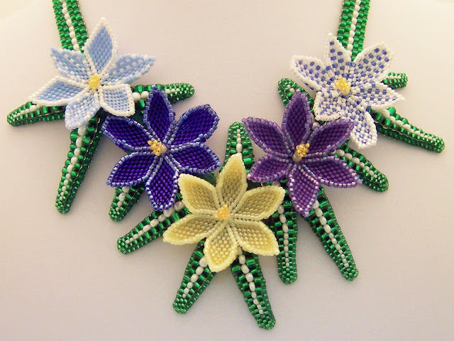
When the Etsy Beadweavers "Seed Beads Only" challenge was announced, I thought it might be nice opportunity to make beaded flowers, something I usually enjoy.  I began with researching crocus on google images and found the variety of colors and shapes appealing, so decided to make several different colored and shaped versions to replicate one particularly appealing image, from Dutch Mill Bulbs.

The range of colors ran from white through yellow to blue, purple, and even magenta. There were also lovely stripey patterns and beautiful ombre's. They all had six petals, but some were pointy, some more blunt, and opened from tightly closed to gently cupped with age.

I simplified a little to try to avoid visual confusion. And finally after a number of test petals, selected five I liked, and got the flowers finished, complete with upright stamen and pistils.   Most of the plants had delicate grasslike leaves and those were my biggest struggle.  I tried some peyote ones that I could cup a little with bead choice and thread tension, but they looked like bandaids to me.  Drat!  :o)
Then I turned the peyote sideways and did a double needle odd count technique, with beads in 4 sizes.  This did not have the same structural merit as the little bandaids, but did pleasantly reflect the size and shape of the leaves.

The white center stripe was also clean and clear with this technique, and I could create curves, but they required support.  So, enter the bead backing.  I created each leaf and then stitched it to the bead backing.  I decided the spiky quality of the leaf structure didn't really want to be other than straight, so ditched the curve potential.  I placed the leaves in what I hoped was a randomly balanced  pattern, and trimmed away the backing as I went.

Then I went on a hunt for something soft and comfortable to back the bead backing with, and a means to apply the backing without widening the leaves with the traditionaly quilled edge beads. I asked my friend Kinga Nichols (beauteous bead embroiderer!) a million questions about leather, adhesives, and stitches which she patiently answered. I found a beautiful piece of "super softy pigskin" in a deep green, and know I will re-visit Tandy Leather in Roseville to buy more in other colors some day.  I tried buttonhole and blanket stitches without an edge bead, but finally decided that the best finish was the quilling.  I quilled with both size 11 and 15 beads, and kept my shape reasonably well with only a small amount of additional width.  I thought the leaves looked like tiny crocodiles from the sides, with their two rows of scary tooth beads!

This finished product is certainly organic in feeling, different from my usual precise and more formal results, but a happy little piece, and certainly a nice harbinger of Spring.

Wednesday, December 28, 2011

Components as Inspiration

I was super excited to be contacted by Steven Weiss at Beadsmith.  They have a new line of clasps, Elegant Elements, and he asked if I might like to design using these clasps. Then, my work (and that of other designers) would be featured as a sales strategy for the new clasp line.  The product line was GORGEOUS!  And I said "Yes!"  Although I quickly discovered many of the other participants are my beading heroes, and I hoped I would find myself adequate to the task.

I have only just met Steven Weiss "electronically," but I am going to go out on a limb here and say the guy is a public relations and advertising genius.  This was a really brilliant way to collect great photos of the clasp line in action and I suspect most of us are really happy to be involved in the project.  A win-win situation if ever there was one!

I chose two beauties from the wide range of Elegant Elements clasps.  The first one I wanted to work with was a three-strand, golden nest box clasp, with snowy white pearl eggs.  I thought this piece could serve double duty, since the February Etsy Beadweavers theme is "NEST."  My first thought was to create a similar beaded nest for pearls to rest in, but after a couple samples, I found my work didn't really allow the clasp to shine.  The clasp is a soft, pale gold and although it has beautiful leaf texture, it's very subtle and super organized.  My samples were VERY textural, and one was a little disorganized, and neither suited the clasp.
I decided I needed to let the clasp lead the way for me, as I often do when I find other components I want to work with, so I analyzed it's basic design.  It sits neatly flat, and the pearls sit up off the delicate, flat, highly organized nest to be featured in their little bezels. So I began a search for flat, golden, subtly-textured components that might allow me to provide contrast to big egg-shaped pearls.  I bought some golden shadow rivolis, and those were lovely, but I really wanted something metallic to go with them.  Then one night in a parking garage in South Minneapolis, the answer jingled out of the payment station in the form of a gold one dollar coin.  I had just read an article about the reducing of production of these beauties, because they are not highly circulated, and considered to be an expense our government can eliminate.  But I just loved it.  And lo and behold, it was flat, pale gold, and delicately textured.  Just what I had been looking for.  But coins in jewelry?  And then the idea of a "nest egg" occurred to me, and it seemed perfect design concept for both of the tasks at hand.

I bezeled the coin and dashed off to the bank for more.  Turns out several different presidents are featured, as well as Sacajawea, but I liked the lady liberty backs, so I chose the ones with the best looking "tails" and got to work.  With several coins and rivolis ready I played with placement, and found a way to organize a triad of each (half dozen packaging, just like the clasp) to allow for a place for some of my big freshwater pearl drops to sit, and joined them together.  I played with several edge details, including tiny leaf shapes, but they still felt overwhelming and out of scale with the clasp, so I just netted in some bicones and found that to be appropriately scaled and detailed.

 I broke the edge detail to allow some of the pearl eggs to drip out of the nest as fringe, and to allow for a soft three strand pearl neckstrap, which joined both the focal and the clasp with big pearls again, to help keep the clasp focused as a major player in the design.

Although I frequently let components speak to me in my design process, I had never before considered the possibility of allowing a clasp to dictate a design. This line is more than worthy of  that kind of attention and I am really looking forward to working with my second clasp.


Wednesday, December 14, 2011

What it Took...

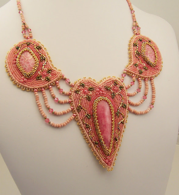
... to make my Arabesque Hearts and Flowers Necklace.


Some materials:

1 8.4 carat Rhodocrosite Teardrop Cabochon  12.00
1 pair Rhodocrosite Cabochons                        20.00
1 piece Pink Bead Backing                                   .65
1 piece Gold Ultrasuede for backing                    4.00
2 2x2mm Gold Filled Crimps                                .30
2 3mm Gold Filled Jump Rings                              .40
22 4mm Swarovski Rose Champagne Bicones      5.50
1 tube 24k Rose Gold Plate Delicas                    15.25
1 tube Nickel Plated Size 11 Seed beads                4.00
1 pkg Size 8 Green Iris Teardrop Seed Beads        2.00
6 tubes Size 15 Japanese Seed Beads                     9.80
1 tube Size 15 24k Gold Czech Charlottes          17.00
1 tube Size 13 24k Gold Czech Charlottes          15.45
4 tubes Size 8 Seed Beads                                    17.00
1 Gold Filled Toggle Clasp                                    9.50
4 bobbins Nymo in 4 Colors                                 5.00
1 spool 10 lb test Red Power Pro                        14.95
1 spool Crystal Fire Line                                    16.80
1 spool Fine Gold Extreme Soft Flex                 25.50

I didn't use up all of each of these items, but I made a just under $200 expenditure to have each item needed at hand to make the necklace. 


Plus some tools:

Needle nose pliers, crimping pliers, beading needles in various sizes, tailors thimble, awl, card stock for making patterns, Lazer shears for cutting the fishing lines, beading mat and tray, bead scoop.


Plus some time:

Usually I keep meticulous track of time, but this time (because I started so late and worked so fast) I have to guess, about 12 hours, but I suspect that is a conservative estimate.


Plus some experience:

Which enabled me to know that what I designed originally could not be finished in time to make the deadline for completion, so I adapted and adjusted my design to allow me to complete it in the time I had available.


Plus the inspiration:

 I got from watching my Etsy Beadweavers teammates post their entries for this challenge, and after deciding that I just didn't have time to do this, re-deciding that I REALLY wanted to make my own response to the challenge of "Arabesque Style."

Tomorrow is the last day of this challenge and if you have not already done so, please visit our Etsy Beadweavers Team blog, and choose your favorite entry of the many delightful interpretations on display and VOTE!

Tuesday, November 29, 2011

A Gift for a Friend

For her birthday, I told my friend Donna I would design a piece of jewelry to go with any outfit of her choosing.  She delivered a new top to me a couple weeks ago and I thought it was a great choice!  It has a funky peacock-inspired print in shades of turquoise, purple, fuchsia, cobalt, and ruby red, on a black ground.  The print is luminous and the colors really pop off the surface of the fabric in some places, and fade to neutral in others. The neckline was a deep V and I immediately wanted to fill that V with a Y shaped peacock tail image of my own.  The top is lush and rich, but subtle, and could be a casual shirt, looking great with jeans.  It could also dress up for a coctail party, so I wanted my piece to serve both purposes.


I found a dyed howlite torus in a nice turquoise-y color, and collected beads from my stash in all the colors in the shirt, choosing some Swarovski sparkle and lots of matte stone to serve my dual purpose.  Then I began fringing the torus wrap to create my tail.

I got it SO wrong the first time!  Bad proportions with too much length, and I mixed the color in horizontal bands and that was a mistake as well.  When you lave lots of texture and color, I think you need to organize it well to keep it from being a  messy pile of confusion, which my first effort was.  I'll show you, because it's the only photo I have of Donna's wonderful top...  But you can tell I wasn't pleased by the photo I took.  Sigh.  See how that color pops?  What a great shirt!

I don't know why this should be, but frequently when I design my beadwork, I have to do it wrong to see what it should be.  After staring at my chaos version for a while, I realized I had an opportunity to create a peacock eye image with the color selection, and that brought order to confusion and calmed the messy texture down to a reasonable level.  BUT, Donna is a petite woman, and I was worried that I had still not gotten the scale right for her. So I dithered about maybe making something more simple, and couldn't quite put the beads away yet.  But I did really like both the color arrangement and the depth and lushness of my second effort.


Fortunately, Donna stopped by yesterday with coconut macaroons from the Crossroads Deli, and while I made us tea, and she noticed the necklace on my stand and liked it! She tried it on, and I marked the length and finished the clasp while we drank our tea, and she will test drive it on Friday on a date she is looking forward to. 


I'm so glad that worked out!  And now all I need is a photo from that date... 

Sunday, November 27, 2011

Pearls from China

My friend Doris Coghill spoke at the Upper Midwest Bead Society meeting a couple weeks ago, providing insight and information from her many years of beading, teaching beadwork, and selling beads.  When asked about beading supplies from China, she used a very bad word.  She explained that the Chinese government has recently forced the retirement of many skilled workers to provide jobs for younger people entering the workforce.  When many of those experienced workers left, with them went skills and ethical work habits. 

One of the results of this forced mass Chinese early retirement program is a flood of poorly drilled pearls on the market.  Earlier this fall I bought piles of pearls at the local Gem and Lapidary Workers Show when it visited Minneapolis.  I love to weave with pearls, but usually find I must buy them wholesale to afford them. Weaving eats up materials quickly, and the GLWS is a great place to shop.

So when the blitz of my fall costume work ended, I happily sorted through my goodies and got out my favorite 3 strands of golden bronzy 3mm-ish rice pearls and two pieces of Biggs Deschutes Jasper and set to work, with this result:

The jasper was pricey, especially the upper piece, but the pearls were very reasonable, so I had plenty to play with, and after configuring the focal section, I decided to drape the pearls on each side.  I liked the exclaimation point image I had, but wanted to soften and disguise it a little, so it had subtlety and invited a closer look, since the details in the focals were so lovely.  This is where my trouble began. 

When you are draping strands of anything, uniformity is critical to success.  And these pearls were far from uniform. I loved the differences in color, since they echoed the depth in the jasper.


But the differences in length were more problematic.  For what I had paid for them, I didn't think the size differences were unreasonable, and the surfaces were smooth and lovely and with a deep glowing nacre.  I sorted them by length, and realizing that I would not have enough of any one length to do the job entirely, tried to organize them in my draping to provide the best results.  They were visually deceptive!  Fatter ones looked shorter than they were, and vice versa.  But all that was 100% acceptable to me and my purposes.

What I found disappointing was the funky drilling of many of the pearls.  In my triangle weave section, it didn't matter, but in the draping, it did.

I did the left side first (ok, REALLY I did the right side first, hated it, and did the left side and got a better result, and then ripped the right side and re-wove it) and I was able to use mosly the pearls with the holes drilled straight through, but by the last strand at the bottom, I had to start encorporating the pearls with the angled holes.  See the one in the center of the picture? There's one in two strands from it as well.  Sigh. 

And the right side has more of those badly drilled babies.  I don't see this as a crisis.  My piece is still pretty.  But my friend was right.  Less care and skill is going into the drilling of pearls from China.

Now, maybe the specific Chinese supplier makes a difference, because I ordered the pearls for my Victoria's Secret piece from China, and I was really pleased with their quality, price, and super fast service with reasonable shipping costs.  Better than companies in this country that shall remain nameless.

So, for future reference, caveat emptor!  When you buy a strand of pearls, hold them up and look at how they have been drilled and consider your purpose before plunking down your cash.  If you want to drape them, you want the holes drilled straight.  Thanks Doris, for opening my eyes.