Search This Blog

Showing posts with label bezel. Show all posts

Friday, May 20, 2022

Raspberry Caramel's Claws

COMING THIS WEEKEND, SUNDAY MAY 22nd, AT NOON CDT.

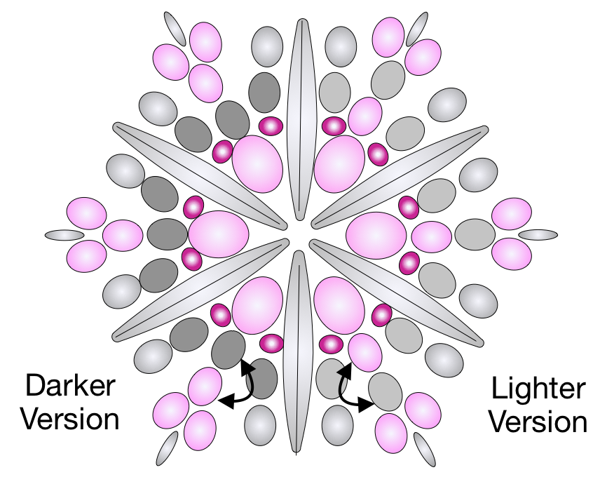
First I'll show you the oval stone focals for the LIGHTER GRAY BEZEL.


And then, the oval stone focals for the DARKER GRAY BEZEL


As you can see below, I have done a different bezel treatment for the darker stones, using a deep fuchsia 15/0 bead for the detailing on the bezel points.  I did a similar detail in the light bezel, including both the deep fuchsia and the French Pink.  All the stones contain both colors, in varying degrees.


 If you have made the design before, you will see that I have included an additional 15/0 bead in Step 15 where usually there is a skip.  I was just in love with the color pop, and you can choose to add or skip as you prefer.  Here's a chart for the two points, which I am also including on an info sheet in each kit.
I also have fiddled with the acorn itself, to get a color balance that I find appealing for each acorn, and here is that chart.  You will use the same thread path for ANY of my acorn patterns, only the bead size and color placement is different.  This chart is also included in each kit, with a key chart for the beads as well.  


I almost feel like I should apologize for these little changes, but I believe they are what maximizes the potential of the colorway, and I hope you can appreciate that although they are fussy, they have value. And of course, you don't have to take my advice.  Bead what makes you happy!

Finally, the 12mm wood bead used for the acorn has a BIG hole and our little beads wanted to slide into it, so the hole has been made smaller with a little nylon tube.  Most of them fit tightly, but just be sure you don't loose that valuable little addition.  


OK!  So I'll get back to finalizing my kits, so they can appear in my shop on Sunday!  

OH!  And....  More Mint jewels are arriving tomorrow, so hopefully those can be re-kitted next!

Saturday, December 14, 2013

Sam in Wonderland

Thus grew the tale of Wonderland
Thus slowly, one by one,
Its quaint events were hammered out-
And now the tale is done,
And home we steer a merry crew,
Beneath the setting sun."

 The "slowly, one by one" part sounds a lot like beading, no?

Stay with me.  I want to show you a necklace that involves beading, Alice in Wonderland, and a "sleeve."

A sleeve is an armful of tatoo.  The ENTIRE arm, usually from shoulder to wrist.  This must seem like random information but it is pertinent because I have a beautiful niece (Samantha, an animal welfare technician for a humane society) with an Alice in Wonderland sleeve. Here is how it looked after her first session with the needle.  Her bravery is vastly superior to my own!


Do you see Alice, the cards, the catepillar and his hookah, and the edge of the white rabbit?

About this time, when the sleeve was in this stage, I found a cabochon from Sandy Spivey with Alice imagery.  I thought it would be perfect for Samantha, and bought it.


Now unfortunately, this particular imagery is by a different artist than Sam's sleeve.  This is a Arthur Rackham illustration, in my opinion, among his best.  Her sleeve uses the illustrations of Sir John Tenniel.  Lots of different artists have taken on the illustration work, including Salvador Dali, but the Tenniel ones are more popular and familar to most people.  I worried that she might consider this a clash, (of style or maybe values) but finally this fall, decided that I would make it up for her and let her decide if it was wearable.

I wanted to honor the barely colorized, sepia look of the cab, so chose muted colors from the cab itself.


I used a delicate matte gold 24k delica in the bezel and some hints of pink and bronze, with a dab of Miyuki Baroque pearls in the surrounding embellishment and the stringing.  I really enjoyed working with the superduos at the edge, but every effort I made with them in the yoke was very rigid and unpleasantly inflexible, so I finally decided that a strung yoke was the best way to encorporate everything I wanted .


I have to admit, I have lost track of the number of piercings in Samantha's ears, but I felt that two earrings would fill at least some of them, if she wanted to wear them, and bravely wire-wrapped cherry quartz points to suit the purpose.

Now, the sleeve is, I believe, complete and really pretty awesome.  It has super vibrant color, which my work lacks.

I know my feeble effort is quiet by comparison, but Sam seems to be pleased with it, and I was happy to do it for her.

If I get really lucky, some day, perhaps Sam will model the necklace for me and send me a picture!

Wednesday, August 14, 2013

Oceanaire, Magic Numbers, and Square Bezels


I am never very successful when I set out to create something that I imagine other people might like to make.  All around me, my beady friends are creating tutorials for their designs and selling them.  I am torn by this.  I have very little time available to spend with beads, given I have a demanding full time job.  I really enjoy the design and engineering aspects of beadweaving.  I want to maximize my time with those things.  But I also feel selfish for not sharing my ideas.  So every so often, I take a little stab at designing something that I think might be a decent tutorial.

Usually, I ask myself, what do I do that I see others either NOT doing, or struggling with.  I am a very competent bezeler.  And I can manage any shape, scale, and proportion with relative ease.  So I decided I would bezel a popular and recent cab, a lunasoft, in a shape that people seem to struggle with, and create something from it. 

I owned some of these, purchased from my friend Doris Coghill, in a lovely ocean blue and since the Etsy Beadweavers theme for August was "Ocean Adventures" is seemed a good fit.

As I worked out the bezel bead counts and decreases I took pictures.  I thought that the tutorial might include general informaton about how to create bezels for geometrtic shapes as well as this particular one.  So... generally, NUMBERS MATTER,  when creating bezels.  Your base row must be an even number.  And some numbers are just better than others, like any number with multiple even divisiors, like for example, 24 (12, 6, 3)  is better than any even number that can only be evenly divided once, before an odd number appears, like 30 (15).  This is because bezels look best if they are balanced side to side.  On a round bezel, this is less important, and ovals can be cheated as well, but to get to the point, geometric shapes demand even base row numbers that are divisible by the number of sides of the shape.  So my choices for base row numbers for any square must be divisible by four.   

I strung delicas until I had about the right number of delica beads to encircle my lunasoft cab.  In this particular case, I wanted to create a color shift in my bezel, so I alternated a dark (1285) and lighter blue (0863) bead.  Then, I hunted for the perfect number.  The number of beads has to be divisible by 4, and the ring of beads cannot be loose on the cab.  Your base row can be a little too tight, or a little too loose.  For me, the perfect number in this case was 64.  It divided SO nicely!  64, 32, 16, 8, 4, 2.  64 is one of the magical numbers in bezel beading!   And it was just a tiny bit too tight, when pulled up snugly, to fit entirely around my cabochon.  Lucky me!  My Lunasoft cab is 20x20mm, so this magic number 64 would work beautifully for any cab that size as a base row. I will later enlarge it at the corners enough to fit.

When I bezel, I start differently, depending on my purpose.  In this case, I wanted the front of the bezel to create a white cap effect, so I worked the front of the cab first. I strung my beads on a 60" length of fireline, waxed my thread to help with the first row tension, and stitched through the first bead again. Then I clamped the thread about an inch past the ring of beads. Holding the beads flat on my fingers, and in place with my thumb, I began to peyote stitch the first row on the outside of the ring, with the dark blue.

I keep the clamp under my hand, out of the way of the thread, like this.  The weight of the clamp, and my fingers held together keep my tension snug on the first row of peyote, but this works best of you have waxed with either beeswax, or microcrystaline wax, to improve grip.  I think of shaping the beads as I go, in to the shape I am trying to create, so when I was done with this step, I had a rough, rounded looking square.

Then I stepped up into the middle row, and again into the center of the rounded square of beads.  Notice I am in the middle of a side here.  I think that is much easier than starting at a corner.

Since I have 4 sides, and my magical 64 beads divide by 4 into four sides of 16 base row beads, I know that I would have eight delica beads on each side of my square.  But now it is time to begin shaping my square more precisely.  So instead of stitching 8 delicas on each side, I will only stitch seven, and skip a bead at each corner, pulling the corner into a neat right angle.

I stitched three light blue delicas, added a lighter blue satin delica and then took a stitch without adding a bead when I got to my intended corner.  In this picture, I have put my satin bead on and taken a stitch and then taken a second stitch, without a bead.  Could have been a clearer picture had I done each step separately.  :)  I did the color switch in the interest of my white caps, but if you are just wanting the nice square bezel, no need to change colors.  Snug up your corner before proceeding.

Then for my next side, I stitched one satin delica, five light blue delicas, one more satin delica, The seven beads for the side, and skipped adding a bead on the 8th stitch again. I repeated this until I got back to my starting point, and my square was complete.  Each side has 7 delicas, one satin, 5 light blue, and one satin, and a stitch without a bead.


So here is the finished square, wiht my needle demonstrating the step up into the next row of peyote bezel.

In my next row, I stitched two light blue satin delicas, one pearl white delica, and a 15/0 white pearl rocaille at the corner. As you continue around the bezel, each row in this round will have a white pearl delica, four satin delicas, a white pearl delica, and a 15/0 pearl rocaille in the corner.  This could be a stopping point for a nice square bezel, and you might also be able to use 15/0 rocailles in each stitch, but keep your tension relaxed if you do not want your bezel to tighten excessively.


In my particular bezel, in the next row, we will decrease again, and we will also begin adding our white seafoam droplets.  So we will peyote stitch two satin delicas, one white pearl delica, and at the corner, stitch in a small white pearl drop bead.  Each repeating row in this round will have a white pearl delica, three light blue satin delicas, a white pearl delica and a small drop at the corner.


The next row is a little trickier, because it includes a step down into the previous row at the corners.  Begin by stepping up into the new row, and stitching one white pearl delica, and one small pearl drop.  Then step down into the previous row and move into the next side through the corner pearl drop, and step back up into the new row.  Each row in this round will contain the step up you just did, a small white pearl drop, two white pearl delicas, a small white pearl drop and the step down into the previous row to pass the corner. 

With the last side of this round finished, your bezel looks like this:


Now for the final row, which also includes a corner step down, this time through two rows.  Step up into the white delica, and add a three 15/0 pearl bead picot, which you should push out, over the finished portion of the bezel.  Step down two rows and pass the corner through the first small pearl drop again, and step back up two rows and add another picot, pushed out, and a large pearl drop, laying in over the top of the bezel, followed by another pushed out picot, and a step down, the process repeating to finish the final row of the bezel.  Here you see me stepping down to the outside edge of the bezel, and most of the picots and drops are sitting where they should be, but you must align them correctly when you are done.  There is only room for them to sit where they should, but you have to show them where that is.  I have not correctly oriented the last side of the last row in this picture. As you step past the original thread tail, make sure it stays on the outside of the beadwork, so you can stitch it back in and trim it off at your convenience.

At the outside row, I added a final dark blue row of delicas, with an 8/0 bead at each corner to create an easy place to attach my components together and drape through them. These 8/0's also enlarge the frame enough to fit the cabochon easily.

After stitching this row, I popped in my cabochon, after painting the back of it with clear nail polish to protect it from wear, and allowing it to completely dry. 


Then I turned the thread so I could keep stitching counter-clockwise, as I am right handed and that is my strong preference.  I peyote stitched a row of delicas, with 15/0 rocailles at the corners to begin the tightening process and stitched an additional row of delicas to secure the cab.  You could continue with additional rows if you liked, but the cab is secure with this row. 

I did stitch one final row of 15/0 on one bezel, and two on the other two, which you can see in the image of the finished back of the work.


Now, since this little necklace has been poorly received, I will not continue with the rest of the necklace, and probably, if anyone actually uses this bezel advice, they will stop at the square frame work many steps ago.  But the best information is the numeric info, and perhaps, I will show other shapes more simply in future posts. 


I personally like this piece, and I think it looks great with denim.  I really enjoyed embellishing the bezel centers in my Artichoke! piece, and wanted to explore that idea further here.  I think the intense matte blue color is off-putting to some, perhaps. I liked the absence of shine because it made it feel deep to me, like an ocean. And without any metal beads, beadwork looks less like legitimate jewelry.  I think my own feelings about the ocean might be off-putting as well.  I purposefully threw the squares into tumbling action, because I have terrible motion sickness, and just looking at the ocean makes me feel disoriented and dizzy.  I wanted the work to have a horizon line that would shift in wearing, rarely being perfectly horizontal, and it does that really well. :) I liked the fringy tassel for the same reason, and the curved drapes reminded me of waves. 

For me, a happy result.  For others, not so much, but the great thing about what I do with beads is, in my day job, where there is always a client to be interpreted, flattered, made beautiful, and pleased.

 At my beading bench, there is only me.


Sunday, December 30, 2012

Buddha's Temple Necklace

The assignment for the Etsy Beadweavers 2013 February Challenge, from Kris Empting-Obenland, is as follows:
"Japan has a most exciting culture. There is a distinct division between past and future: ancient traditional values with their strong rituals, art forms and language on one side, versus the crazy dazzling fashion modernity, neon colors, and plastic kitsch on the other side.

Pick ONE of these two styles to create a piece of jewelry that shows the important criteria needed to convey either the traditional or the modern Japan. OR: combine both styles into one piece accentuating the contrasts!"
So, the above necklace is my answer to the challenge.  Let me ask you, before I explain myself,

1)  Can you see any Japanese influence in this piece?
2)  Do you see traditional Japan, or kitschy contemporary, like Hello Kitty and Anime?
3)  What aspect of Japanese culture do you think my research and inspiration was taken from?

I would just love it if any of the ideas in those questions were discernable in the finished work, but they may not be.  If your first impression of the piece, without knowing the title, had a sense of "Asian," without really knowing why, I'd feel wildly successful.  Because, according to what I have read, Japanese architecture derives from Chinese and other Asian construction styles.  So, here's my intention, laid out in words.  Let's see if you got any of what I tried to do.


Image from WikiMedia
I looked at several images of various things Japanese, and found myself drawn to traditional Japanese architecture, specifically the sweeping, gently curved roof lines of temples.

Some of the temple roofs actually had spiked details at the roof corners, which REALLY appealed to me.
Image from WikiMedia
So I decided that these traditionally Japanese /Asian and very appealing shapes would inspire my work for this challenge.

I chose some "Purple Turquoise" pillow beads and a gorgeous 14 carat piece of Sleeping Beauty Turquoise, whose softly curved edges reminded me of the shapes I liked in the roofs.  I captured them in 24k dark gold delicas, to emphasize the bronze infusion in the Purple Turquoise.  Then I used Bohemian hand-make spike beads to emulate the spiked details at the roof corners.


The detail is easier to see in the more nearly rectangular beads.


I was pleased with how I was able to make the spikes seem to spring out of the bezels, without fully bezeling them, thus maintaining the same effect as the "spikes" on the temple rook corners.  Then, I connected my spiked components, trying again to use the delicately curved roof lines.


I chose an antique bronze filigree toggle and ring as a clasp, and finished the piece with a delicate drop from the Sleeping Beauty Turquoise center component.  If this piece should be yours, please visit the listing for it in my Etsy shop here!

I struggled for a little while this fall with what to make.  I decided the best thing to put in my Etsy shop are things I myself would want to wear.  I'm kinda lusting after this piece, so, the idea produces things I like, but it's a little hard to part with them. :)  But list I will, and here's a link if this piece should be yours!  I'll take pleasure in knowing I have made something I'm proud of, and would be proud to sell, or wear myself.

To quote the Buddha himself:
"The only real failure in life is not to be true to the best one knows." 

Tuesday, October 9, 2012

By The Dawn's Early Light

 
Dawn's Early Light
I enjoy being a member of the Etsy Beadweavers team, and the best thing about the Beadweavers (aside from the wonderful, world-wide beady friends I have made there!) is the monthly challenge opportunity. Not only is there inspiration provided, but a deadline encourages work to be completed, photographed, and listed for sale.

This month's theme was "Misty Winter's Dawn" and I found it very inspiring.  I wondered if I'd feel like creating winter in the midst of my favorite season, but I got into it and loved it.  The fact that acorns are falling like rain here helps! In Minnesota, that is always an indicator of an early winter fast approaching.

I began with Swarovski rivolis, in Light Sapphire, Rose, and Rose Champagne, and bezeled them in 24k blue gold Miyuki delicas.  I wanted to make tiny stars of the rivoli's, and play down the sparkle factor while featuring the amazing blue gold bead bezels.

Detail
I kept the centers of each component clean and simple, and added pearls and magatamas as texture and density at the edges.  I wanted an impression of stars winking out as the sunrise begins to color the sky.  I muted and narrowed the colorway to keep the results soft and misty.  I rarely use grays, or silver, so this was a true challenge for me.

I also ran into a mathematical challenge.  Since I wanted to feature a star shape in the center of each component, there could only be numbers of beads in each bezel that would be evenly divided twice by two.  So, 24,12,6, the smallest stars, 32,16,8, the medium stars, and 40,20,10, the largest star.  But I had purchased 10, 12, 14, 16 and 18mm rivolis.  So, I had to cheat repeatedly with technical control of tension to make this work.  Yeeks!  Much of what you see here is structural netting.  The rivoli's are only about half of the width of the component in each case.  Here's a peek at the back, which gives a better sense of how where the rivoli stops and the structure begins.


I also wanted the piece to have an organic, natural quality.  I found that in my stick pearl tassles.  For me, the sticks look like newly bare branches, glistening in the dewy dawn. 

Fringe detail

This piece grew as it developed.   I had created a piece with linked rivolis earlier this summer in a hex pattern, which was supple and flexible, and I loved the feel of it.  I wanted to explore what other shapes would be stable as negative spaces.  I found that each opening I created required structural support from its neighbors and that the strength and suppleness of the whole was very dependent on the ingtegrity of each connection.  I want to explore this further in the future!
 

Early assembly detail, which really emphasizes the negative spaces and connections, before I finished the star picots.


 Please visit our Etsy Beadweavers Team blog and view my teams beautiful work and varied interpretations of "Misty Winter's Dawn."  Please choose your personal favorite from the array, and give it your vote on confidence in the right hand column.  Thanks!

Sunday, July 29, 2012

Missing...

I am proud to announce that my piece, "Missing" survived the first cut in the 2012 Battle of the Beadsmith International Invitational Beading Tournament on facebook, and of the 80 original entries, it is one of the 40 that will continue to round 2 of adjudication.
Back View - I like to close my bezels to prevent wear.
When I set out to create my piece, I thought it would be a representation of my home, Minnesota, Land of 10,000 Lakes.   I imagined a work with many bezeled Bermuda Blue rivolis, representing lakes, and lush greenery swirling around those lakes in elegant twists like naturally occuring fibonacci spirals.  I had looked at many examples of fractals in nature and mathematics, and I had a sketch that gave a rough impression of what I was hoping to accomplish.  I hoped to suggest a waterfall, like Minnehaha Falls near my home, as the focal component.


About half way through my project, my mother passed away.  My parents were both very supportive of my artistry, encouraged me to pursure a degree in theater, (when many might have suggested learning to type) and my mother gave me my love of handcrafts, teaching me to knit, crochet, embroider and sew. For Christmas of my Senior year of High School, they gave me a sewing machine.  It was an astonishingly expensive thing, and competely out of line with what Christmas gifts usually were, but it was also a confirmation of their support for my chosen career, and it meant the world to me.
Suddenly, my work was not about Minnesota any more.  It was about my mother, or more important, the absence of my mother.
The lively, curling greenery idea disappeared.  The beautiful blue components rearranged themselves into a soft circle of life, with a smaller supporting outer ring for me, and a larger inner ring for her, which merged into one single line at the base of the focal, as I realized I am now the family matriarch.  The negative space in the center of the focal created a soft heart impression.  Then the waterfall became a curtain of tears, falling from the circle. 

The blue was just the perfect color.  My mom's kitchen was always blue.  And I associate her with that room.  She loved to cook and bake, and so many photos of her were taken in that room.  She owned a set of beautiful, cobalt blue dishes.  Let me show you!  These were in the kitchen, but I moved them to the dining room while I prepared the house for sale over the the last month, because I thought they were so beautiful in the china cabinet she was so very proud of. For Mom, preparing and sharing food was an act of love!
And here's the kitchen. See the blue gingham curtains she made?  The pale aqua figure on the  backsplash tile she chose?  The adjoining wall has paper with a delicate blue figure on it.
And the dining room chandelier?  Gold, of course.  And there have always been golden yellow accents in the kitchen too.  Mom had beautiful blue eyes as well, but she was legally blind when she began to fall, and the third fracture of her pelvis was just too much to recover from at 89.

I think although it began as something quite different, this is the most personal and deeply felt work I have done as a beader.  I always create with wearability in mind, and have worn each piece I have made at least once.  Initially I din't think this particular piece would get a public wearing.  But I did put it on... and asked The Best Man Ever to take a shot for me.  I also thought I would never sell it, but a time comes to move on through life, and it is now listed in my Etsy shop.


So, there you have it.  A very personal piece, about an empty space in my life.  I tried to make the empty spaces, the negative shapes in the work, (the "missing" bits if you will) speak as loudly as what is there.  I wish I could share it with her.  I think she would approve.