Search This Blog

Showing posts with label beadwoven. Show all posts

Friday, May 20, 2022

Raspberry Caramel's Claws

COMING THIS WEEKEND, SUNDAY MAY 22nd, AT NOON CDT.

First I'll show you the oval stone focals for the LIGHTER GRAY BEZEL.


And then, the oval stone focals for the DARKER GRAY BEZEL


As you can see below, I have done a different bezel treatment for the darker stones, using a deep fuchsia 15/0 bead for the detailing on the bezel points.  I did a similar detail in the light bezel, including both the deep fuchsia and the French Pink.  All the stones contain both colors, in varying degrees.


 If you have made the design before, you will see that I have included an additional 15/0 bead in Step 15 where usually there is a skip.  I was just in love with the color pop, and you can choose to add or skip as you prefer.  Here's a chart for the two points, which I am also including on an info sheet in each kit.
I also have fiddled with the acorn itself, to get a color balance that I find appealing for each acorn, and here is that chart.  You will use the same thread path for ANY of my acorn patterns, only the bead size and color placement is different.  This chart is also included in each kit, with a key chart for the beads as well.  


I almost feel like I should apologize for these little changes, but I believe they are what maximizes the potential of the colorway, and I hope you can appreciate that although they are fussy, they have value. And of course, you don't have to take my advice.  Bead what makes you happy!

Finally, the 12mm wood bead used for the acorn has a BIG hole and our little beads wanted to slide into it, so the hole has been made smaller with a little nylon tube.  Most of them fit tightly, but just be sure you don't loose that valuable little addition.  


OK!  So I'll get back to finalizing my kits, so they can appear in my shop on Sunday!  

OH!  And....  More Mint jewels are arriving tomorrow, so hopefully those can be re-kitted next!

Friday, August 10, 2018

Vintage Jasper

Well, I still have work to do, but tomorrow at noon CST, I will release the kits for my new project, Vintage Jasper.  I want to use this post to just quickly introduce you to the two colorways, and the 14 available cabochon sets.  You get to choose your own.  You might want time to think about it.


Here is a quick peek at the two colorways.  You will also notice that it is possible to put either one or two links between the large cabochon and the smaller ones.  If you are taller and plan to make a longer necklace (the kit accommodates up to 22") you might prefer two links, and if you are shorter like me, one link might be your choice.  Both are given in the tutorial, and a chart for number of links needed for sizes 17" -  22" are given.  FYI, I have to double check all my numbers and calculations, but I think these kits will be $75. Actually... $73.  Here's a link. 

So without further ado, here are the yummy Red Creek Jasper cabochon sets for your perusal!  You'll notice I used a GemDuo with color variation and hints of warmth in the Heirloom Silver group, with a link to those here. And the bezel is my favorite of all the Aiko colors.  It's called Oceanic Metallic, and is a mix of silvers, with bits of gold and dots of copper.  Here's a closeup for reference. The bezel embellishment really adds color and merges the cabs with the GemDuos.


I did the same with the GemDuos in the Antique Bronze group, and some are almost coppery.  Again, for reference, here is a closeup.  The bezel is simple Bronze Metallic, because most of these cabs have dramatic patterning and I did not want to distract.  Here's a link for the kits.


Enjoy!

Monday, May 8, 2017

Pineapple Blossom Necklace


This project is a combination of two stitches (Peyote and Chenille), and two different bead finishes (shiny dark rainbow, and matte pastel rainbow). The 29 page Intermediate-Advanced level tutorial is available here in my Etsy shop.

Sadly there are way more than two different beads in the project, but whenever gradation figures into a design, it's a safe bet that MANY different sizes of any bead used will be necessary.

I appreciate that buying $3 worth of beads to get three of them does not always fit into everyone's budget.  I have had a great time playing with colors, and have three colorways available as kits in my Etsy shop.  The kits actually cost less than buying all the beads you need separately, and save you time.  But if you want to create your own version in your favorite colors, there is a handy chart on pages 3 and 4, that show your which beads need to be dark and which light, and what needs to contrast with what.  I struggled with that myself, and wanted to make it EASY for you to do!


First, there is a warm, soft golden green, which reminds me of new leaves, paired with a metallic olivine rainbow effect. I love the flashes of purple in that dark bead!  I called it FROND, and that kit is available here.  I think you can see in this photo the texture of the bezel, which very much reminds me of a ripe pineapple, hence the name.

Since the pineapple name evokes Hawaii for me, I thought there should also be a SURF color, which is soft matte pale turquoise, accented with deep teal metallic rainbow finish.


This image shows the back, and another important part of this project.  Before it is bezeled, the 20x30 Swarovski jewel is backed with soft leather, in this particular case Tandy "Super Softy Pigsuede" but Lambskin works really well too.  A soft, flexible piece serves well, and the process is described with photos in the tutorial.  I plan to try a making a video of that process over the next weekend, to help those of you who want to do it for yourselves.  If you don't, it's already been done for you on the jewels in the kits.  Surf is available here, although currently sold out.  But I will be re-stocking ASAP!


One more thing about the SURF kit.  The 15/0 beads at the center edge of the bezel are a tight fit, and one of mine (center bottom) sat a bit cooked.  I hate things like that.  BUT I think if I had not pointed it out to you, you would never have noticed.  SO, cull the tiniest of these beads and save them for the center of the bottom of the bezel.  It's interesting to me that each bead, even from the same manufacturer, has its own character.

Now, to the final colorway, the Orchid MIST kit, available here.  Had to have a flower for the Hawaiian theme, yes?  And orchid is a good description of the lighter color, with deep purple and navy metallic rainbow accents.


 I have to tell you, I have really struggled with photographing this color to get it to look like the real thing, and I think the above shot shows the color most accurately. There are two things I want to point out to you.

First, the bezel edge bead is transparent.  I wish it had a little more presence than it does when worn, especially against a darker color.  SO, I have given you a second, tiny bag of those edge beads (J), inside the bag containing the ones I used in my sample.  The beads in the little bag are opaque and have a bit of moderate shine. You can test for yourself and see which you prefer.  I also put in some of the same beads in the smaller size in the H bag, for the center of the bezel if you prefer them.  Your choice: neither is a mistake, just a slightly different result.


The second thing I want to discuss with you is the N bead in this first Orchid colorway, that peeks out of the bell-shaped cones at the bottom of the ropes.  I did not find what I thought was the PERFECT bead for that spot, until my second set of kits.  So first generation Orchid kit buyers have three choices.  Two sets of them have a gold finish on them, and if you look at the first photo, you can see I used the lighter one in the sample I made.  It's OK, but a little golden, for the rest of the beads.  I think the other gold finished bead looks a little taupe-y, and not my favorite. Marie, who tested this project for me, used the purple bead, and I think it blends in better with the rest of the colors.  BUT you get to make your own choice.  Remember that it sits almost entirely hidden in wearing, and is seen only in shadow.  Make the choice your prefer.  None of them is a bad choice.  Please yourself!

I had a wonderful release of this tutorial and set of kits, (the photo below is the result of the first 12 hours, and barely fit into my very large mailbox) and I want to thank you all again, for your appreciation of my pattern, and your purchases.  If there are ever questions you have about a process or step, please contact me, and I will do my very best to help you.


 May your mat be full of beauty, and your heart full of joy!

Friday, September 2, 2016

"Aflame" and Friends


I have been playing with chenille stitch and gradation for over a year, and find there is a nice depth in working with the same idea over an extended period.  Part this work is the rope above, published in the October 2016 Bead & Button Magazine.


I submitted the project with a maple leaf pendant, employing the same gradation, but only the rope was chosen for publication.  One nice thing about working with Bead & Button is, although you cannot publish your accepted project anywhere else before they do, afterward, you may submit it for publication elsewhere, or self-publish, which I have done in my Etsy shop.  I have published a tutorial for the leaf, rope, and bail here, as well as a kit in the "Aflame" colors shown above.

I think they play nicely together, and really like the flame-ish aspect of the whole.  I tried to combine both the colors of the leaves I pick up on my daily walks, with the colors in the bonfires I find so appealing in my fire pit in the fall.  I love the crisp cool air on my back and toasty toes, and the blue-purple embers at the edges of the fire.  I tried to roll all of the juicy goodness of Autumn together into this work.

I worked up two other colorways to include in my tutorial.  I realize that "Aflame" is a very bold piece with bright colors.  So I did a much more subtle version.  This is "Singe". I made up jest a few kits in this color group, since the investment in the 24k beads is substantial.  They are available here!


It represents the leaves of the Silver Maples that fill my yard, which go almost directly from green to coppery topaz, bypassing all the reds and oranges of the Sugar Maples in the neighbor's yards.  They always seem a little burnt to me.  But they have their own beauty, and the colorway has more a feeling of proper jewelry, (a bit less fantastical than bold "Aflame") given the 24k gold edges and accents in the rope.

And then, there is "Psychedelic Scarab".  OK, get out the mushrooms. This might be a tribute to my coming of age in the early '70's. I had a few Scarabeus Green Swarovski beetles left over from a dressmaking project, and the color in that little piece of glass was pretty awesome.


I added a beetle to the bail, and despite the "tripiness" of the colors in the leaf, this baby looks awesome worn with either of my two cobalt blue tops, and turns heads. Ladies who share my table while I am sipping my tea at the farmer's market demand I take it off for closer examination. I have to admit, it might be my favorite.  And the ROPE!  The kit for this color is here in my Etsy shop.


Both pieces (rope and leaf) could also be worn separately, and I have made a few leaves as samples for another, larger project, which I am also selling in my shop.


These leaves use the same pattern, MOSTLY.  I have scaled the bail down for the thinner rope. As you might notice, I take liberties with the exact placement of the beads as I work this pattern.  You can bead both sides symmetrically if you like, but in my world, it looks much more natural if each side is a little different.  I suggest in my pattern that when you lay out the second side, you use the beads I suggest, but switch a few with their neighbors.  In my samples, I have fiddled further than that, and changed a few edges a bit, but it's nice to know that once you have the shape established, you can play with color placement to your hearts content.  I really look forward to seeing what you all will do with this pattern.

I hope your will enjoy the curly-edged, ripply-centered, funky shape of this project too, which also keeps the leaves looking realistic!


Happy Autumn to you!  I hope you will enjoy making your very own leaf pile!


Monday, March 5, 2012

A Visit to the Emerald Isle

When the "Destinations" theme was chosen and announced by Jacquie Champion of Etsy Beadweavers, I immediately thought of Ireland.  I am a quarter Irish, and although I am a dreadful traveler, frequently completely undone by motion sickness, if I could go anywhere in the world, Ireland would be my choice.   Add to that, I usually like to make jewelry that suits my mood, and I am always longing for green when March finds Minnesota.   And with St. Patrick's day the big holiday in the month, happening right after our challenge, the deal was sealed.  Shamrocks, shillelaghs, and leprechaun gold!


I was also inspired by a book I was reading, The Witching Hour, by Anne Rice. My travel is frequently done in my imagination through books. I knew my necklace would be emerald green for Ireland's beautiful rolling hills and clover, bumpy for the famous buckthorn walking (and fighting!) sticks, and gold, to represent end-of-the-rainbow treasure.  In this book, a Brazilian emerald necklace, vintage late 1600's, is acquired and passed down through 13 generations of female designees to the Mayfair Legacy, and its description became part of my design imagery as well.  It had a heavy gold chain, and ornate gold setting.  So my necklace also represents the "Mayfair Emerald," as well as Ireland.  The Mayfair necklace had only one, large rectangular jewel, but I added more jewels and other shapes.

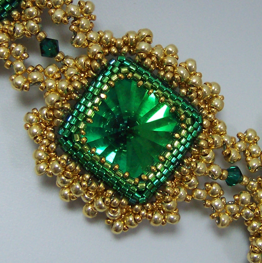
I began with bezels for the beautiful rectangle and triangle Swarovski emerald jewels, and the amazing vintage effect squares I got from my friend Doris Coghill at BeadsbyDee.  In all fairness, much of the magic in the necklace is in the beautiful color in those squares.  I bezeled the jewels in gradated rows of greens in teal, emerald, grass, and peridot.  This is pretty subtle color use, and you may not have consciously noticed it at first glance, but I think this kind of detail really makes a huge difference in the final product, and provides added dimension for the bezel, since the darker, cooler colors recede from the eye and the lighter ones advance toward it.

 I did the same sort of thing with the gold beads that I used.  My 15/0 beads are Miyuki 24k gold plate, a deep rich gold. The 11/0 are labeled 4202 Duracoat, (pet peeve! a label that does not tell me what bead I have bought!!!) and also fairly dark and rich.  The 8/0 beads are Toho PF557 Gold Galvanized, which I don't usually like to use because the durability is questionable, (despite the "permanent finish" advertised) but I needed gold beads, and these are what is available.  My personal body chemistry does not strip metal from beads, but I know I am in a minority. The point here is, the bigger beads are a lighter shade of gold than the smaller ones.  This provides lots of added depth and dimension, which may not be noticable without having attention called to it.  See how the beads closer to the bezel are darker?  They really increase visual depth.  Well, that, plus the negative space I left open there, and of course, the bezel ombre, helps too.


I was stuck on my frame for a long time.  I added a simple picot.


Then I closed it for stability and to create substance and size, and then I was stuck for a while.


Finally, I began to embellish the frame, aiming for both "bumpy" like the blackthorn Shillelaghs, and "heavy" from my book. The first row thickened the frame, and began adding bumps, which I wanted to look something like granulation.


Then, I added a netted picot through that layer.


And finally, I felt good about my goals of evoking Ireland, ornate, bumpy, granulation, and late 17th century, portrayed in beads. Then I began a quest for "heavy gold chain" that would still represent all the above characteristics, and relate to the framework I had already created.  I tried spiral, flat spiral, double spiral, embellished RAW, cubic RAW, tried to work out what cubic triangle weave might be (which was pure disaster!) and finally resorted to double stitched flat triangle weave.  I used moss green power pro, and although you can't see it so well in the photos, in person, it lends a kind of antique verdegris shadow to the work, which felt just right to me.


Then I laid out my components and began linking them with the triangle weave chain.  I considered a shamrock configuration, but felt it would be too literal, not pleasing to the eye, plus it denied the vintage jewelry quality I was trying to create.


I desperately wanted to add fringe, but in looking at jewelry from the late 1600's and early 1700's,  I saw few fringy components, so managed to restrain myself this time.  But those emerald faceted drops I bought are bound to show up in my work in the near future.  They are just too good to pass over permanently.

Being obsessive compulsive, I also had to finish the backs of my bezels.


Then I went shopping for a clasp and I must say, I have been spoiled by the fantastic Elegant Elements clasps I have put on my last three projects. Mind you, this clasp is good on the piece, but as I mentioned, I am spoiled!!!  Usually, when I piece is done, I hate to back up, but I would gladly rip this one back for an Elegant Elements clasp.  I've lost the link to the collection, but maybe I'll ask Steven if he's interested.  Neither of my two favorite local bead shops carries Elegant Elements clasps.  SAD!!!