Search This Blog

Sunday, April 7, 2013

The Weed and the War Chest

This may not be about what you are thinking!  If "weed" to you means reefer, Mary Jane.. any of THOSE things, you are wrong. 


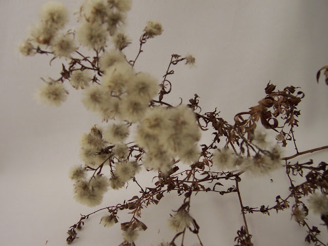
This is an actual weed.  I plucked it last fall from the marsh by my house, because I found both it's beauty and humbleness astonishing.  It has faded a little, (those little seed heads were a much more luminous pale, clear green) and may have collected a little dust, but the elegance of the little blossoms and the bronzy glory of the twisted leaves has not changed.  And I wish I could show it to you as it looked when I collected it, with the sparkling blues of the pond and sky behind it.  I often either take pictures of, or collect things I find inspiring. Since this has managed to survive the entire winter in one piece, I believe some aspect of it will possibly end up in my Battle of the Beadsmith work this year.  At this point, you may be thinking I have been into the other sort of weed after all!

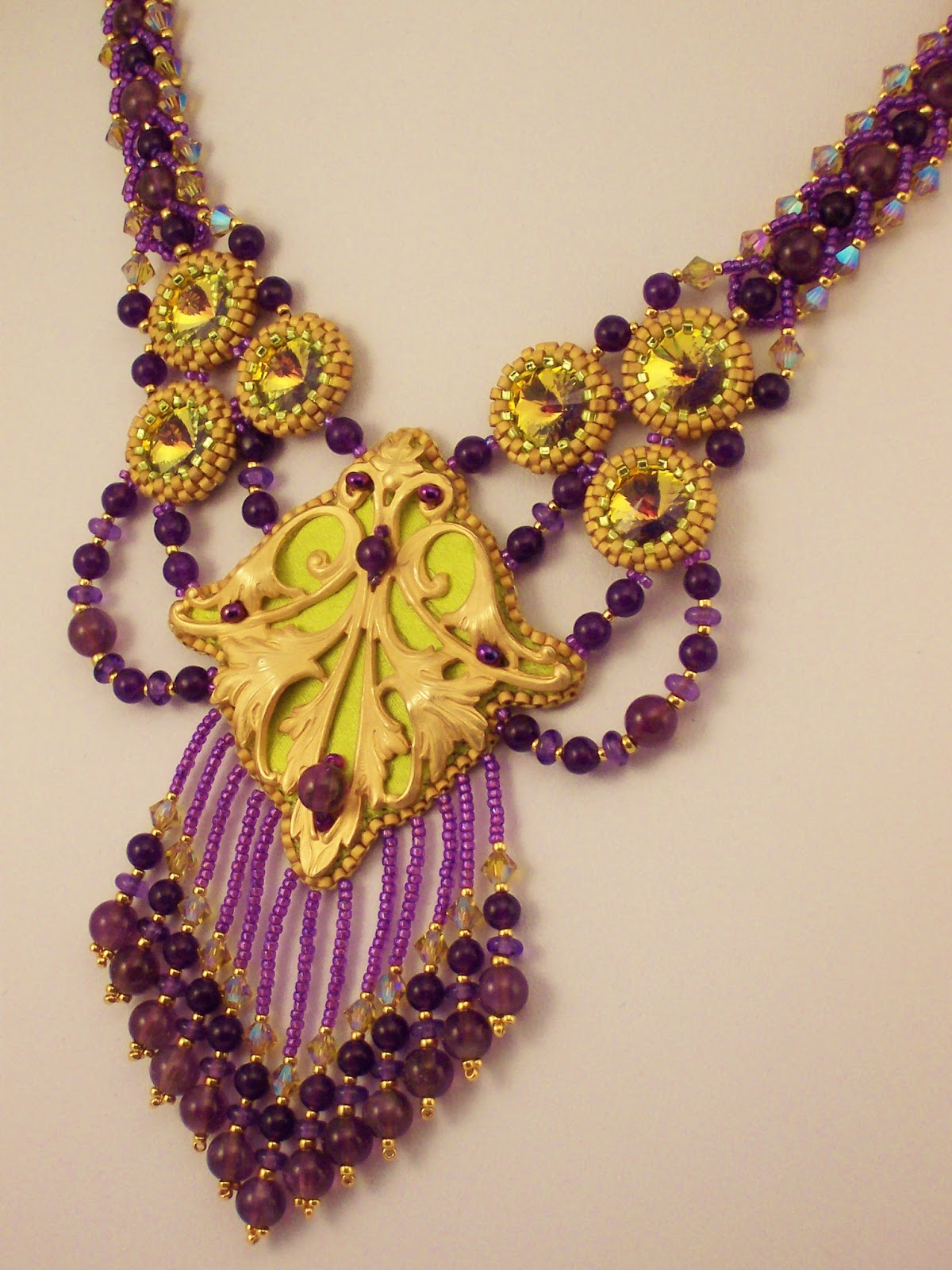
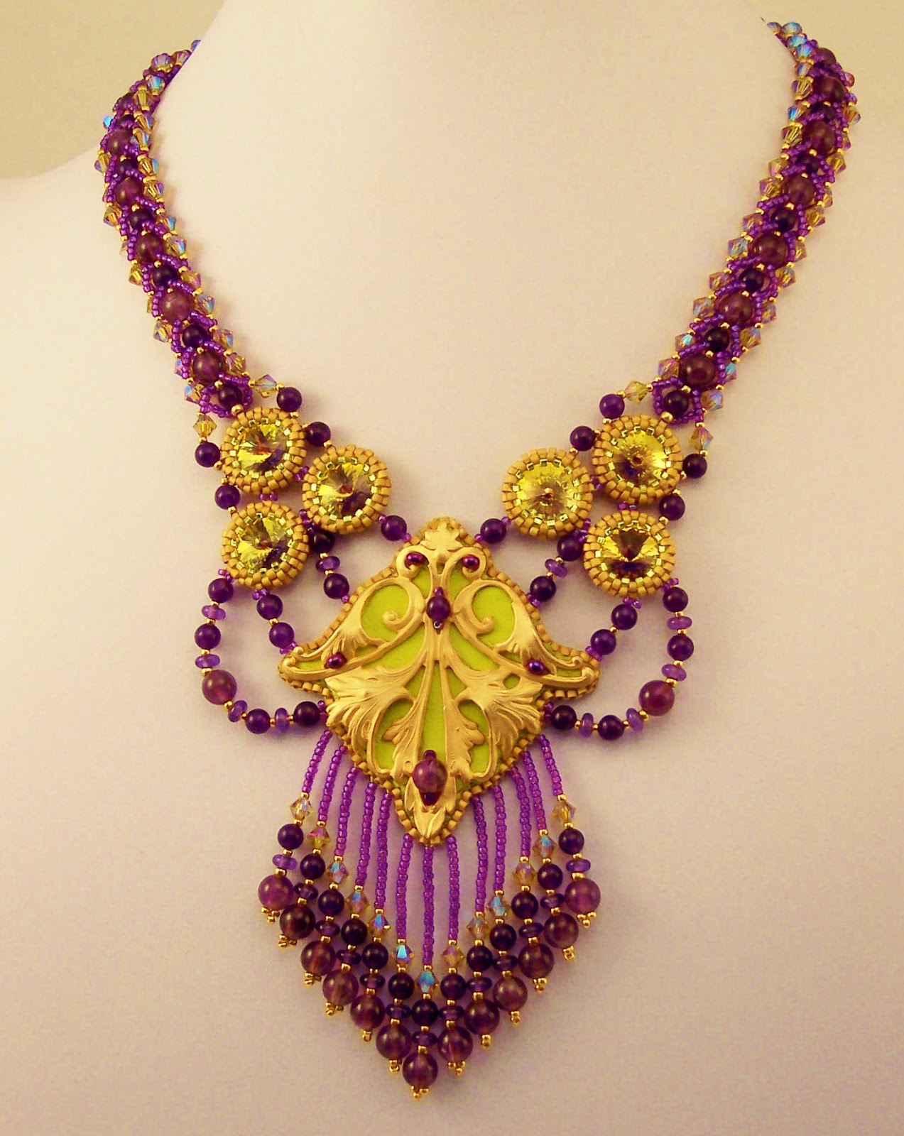
This will be my second year of Battle of the Beadsmith, and I really enjoyed last years event, despite my personal grief.  About half way through my process, my mother passed away. Her death changed my work entirely, and it became a memorial to her.  You can read about it here if you like.  But I'll remind you too...


I am super proud of the fact that my "Missing" made it into the third round, placing it in the top 25% of entries. The "sweet sixteen" to use Steven's analogy.  And I am very happy to have the opportunity to participate again this year in the 2013 Battle.

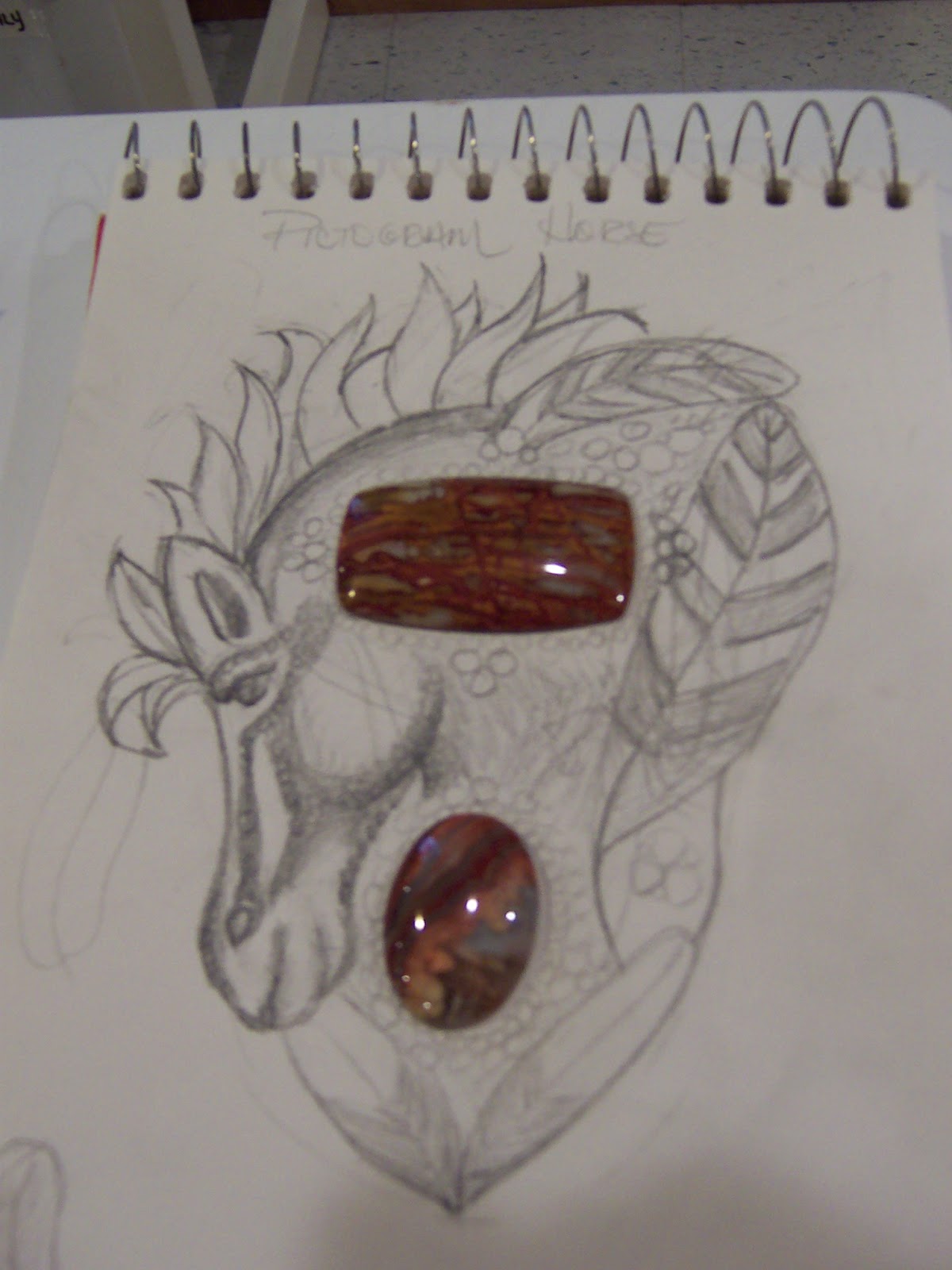
Last year I talked about what I might do for my battle piece here on my blog.  Not this year.  Because I have no sketch, and no specific image in mind.  I do have inspiration, ideas, and I have a war chest, which I have been filling since last fall when I picked up the weed.


So, some of those bits and bobs, and maybe some from the OTHER layers of the chest, will end up in my battle piece 2013.

I am going to enjoy the ride.  And THANK YOU Steven Weiss, (of Beadsmith fame!) for concieving of this wonderful event, and managing to herd 192 artists through their paces.  I think it must be very much like herding cats!  If you would like to watch the battle, just let me know and I or Steven can add you to the group on facebook!

Sunday, March 24, 2013

Persian Princess Parure


I have been missing from the blogosphere for what feels like a very long time. Partly, this is because I decided to produce an entry for Bead Dreams this year, and it has taken over 100 hours to realize this literal dream.  I submitted my entry about ten days ago, and began working on this little piece for the Etsy Beadweavers April Challenge, "Shades of Scheherazade."  The theme is about Middle Eastern dancing, or as it is more commonly known here in the US, belly dancing.

Based on words from the theme description, I wanted my entry to be mysterious, exotic, curvey, and have movement itself, so that it might appear to dance with the wearer.

I hunted through my stash for things with those attributes, and also attended a local Bead Bazaar, organized by my friend Doris Coghill, in a high school gym with 40 bead vendors from 10 states.  I found several things that fit the bill.  Doris sells Swarovski Rivolis in ultra colors, which have tremendous depth and unusual color, and I found the ultra purple ones to be particularly exotic and mysterious, with a color range from purple to green gold.  She also had delicas in pale matte gold, and those seemed right too!


I found another vendor at the Bazaar with matte gold metal trinkets that seemed both curvey and somewhat in the Arabesque style, which has a Persian feeling and put me in the right corner of the world.  I bought three little metal bits, and some funky embellished chain, and a wonderful tassel, all in the matte gold.

My plan was to make a simple, wearable, date-night kind of piece, that I could easily finish before the beginning of April and the Battle of the Beadsmith, which I am putting on my dog tags for again this year.

I had seen other Beaders use metal bits like mine in embroidery, so I found a scrap of bead backing, glued on one of the bits and got out the beads.  But my results were abysmal.  Sigh.  I had buried the pretty shape in too much texture, made it bigger than I wanted it to be, gave it the disturbing quality of an animal face of some sort, and overwhelmed the matte gold finish I liked so much. Epic fail!

I decided I wanted the metal piece to be the size it was, and that it should have only minimal additional texture. I wanted to add color to it, but not beads, or only just a few.  I dug through my satin scrap bin and found a wonderful green gold piece.  I fused it to a bit of backing, and cut it to the exact shape of the stamping.  Then I added a few delicate beady touches and glued that result to ultrasuede.  But THEN WHAT?  I was used to having a beadwork to edge, and how in the world was I going to apply the backing through the metal at the edges?  The answer was, with great difficulty. And as I was edging the thing, the difficulty of adding fringe, which I knew I wanted, also occurred to me.  Nothing is ever simple, you know?

After the edging, I bezeled 8 of the smallest Ultra Purple rivolis in the light gold matte delicas, set them aside, and turned back to the fringe problem.  I thought maybe I should just attach the funky tassel I bought and call it sufficient movement, but the scale of that tassel felt too large, so I took it apart, thinking I would eliminate the biggest ball.  Then I decided I really wanted the fringe, and that I would just figure out a way to do that.

I experimented and discovered that I could pick stitch the fringe through the ultrasuede backing with a sturdy needle, creating minimal visual impact from the stitching I would usually hide in the beadwork, so I fringed, and re-fringed, tassled, and fringed again until I got a delicate result with nice action. Here's the back and the tiny pick stitch dimples.

I grouped the rivolis into a triangular support for the focal, and played with connecting them, one of my current favorite beading interests.  I am loving working with connections as a means to blend disparate elements into a cohesive whole! I used 4 and 6mm Amethyst rounds from my stash to pull out the purple from the rivolis in the connection elements. I wanted the piece to have "hips" since hip action is such a defining element of  belly dancing, and found a way to drape on a hip shape on both sides of the focal that really pleased me.
HIPS!
Then it was time to make the strap.  Warren Feld (in his Jewelry Design Discussion Group on Facebook)  just wrote about the importance of the integration the strap, and I whole-heatedly agree.  And the first step is creating the right strap to integrate; one that will blend in with ease, offer support to what is already there, and bring its own little delight and meaning to the party.

Once I had the right thing, (a flat spiral, which is one of those techniques that I have never used before, but like the look of) I think the integration went pretty smoothly. 


In fact, I decided to make a larger flat spiral bracelet and a pair of earrings to create a set, making it sufficient to be called a parure, and helping me discover my alliterative title, Persian Princess Parure.   Although, I think Scheherezade was actually a queen...
 
If this set should be yours, you can see the listing in my Haute Ice Beadwork Etsy Shop here!


I find it has a springtime, crocus kind of color feeling, something I am just itching for!  Outside my window there are still many inches of snow blanketing my world.  Spring?  My backside.

I try hard to consider my design time irrevelant in the pricing of my work, and attempt to just price according to the time I believe it would take to duplicate the work, once the design work is resolved.  How do you price your work?  Do you include design time?  Construction time? Cost of materials?  The time it takes to make photos and write and post listings?  I think to recoup design time, you probably need to write tutorials.  Which would take yet more time.  :o)  That just has to be on my horizon, I think.  But not right away for sure.

Tuesday, March 19, 2013

Thank you Eva Maria Keiser!

I am a ballroom dancewear designer by day, but after dinner, I play with beads.  Through my beadwork, I have met a most remarkable woman, Eva Maria Keiser.  She is a beader, designer, and artist extraordinaire, with a phenomenal understanding of three dimensional structural beadwork. Those amazing pieces bannered across the top of her blog are part of her Chess Piece Series, but beyond that they are also vessels! (Go ahead, use this link and check them out,  I'll wait! Scroll down to see them all)  She creates astonishing jewelry, which she refers to as "Adornment" that is truely alive in all three dimensions, as these recent pieces attest, something I really admire as a dancewear designer.  And if this artistic brilliance were not sufficient, she is also a super blogger, posting daily with tutorials, beautiful beadwork, and introductions to the best beaders in the world.  She knows everybody, and features bead artists and their work in many ways.

 One of my favorites among her regular features is her Artist Colorway Series.  She examines an artist's work carefully, and assembles a color plot, which she displays alongside the work.  Today, she is featuring one of my ballgowns and I am so very honored.   I believe that my costume design work and my bead design work are linked, and I really appreciate her recognition of that as well.  Please visit her blog, and check it out!  She featured another of my pieces last year, and I am truely honored.
You can see more of Eva Maria's own breathtaking work in the soon-to-be-published book,

and read about her personal innovations and style, along with seeing some wonderful eye candy!  I cannot wait for my copy to arrive, and highly recommend this book.

 So this little post is a big THANK YOU, to a woman who promotes bead art and artists every day.  Here's to you Eva Maria, for all you do for the world wide bead community.  You are an inspiration.

Sunday, December 30, 2012

Buddha's Temple Necklace

The assignment for the Etsy Beadweavers 2013 February Challenge, from Kris Empting-Obenland, is as follows:
"Japan has a most exciting culture. There is a distinct division between past and future: ancient traditional values with their strong rituals, art forms and language on one side, versus the crazy dazzling fashion modernity, neon colors, and plastic kitsch on the other side.

Pick ONE of these two styles to create a piece of jewelry that shows the important criteria needed to convey either the traditional or the modern Japan. OR: combine both styles into one piece accentuating the contrasts!"
So, the above necklace is my answer to the challenge.  Let me ask you, before I explain myself,

1)  Can you see any Japanese influence in this piece?
2)  Do you see traditional Japan, or kitschy contemporary, like Hello Kitty and Anime?
3)  What aspect of Japanese culture do you think my research and inspiration was taken from?

I would just love it if any of the ideas in those questions were discernable in the finished work, but they may not be.  If your first impression of the piece, without knowing the title, had a sense of "Asian," without really knowing why, I'd feel wildly successful.  Because, according to what I have read, Japanese architecture derives from Chinese and other Asian construction styles.  So, here's my intention, laid out in words.  Let's see if you got any of what I tried to do.


Image from WikiMedia
I looked at several images of various things Japanese, and found myself drawn to traditional Japanese architecture, specifically the sweeping, gently curved roof lines of temples.

Some of the temple roofs actually had spiked details at the roof corners, which REALLY appealed to me.
Image from WikiMedia
So I decided that these traditionally Japanese /Asian and very appealing shapes would inspire my work for this challenge.

I chose some "Purple Turquoise" pillow beads and a gorgeous 14 carat piece of Sleeping Beauty Turquoise, whose softly curved edges reminded me of the shapes I liked in the roofs.  I captured them in 24k dark gold delicas, to emphasize the bronze infusion in the Purple Turquoise.  Then I used Bohemian hand-make spike beads to emulate the spiked details at the roof corners.


The detail is easier to see in the more nearly rectangular beads.


I was pleased with how I was able to make the spikes seem to spring out of the bezels, without fully bezeling them, thus maintaining the same effect as the "spikes" on the temple rook corners.  Then, I connected my spiked components, trying again to use the delicately curved roof lines.


I chose an antique bronze filigree toggle and ring as a clasp, and finished the piece with a delicate drop from the Sleeping Beauty Turquoise center component.  If this piece should be yours, please visit the listing for it in my Etsy shop here!

I struggled for a little while this fall with what to make.  I decided the best thing to put in my Etsy shop are things I myself would want to wear.  I'm kinda lusting after this piece, so, the idea produces things I like, but it's a little hard to part with them. :)  But list I will, and here's a link if this piece should be yours!  I'll take pleasure in knowing I have made something I'm proud of, and would be proud to sell, or wear myself.

To quote the Buddha himself:
"The only real failure in life is not to be true to the best one knows." 

Friday, December 14, 2012

Emotional Roller Coaster


Please check out the Etsy Beadweavers Team blog.  I chose the theme for this month's entries in our monthly challenge promotion, and there are some gems!  The blog poll closes on December 15th, tomorrow, so don't delay!

The theme is "Emotional Roller Coaster" and the challenge is a variation on something I did in college as an assignment in a graduate Sceneograhy seminar.  Set Designers, Lighting Designers, Costume and Makeup Designers and even a Sound Designer had to interpret five emotions, Love, Anger, Sadness, Happiness and Peace, each week, using a different design element.  So one week, we would convey each of the five emotions with a line, and the next week, a texture, color, shape and form, light, or space .  It was a great way to learn to use the basic elements of design and understand how to manipulate each one, and the class discussions of our work were always stimulating and illuminating.

In my version of the assignment for the challenge, members were to choose an emotion, and interpret it in beads, using any design elements they chose.  Some of them were very successful and you can guess easily the emotion they were representing in their weaving.

I chose the title for the theme, thinking that if everyone did a good job of interpreting their chosen emotion, looking at the mosaic would be like riding an Emotional Roller Coaster, moving rapidly from one feeling to another, as you viewed the images.  I hope you'll enjoy the ride!

I really struggled with my own entry.  At first I thought I'd do serenity.  But it turns our, serenity is just not very dynamic or visually exciting.  Plus, I challenged myself to make a bracelet, which I rarely do, and to use some Czech tile beads I had purchased.  My lack of experience always means making MANY tries before I succeed.  So, knowing that, here was my first finished version of "Serenity."


It was certainly serene, but I wanted a better solution to the challenge as a bracelet.  There is really nothing WRONG with this.  I just don't love it.  Plus, I didn't like how it moved, and that was another kettle of fish altogether.

So I tried a few other ideas.


Actually the first one on the left was my very first try, and similar to the neckstrap for my Amur Maple necklace.  I didn't think Serenity should be shiny, so the first try was out. Then I made the one from above, but fell asleep looking at it.   I liked the doubled up version second from the left, but I didn't think Serenity could possibly have bumpy edges.  Visually, that is just not very... well, Serene! But it was certainly more interesting.   So I decided if I was going to make a bracelet I thought was interesting, I'd best change emotions.  I thought maybe Euphoria was a good idea.  It might have an interesting edge and texture.  The third bracelet was the first try at that emotion, and I felt pretty good about it, but didn't quite like my color choices for my chosen emotion.  Then when I picked up my bottle of Calvin Klein "Euphoria" the next morning, eureka, I realized I had the the perfect color palette in my hand.


But the bracelet still seemed  not quite emotionally correct to me.  It was too repetitive and rigid, almost Victorian in feeling.  I thought Euphoria should be more unpredictable and varied, so I brought in an additional smaller component, to add dynamic interest to the shape.   I also learned that the suppleness I was after in the wearing of the bracelet was inhibited by any thread that ran the length of the bracelet, so I came up with a way to weave the thing that is the essence of RAW.  There are no straight lines through the bracelet, but rather multiple continuous loops, and for each component, the thread path reversed from clockwise to counter clockwise, again like RAW.  Pretty cool, huh.  I think thread path is everything in bead weaving, and here's another bit of proof.


I decided I wanted a touch of Euphoria near the face as well, since I apply perfume to both neck and wrists, so I made a pair of earrings to match, and there you have it.

Please go and take a look at the work of our talented members who found time in the busiest month of the year to participate, and cast your vote for the one whose emotional content seems the clearest to you.  I have three personal favorites and none of them is my own.  I'd love to know which one spoke to you!  And,  THANKS FOR SUPPORTING OUR TEAM!


Monday, December 10, 2012

Gina

My sister-in-law is someone special. She is the director of a large animal humane society and works tirelessly to control pet population through her support of,  and participation in spay and neuter clinics.  She has also recently been involved in a heart-rending Malamute breeder abuse case with the Humane Society of the United States.  This spring, when my mom was dying, she provided wonderful support to my brother and my sister.  I wanted to thank her for her loving kindness to my mother and my family, and decided to bead a piece in her honor as a gift.

Gina has Native American ancestry.  Her father was a member of the Blackfoot tribe, whose territory is in northern Montana and Canada, around the Glacier Park area.  I know she admired some of the things she had seen when looking at the Battle of the Beadsmith entires, particularly Sue Horine's piece, so although bead embroidery is not my usual technique, I decided to try to represent Gina's heritage in my work.

I imagined buying a beautiful animal cabochon from Laura Mears, but I wanted to get the right creature, so I asked Gina if she had a special "spirit animal" or if there was something she specifically wanted me to include in the piece.  She responded "feathers, and pictogram horses."  I was a lttle stymied.  A pictogram horse?  I googled "pictogram horse" and found images the reminded me of Lascaux Cave drawings, primitive and stylized.  I found a couple cabochons, both agate, as agate is native to Montana, and started a sketch with several pictogram ponies running around the edge of the cab.  But I just could not leave the ponies alone.  I kept tweaking them.

Gina's mother was an art dealer, and had a huge gallery full of Native American art.  Much of the imagery was romantic in my eyes, and after I worked my sketch for a few hours, the pictorgram horses were gone (REALLY, they WERE there to begin with!!!) replaced by a romantically stylized horse, like what I remembered from Gina's mom's gallery, with a few feathers.


 I was absolutely confident that this was NOT what Gina had in mind.  I was also reasonably sure that I was not a person who was going to be able to bead a pictogram horse, given where my sketch had gone.  Plus I wanted the overall shape of the piece to be significant, as well as the components, in the same ways that Sue Horine's work (which I admire) often does, like for example, her Cleopatra (4th row, fourth from the left) piece.

 I also wanted the piece to be biographical, or at least, a sort of character sketch.  But not photoreal or literal.  Symbolic and gestural, like the pictogram ponies.  SO, new plan.

I hunted for horse fetish beads, and found some I thought had a pictogram quality, as well as looking like Pintos, which seemed right to me.  I just didn't think I had drawing pictogram horses in my soul, and wanted to provide the requested animal in a way that hopefully could be meaningful to both me and Gina.  I chose a cabochon to represent Gina's heart and spirit, aiming for warm, complex, and rich, a "keeping-the-home-fires-burning" image, with a stable, grounded shape.  Then I arranged stacked components like a totem, hoping to create shapes that might represent a dancer's fringed skirt and rising sun,


...a warm red parka with horses on its sleeves, and a thick maybe fur-covered hood.
I wanted the woman's arms to be flung open wide, embracing the sky,

and I also liked that the overall shape had a thunderbird quality.

I found beads to use in my fringe that looked like bone and feathers, so hopefully had included all requested components.

I thought maybe the arms should be fringed, and asked Gina how she felt about that.  The piece is already large and the additional fringe would have made it very big and certainly "ceremonial." I imagined that the piece without more fringe MIGHT get more wear, and explained that.  But I liked the fringe idea too, made a couple samples, and turned the final decision over to Gina.  She decided against the fringe.


About this time noticed a facebook post from my niece about her cousin Jackie Larson Bread, a traditional Blackfoot Bead Artist. who had just had one of her beaded pieces purchased by the Smithsonian Institution.  So THAT was what Gina meant with her reference to pictogram horses.  Yikes.  She has a relative who actually does museum quality Native American beadwork.  I'm glad I didn't know this to begin with, as I would likely never have attempted what I did, but it's done, and I hope Gina will enjoy it!

I learned just how challenging symmetry, perfect shapes, and finishing techniques are in the process of embroidering this piece and I salute all Bead Embroiderers for their precision and beauty, and my beady buddy friends who answered endless questions about this work as I finished it.

Thank you Gina.  I love you.  It will be on it's way tomorrow!

Sunday, October 14, 2012

"Amur Maple" - Exploring Component Connections


Amur Maple Necklace
Sometimes, something outside is just so beautiful!  There is a little tree in my neighborhood, an Amur Maple, that has beautiful color each fall.  It's primary color is nearly indefinable.  Somewhere between cerise, claret, and burgundy, with hints of rust, and it has touches of creamy gold here and there.
Here's a closer look!

When I went the Gem and Lapidary Workers Show a couple weeks ago here in Minneapolis, I found at my favorite cabochon supplier, a "Cherry Creek Jasper" which reminded my of the glorious color in this tree.  I bought some ovals and tiny rounds and could not wait to play with them!

I have developed a passion for Miyuki 24k Gold Delicas.  I had some Dark Gold Rainbow, and they brought a beautiful bronzy rust to the color palette.  I bezeled everything and played around with embellishments.

I decided that I wanted to feature the beautiful stones, and also, wanted to continue playing with connections between components, with those shapes playing a starring role in the piece, so removed all the picots and began to connect the elements.


Oh, and one step back, when thinking about a neck strap, I remembered my "spoils of war." Going to "war" in the Battle of the Beadsmith brought an AWESOME set of dog tags to my home as a token of participation.  Along with the tags were some wonderful 6mm Czech brass tile beads.  I got them out and played with them until they looked a bit antique, and wove up two straps.  You can see the progression of my design, step by step from right to left, with a change in each generation, until the final one, which became the strap. Oh, those fantastic 6/0 beads are Czech too, I've been saving them for something special, and this seemed the right time!
 
 
I attached them to check the drape of my connections, and to be able to see how the strap and the focal piece worked together.  I am really interested in an airy look to my beadwork, and negative space that creates lovely shapes.  But once the strap was in place, I decided that some of the connections needed amplification to work effectively with the substantial strap.  So, with a stronger edge in mind...
 
The black background really helps focus the negative spaces and the improved relationship to the neck strap through the added connections at the edges and between strap and focal piece.
I am not going to list this piece in my Etsy shop right away, for two reasons.  First, I really like the thing, and maybe I don't want to sell it!  And secondly, I have to take good photos of many of my pieces for an upcoming project, and I don't want it to sell until I have it carefully archived.  So, on to the camera work!   One final glance, and then, off to clean my beading counter, and walk the doggie.  Happy beading to you!


.