Search This Blog

Sunday, July 3, 2011

The Thumper Principle

...which states, "Iffn you can't say somethin' nice, don't say nothin' at all!"  It's a principle I believe in and apply as often as possible.  I am far from perfect, but I do make conscious effort.

But I am not sure how to apply this idea to my own work.  My husband was a metalsmith and maker of art jewelry when I met him in 1977.  He had a friend who was a potter, and they traveled to art fairs all over the US together.  The potter was a very good ceramist, and a better salesman.  All day, each day at the fair, he repeatedly sold his "best pot!"  It was like watching performance art.  I wonder if that is the best policy when it comes to art work, especially work you make to sell?

Not every creative effort results in the same success.  I just scanned an article on Beading Daily about "What it Takes to be a Designer of the Year."  Jean Campbell, editor of Beadwork magazine, talked about meeting deadlines and not achieving perfection each time, but ending up with many good pieces.  I think that is reality.  I have a big box of UFO's (Un Finished Objects) and usually, I have the good sense and taste to put things in the box that I find less than perfect.  But not this time.


Not that there is anything badly wrong with my new piece.  And I guess that is why I went ahead and posted it.  But it's not meeting some of my usual criteria.

I looked at LOADS of images for the "Sizzling Sunshine and Soothing Water" challenge.  And I kept loving the sunrises and sunsets on water.  The colors were vibrant, and the images breathtaking.  And the idea of creating a reflected image was pretty exciting.  I decided to be literal with the imagery, and remembered a PBS program featuring a painter, Bob Ross, who painted a beautiful landscape as you watched, while talking about "happy little trees."   It was so soothing!  So I decided I would bead a "happy little sunrise."


I found the nearly perfect image in a book of photography by Chuck Haney and John Reddy, (who was my back door neighbor growing up in Helena, Montana) called "Montana, Wild and Beautiful II." 

Mr. Ross (the PBS painter) frequently made his paintings in pretty shapes, so I chose a half circle, like a rising sun, and he also took liberties with his paintings, seeming to follow his heart as he chose what things to include in this paintings.  So although I wanted to represent this particular photo, I had looked at MANY reflected dawn photos, and complied ideas from several of them as I worked.

I am not a frequent bead embroiderer, but I ended with a reasonable sunrise, and then fringed in the lake, using a scan of my embroidery, flipped and scaled, as a guide.

I struggled with the fringe.  My original intent was to end up with a circle, half embroidery and half fringe, but the fringe didn't want to lay happily in the half circle.  I used small glass drops as "fringe weights" but at the bottom, the drops crowded each other, and after posting the piece as it was, I de-activated it and re-created the fringe, trying to attenuate the bottom of the circle, as though the image perspective was warped in the expanse of lake stretchng toward me, to give the fringe a chance to hang straight. 


The best things about this piece are the intense color and the mobility of the fringe.  I really like the fact that the fringe behaves like water, rippling and disturbing the reflected image with movement.


But I don't know that I personally could ever wear the work.  It's substantial, and I am a small person with a small face and small features.  In terms of wearability, this piece is for a larger person than me.  And the color is so vibrant and striking that it has a playful quality, which was not my original goal.

Not a loss, by any means, but not what I meant either.   So, should I keep my yap shut, or tell the truth?  At my son's elementary school, students are asked not to say anything that is not true, kind, and necessary.  Well, it's certainly true.  This piece is not a success on all fronts.  And kind?  Well, I don't mind the truth, so I am not hurt by it.  IF someone chose to buy it, and found out how I felt, would that be unkind?  Maybe.  But if I reveal my thoughts before-hand, does that remove any unkindness?  And necessary?  Well, I am an honest person, and it might just be necessary for me to come clean.

So there you are.  My best reflected sunrise effort, and a disclaimer of truth.  Do you ever make things you are not fully happy with? 

Friday, May 20, 2011

Thank you Etsy Beadweavers Team!

My wonderful Etsy Beadweavers Team tried out a new voting system this month for our "Lord of the Rings" challenge.  In addition to the Popular Favorite entry, chosen by viewers of our blog, we also hosted an in-house private team vote.  I was extrememly honored to have my entry "Ash & Ember - The Balrog"  chosen as the first Team Favorite.  I wanted to offer a public thank you to my team members for choosing my work to represent our team for this month. 


I also want to offer my congratulations to all of the very worthy runners up.  I was particularly fond of the the second place winner, Amanda of ChrysanthememVeil, whose Nightingale Necklace also won the Popular Favorite vote on our blog. I am a big fan of labrodorite, and I was immediately drawn to the cleanliness and intricacy of her design.  I thought the limited color scheme allowed the elegant textural beauty to shine, and I also really enjoyed her description and elven inspiration. 
Nightingale Necklace by Amanda of ChrysanthemumVeil
I also loved the third place EDORAS Pectoral Necklace by my friend Rosita of CrownRoseGems. I think beautiful and manly sit together magnificently in her work, and I also really appreciate the multi-media use of the woven copper with the beadweaving. And the color pallette, while masculine, is also very sophisticated. Her inspiraton was from archways on the LoTR film set and a visit to her listing to see how that looks is strongly advised. Everything comes together in this piece so perfectly!

EDORAS Pectoral Necklace by Rosita of CrownRoseGems

The winner of the Team Vote is granted the opportunity to choose the next team theme, and mine will be presented in July.  It will be "Sizzling Sunshine - Soothing Water."  We will start our projects by finding an image that combines water and sunshine. We might look through books, magazines, postcards, travel brochures, or through the lens of our own camera. Then, inspired by some aspect of our image (colors, shapes, whatever we find most appealing) we will create a beadwoven work that represents the dichotomy that is the best summer has to offer. Our listing will include the image we have chosen, and an explanation of how it inspired our work. I hope to find time to participate.

I found an image I loved, via google images, and cited the blog Google credited with the image.  BUT it is now a "forbidden image," so I must have done something I should not have.  Best check into that right away.   I know copyright regulation is stringent for photography.  For example, a competitor of my other business, Made for Movement, also has a photography subsidiary.  They go by the same name as the dressmaker, Dore'.  They are using an image of a gown I made to advertise their photography services.  They do not have to credit my design, and the implication is that the gown is a Dore' gown.  Sigh.  So before I get my team in trouble, I best do a little checking here about the use of images!

I hope if you are a team member you'll find this inspiring, and if you are a fan, that you will enjoy the work we present for your pleasure on the 9th of July on our Etsy Beadveavers Team blog.

Friday, May 6, 2011

Decisions To Be Made

I belong to the Etsy Beadweavers Team, and once a month, we hold a challenge, where members can bead something on a specific theme, and enter a contest to choose the best entry. The winner of the contest gets to choose the theme of the next challenge, and is featured on the team blog and facebook page.

In the past, the winners have been determined by popular vote on our team blog. There will still be a popular vote and a Fan Favorite. But this month, we are trying out a new voting system whereby the team will choose a Team Favorite.

I personally feel that extra consideration is due to my selection this month. It is my hope that this new team vote will be a reflection of what our team values as a group. And I want to establish a list of criteria for myself to help me make my selection.

I cannot take credit for this idea. It came from the Bead Mavens. They have hosted two competitions and found that it was hard for the group to select a winning entry, with each person having their own criteria, likes and dislikes.  Their solution was to develop a list of valuable characteristics.  Then each member ranked each entry by each criteria, using a point system. Finally, they compiled this information to determine their winner.

As a big fan of spread sheets, I think my selection system will take that form. So now to establish my criteria.

I think I'll start with FIRST IMPRESSION. When I first look at it, is it fantastic, or do I like it, or do I not find it appealing? And since this competition has a theme, I think that had best be my second criteria. How well does the design encorporate the THEME? Perhaps I can eliminate some of the work from consideration at this level.

When I am ready to delve deeper into my favorites, as an artist with an MA in costume design, I think the basic elements of design deserve consideration, so onto my spread sheet will go, LINE, COLOR, TEXTURE, SHAPE & FORM, (which for me is about the use of both positive and negative space) and my personal favorite MOVEMENT. You could argue for the inclusion of other ideas here, but those are the big six for me as a designer. I use a lengthy cadre of other concepts, repetition, sequence, gradation, transition, rhythm, proportion, scale, contrast, balance, on and on, but they are lesser tools, like supporting characters and I don't consider them all each time I design, so I'll stick with my major players. And while I am considering, I'll keep the theme in mind here.

Next, there are some technical considertions. What is the construction of the work like? How is it finished? Is it beautifully made? I think I will call this TECHNIQUE.

Then, since this is a contest between Etsy sellers, I want to consider SELL-ABILITY. Would someone want to purchase this item? Would they want to wear it or display it in their home, or maybe in their gallery?

I think there are some things that I don't want to consider. I don't really care how long the work took to make, or how complex it is, or how much it costs. Price, especially, is so specific to the seller that it would reqire comparing apples to oranges. Some of our members sell only on Etsy. Others sell in galleries and at art fairs as well. There is a huge range of experinece among our members and their pricing reflects their own needs and costs. I don't think for me it's a consideration.

Then there is one final something a little more intangible to consider. I'll call it ARTISTRY. Does everything come together to create a cohesive whole that speaks from the artist's soul to mine? Do I feel something when I look at this piece? Does it change me, make me see in a new way, make me ache or smile or cry? This is a very deeply personal thing, and I would expect that my reaction is probably not the same as yours, but still important.

I think I like my list, and it's probably more than complete for my purposes. I'm ready to make my spreadsheet, in preparation for casting my one, important-to-me, vote. I don't know what criteria will matter to other members, and I surely do not mean to suggest that my system is the only, or the best way to choose a winner. It's just mine. And writing it down and sharing it seemed an important thing to me this morning. So, now, before my laptop battery dies completely, off to work!

Thursday, April 28, 2011

One for My Son Zak

When I announced the May theme for the Etsy Beadweavers May 2011 Challenge at the dinner table, my boys were thrilled. Both my husband Carl, (The Best Man Ever) and my son Zak (Most Excellent Teenager) are big Lord of the Rings fans, and Zak knew just what the inspiration for my challenge piece should be. He wanted to see what I would create, based on a character called a Balrog. I am so proud of my son, who will graduate from High School this spring, that I decided to do my best to honor him with this piece.

As I worked, I frequently asked Zak for description. I know that the artist who chose this challenge felt that only the book should serve as inspiration, and Zak has read them all.  I also purposefully didn't seek out images until I was finished. Here's what I found today, with thanks to Google Images.

According to Zak, a Balrog is a tall creature of shadow and fire. It is epic and ancient, like a titan. Its presence is felt as much as seen, and it is an embodiment of evil. Zak mentioned shadowy wings and a fiery whip, and horns that curved down, all of which I see here, and very much as I envisioned them from his description. He also mentioned a sword. He said in anger, the creature flames. A flaming necklace!

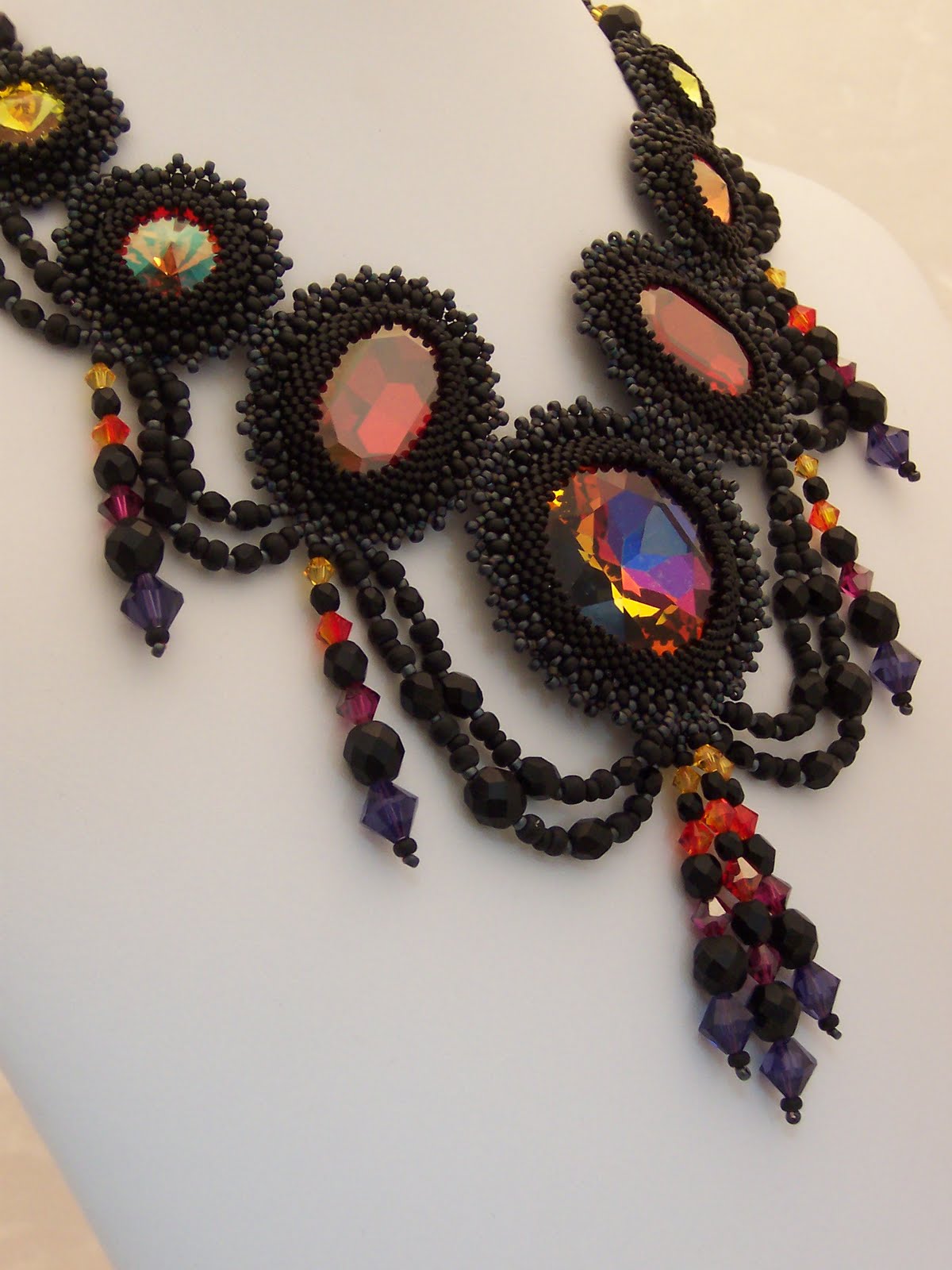
I wanted the necklace to be tall, but not solid, as I wanted to try to create the insubstantial shadowy aspect. I used large Swarovski jewels, in Cathedral, Magma, Crystal Copper and Ultra Orange to represent the flames and matte black cylinder and seed beads to bezel the jewels, encasing my "embers" in ash and charcoal. Those matte black Czech Firepolish beads actually felt like coal in my fingers! I tried to imagine wings unfurled as I joined the bezeled jewels.

I wanted lines that drooped, as I imagined the horns did, and created those with the draped sections of coal black Czech firepolish beads. I tried to create the flame-like whip imagery with graded bicone tassles in flame colors.

Photographing black beadwork is REALLY a challenge.  Realistically, I am not a very skilled photographer, so I find all photography challenging, but this is over the top for me. I believe I read somewhere that the bead magazines will not accept black work due to the difficulty of photographing it. So I am certainly struggling!  I did finally find an angle that would let me see into the jewels without a ridiculous amount of reflected shine. 

Now, a few words about my splendid son. Zak is a National Merit Scholarship Finalist. He has earned a full ride scholarship to the University of Minnesota College of Biological Sciences, and a place in the Honors program as well. He is also an AP scholar. Can you see why I am so proud? This one is for you, Zak!

OH!  I almost forgot to mention, once again, all the the Swarovski jewel components in this necklace came form my friend Doris Coghill.  She's got a WONDERFUL selection of interesting and unusual things, at reasonable prices.  Visit her rivolis and jewels at : http://www.beadsbydee.com/Catalog/Swarovski-Rivoli.html

Wednesday, April 6, 2011

Lemonade from Lemons

I did start with a sketch.  But not a very detailed one.  This lilac necklace idea was so exciting I really didn't want to spend time in two dimensions with it.  I wanted to get right to the 3D part I love!  So although I thought about color, I didn't ever sketch in color.  I think that would have changed my mind, but hindsight is always 20/20.  If I had REALLY considered how busy this piece would be with 4 colors, TONS of texture, frenetic lines, and complex shapes, I'd have RE-considered.  But I didn't.


I didn't enter Bead Dreams last year because I was involved in a complex and time consuming piece with Hannah Rosner for the ISGB exhibit Convergence II, Adorning the Past, Present and Pretend.  So this year, I thought the time was ripe to collect a second rejection letter, and I planned to do that with the lilac piece I had envisioned.  Somehow, my day job got really busy.  So I worked in fits and bits and starts, assembling parts and making components, without ever laying them all out together to see how I was doing.  That would have helped too.

I arrived at the end of March with 72 4-petaled lilac flowerettes in three colors, 9 lilac leaves in various sizes and two different neckstraps, neither of which I was in love with.  The little flowerettes and leaves reminded me of my son's video game, Pikmin.  They seemed to flock on my bench like the little "floral militia" commanded by Captain Olimar.  If you have seen this game, I bet you know exactly what I mean.

Unfortunately, when I assembled the three colors of flowerettes into blossoms and laid them out together it was painfully obvious that that multi-colored blossoms were an unfortunate choice. There was way too much going on. (Note to self, next time, sketch in color!!!)

But all was not lost. There was the Etsy Beadweavers April challenge, with the serendipitous theme, "Spring Around the Corner" on the horizon, and I could take one of pretty awesome  blossoms and make a simpler necklace. So I put one together, using the least disliked neckstrap, but drat, I just didn't like that strap, (see the little ripple on the left side where it does not want to lay flat?) plus the blossom was not proportionately long enough.
So I listed it, because I know I am obsessive-compulsive and fairly hard on myself, and it wasn't terrible. It had potential for greatness. :o)  And then I began a race with the clock to make a new neckstrap I could like, and a longer blossom configuration, requiring several more flowerettes.  And, pwhew, at 10:30 ish on the evening of the 5th of April, minutes before the entry deadline, I posted the new piece, and I am SO happy with it.  And best of all, I can now make two more, a lovely pink one, and a pale lilac one.  Lemonade from lemons!


Tuesday, March 15, 2011

Persephone's Return


Persephone's Return was created for (and WON!) the Bead Mavens Vernal Visions Challenge.   I like challenges because they provide inspiration and purpose for my evening's play with beads, and this particular challenge was especially appealing, because I live in the frozen north land of Minnesota.  Here's the view out the door next to my beading bay.  This is on track to be the snowiest winter on record where I live, and personally, although I find beauty in almost every landscape, I have had enough of this season!

Below is the inspirational image the Maven's posted for their contest.  Is there any question about why I'd rather live in their world?  I find myself anxiously awaiting a day when the walk with my dog does not entail long underwear, hooded parka, scarf and boots.  I felt the Maven's imagery provided a content and a color scheme I was totally ready to embrace.    
              
Well, OK, in all fairness, there were two images provided.  March is the month of, "In like a lion, out like and lamb," and the other image is colder and wintery.  But I am ready to move forward, and so it was an easy choice for me.


This work of mine is a sister piece to "Zephyr's Spring Flower Neck Lace," created last year, about this same time.  It is based on a piece of hand painted lace from Etsy seller Jennie's Heirlooms.  I find working from the lace is a labor intensive process.  I think most bead embroidery allows the application of many beads at a time, backstitching 3, 4, and even 5 in one needle stroke.  Given the softness and vulnerability of the lace, I find I can apply just one bead at a time, stabilizing the lace as I go, and placing the beads in different relationships to the edges of the lace, depending on the result I want.  When you examine the work from the front, I did not want the lace visible, and from the back, I did not want stitches visible. I found I frequently had to reinforce the lace with a darning stitch to give it the stability to allow me to embroider on it, and I tried to disguise that as well, but if you know what you are looking for, you can see it. 


As a sister piece to Zephyr, and to honor the Vernal Equinox and return of springtime, I named the work for Persephone, the Greek goddess of springtime. Persephone was the unwilling wife of Hades, king of the underworld. Mythology says when she was stolen from the earth to live under ground with her husband, the flora of the earth died, and slept below the ground through the winter. Her return brought the rapid growth of flowers and grain.

My piece, designed to honor the balance that is the equinox, has formal symmetry, yet is organic in character. The delicate loveliness of Persephone’s Return springs forth from the slumbering earth in full bloom almost overnight.  I anxiously await the vision of the first crocus, peeking out of the snow.   And in the meantime, I have captured that joy in beads.

Monday, March 7, 2011

After a Long Silence...

Finally, a new post and a new piece.  I spent all of January and most of February pursuing a project that I was simply unable to realize in the way I thought should be possible.  I eventuallly set aside my fourth attempt, took the hundreds of dollars worth of pearls I had purchased for the "IP," ( impossible project) and decided I would enter the March Etsy Beadweavers Challenge, "Fashion Through the Ages."  I purposefully used the biggest and best of the pearls, so I could not revisit "IP" without re-investing. 

The March Challenge was to choose a historial fashion style and create a piece of jewelry in that style.  I found this beautiful painting by Victorian artist Franz Xaver Winterhalter very inspiring.  I loved the bare necks and beautiful soft shoulders and wanted to create a pearl choker with a three dimensional feeling that would embellish all that lovely bare skin from all angles.
I used triangle weave, one of my personal favorite stitches, to create the choker, and then added drops all the way around the base, so that there would be something beautiful to see from the sides and back, as well as the front.  This is my second attempt, and I was glad to start again after nearly finishing the first time, because it allowed me a opportunity to perfect the design, which had potential, but needed cleaning up.
Then I visited my favorite local bead store, The Bead Monkey and found this splendid sterling silver clasp, shaped like a little heart.  I was thinking my piece would be a great wedding necklace, and the clasp seemed perfect for that purpose, as well as continuing my "beautiful from all angles" idea.  And then of course, it needed a little extender chain.  I tend to design jewelry with my own skinny neck in mind, and like to make it possible for others to adjust the work to fit without alterations to the weaving.


On a side note, I just read about the tiara likely to be worn by Kate Middleton when she becomes a British Princess and, in the process, stumbled across this photo of a necklace worn by Queen Mary, with one of the tiaras under consideration.  According to Wikipedia, the neckalce is from Garrards, Inc, "Crown Jeweller of the UK, charged with the upkeep of the British Crown Jewels, from 1843 to 2007."  Very similar to my own attempt, but made of silver.  Wonder if the stiff, cold metal would be uncomfortable?  Too bad they didn't beadweave this piece!  Take a look.  The design inspiration must have been very similar to my own!


Fortunately, stepping away from the "IP" has been refreshing, and I am happily working on another new piece as well.  Maybe someday, I will revisit "IP," and by that time, I will either have a more realistic expectation, or the techincal skill to reach my goal.  Do you ever get stuck?

Let me add a note here: this is a contest entry, and you can choose your favorite piece and have your voice heard!  Please visit http://www.etsy-beadweavers.blogspot.com/ by March 15th and vote for your favorite entry on the right hand side of the blog in the poll!!!